

![]() New Orleans Pelicans Logo PNG
New Orleans Pelicans Logo PNG
As a very young professional basketball team, the New Orleans Pelicans have had only one primary logo so far. In addition to it, there’s a set of secondary emblems.
Meaning and history
![]()
The team was created on the basis of the Charlotte Hornets when they relocated to New Orleans. During the first 12 years of its history, the team was called the New Orleans Hornets. It was only in 2014 that the club received its current name and the first logo was introduced.
As the most prominent part of their logo New Orleans Pelicans used a stylized pelican. There’s the lettering “New Orleans” above, while the word “Pelicans” is placed below.
2002 — 2008
![]()
The very first badge for the club was created when its name was New Orleans Hornets, so the hornet was in the center of the composition. The insect was drawn in a funny caricature manner, in a sea-blue and bright blue color palette, and was placed between the two parts of the wordmark, set in the uppercase of a bold geometric Sans-serif typeface.
2008 — 2013
![]()
In the redesign of 2008, the color palette was switched to a calmer and more pleasant shade of blue. The contours of all the elements were also refined, and the lettering gained new typefaces that looked fancier than the one from the previous version due to ornate serifs added to the ends of the letters.
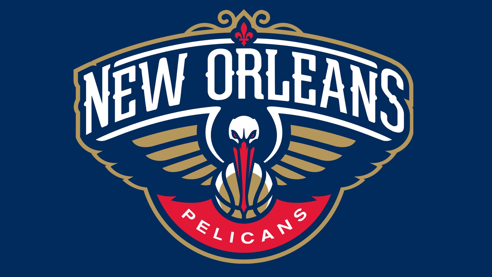
2013 — Today
![]()
The name of the club was changed in 2013, so the need for the new logo appeared. The refreshed design was introduced in the same year. The current Pelicans logo boasts a dark blue badge with a stylized gold and blue pelican holding a ball in his beak, a white arched lettering above it, and the red rounded element at the bottom, with the white “Pelicans” inscription, arched from the center.
Alternative emblems
There are at least three official secondary emblems. One of them represents a huge fleur-de-lis with a pelican’s head inside. A gold (or brown) basketball can be seen under the bird’s red bill.
Another logo sports a gold basketball, which is placed inside a red circle in such a way that a red crescent is formed above the basketball. There’s the text “Crescent City” (on the top) and “Basketball” below. Between them, there’s a red fleur-de-lis.
Nola symbol
One more logo features the white word “NOLA” (which refers to the city of New Orleans) in the same type as the one used on the primary logo. A red fleur-de-lis symbol can be seen above the lettering. On the background, there is a gold (or brown) basketball.
Font
While the logo usage guidelines state that the team’s official font is Arial Bold, in fact, the wordmark features an entirely different type. The custom letters are highly recognizable due to the unique round elements. They were probably inspired by the yellow plate that can be seen on the upper bill of the American white pelican (the plate forms only on the bills of breeding adults). By using the round elements, the author of the New Orleans Pelicans logo managed to create a symbolic link between the name of the team, the emblem, and the wordmark.
Color
The official palette includes navy blue (PMS 289), gold (PMS 872), which is actually more like brown, and a bright and eye-catching shade of red (PMS 186).
New Orleans Pelicans Colors
PELICANS NAVY
HEX COLOR: #0C2340;
RGB: (0, 22, 65)
PANTONE: PMS 289 C
CMYK: (100, 76, 12, 70)
PELICANS RED
HEX COLOR: #C8102E;
RGB: (225, 58, 62)
PANTONE: PMS 186 C
CMYK: (0, 91, 76, 6)
PELICANS GOLD
HEX COLOR: #85714D;
RGB: (180, 151, 90)
PANTONE: PMS 872 C
CMYK: (40, 48, 76, 16)


