The professional basketball team Charlotte Hornets has already had at least five distinctive primary logos. The need for logo modification has been in many cases connected with changes in the name of the team.
Meaning and history
The history of the basketball team from North Carolina can be divided into two periods — the Hornets, which started in 1988, and then again in 2014, and the Bobcats, which lasted for only ten years, from 2004 to 2014. The same was with the club’s visual identity — the logo for Hornets was based on a wasp image, while the Bobcats insignia featured a sharp wild-cats drawing.
1988 — 1989
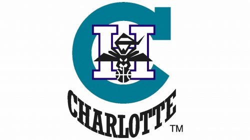
The initial logo for Charlotte Hornets was composed of a light blue letter “C” with a white “H” in a bright blue outline and a black stylized hornet placed on it. The “Charlotte” lettering in a square typeface with massive geometric serif was arched under the emblem, written in black.
1989 — 2002
The color palette and composition of the logo were changed in 1989, placing a funny caricature of a hornet inside two arched wordmarks — “Charlotte” on top, and “Hornets” on the bottom. The lettering was executed in a bold serif typeface in a muted turquoise shade, which could also be seen in a striped hornet with a red basketball.
2004 — 2012
In 2004 the club was renamed Charlotte Bobcats and got its new emblem in the same year. It was a sharp and modern badge with an orange wild cat drawn in profile, facing right. The white stylized “Bobcats” inscription was written in a blue background, while the “Charlottes” part was placed above the badge’s executed in a simple yet strong sans-serif font.
2012 — 2014
The redesign of 2012 switched the color palette of the logo to blue and gray, keeping orange as an additional color, used for the “Charlotte” lettering, which now was placed on the badge, not above it. The cat was colored gray and looked edgy and dangerous, reflecting the spirit of the team.
2014 — Today
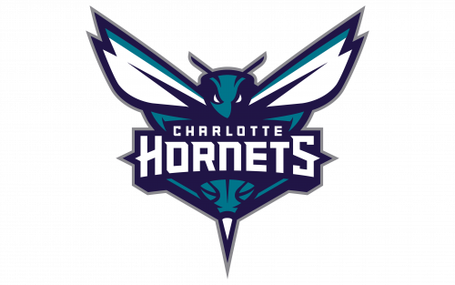
In 2014 the club came back to its original name, and the visual identity was redesigned for the fourth time. The new emblem is executed in bright blue and muted turquoise color palette with white accents and lettering. The stylish hornet with its wings spread to the sides has a bold white nameplate placed in the center of the body. The lettering is executed in a custom sans-serif typeface with some sharp elements of “H” and “S”.
Color
The current Charlotte Hornets logo comprises four colors: teal, dark purple, gray, and white.
Charlotte Hornets Colors
ORNETS PURPLE
PANTONE: PMS 275 C
HEX COLOR: #1D1160;
RGB: (29, 17, 96)
CMYK: (96, 98, 38, 44)
TEAL
PANTONE: PMS 3145 C
HEX COLOR: #00788C;
RGB: (0, 120, 140)
CMYK: (100, 38, 39, 7)
GRAY
PANTONE: PMS COOL GRAY 8 C
HEX COLOR: #A1A1A4;
RGB: (161, 161, 164)
CMYK: (0, 1, 0, 43)


