

Everything changes all the time, and business is no exception. To meet people’s ever-changing needs and interests, the business has to constantly adjust to the world at large. It is not only a company’s policy and product that must evolve. To sync with modern tendencies, even company logos have to be modified! Here you will see 30 logos that come in shapes that we are all used to, but these are not their original ones.
In this article, we wanted to show you the progress of the brands, or, on the contrary — their loyalty to traditions and heritage, as some badges still keep their original design, even though are slightly modernized to suit the modern trends.
About the history of creating old and new versions of the logos, you can read on our website, the articles dedicated to each brand.
Canon
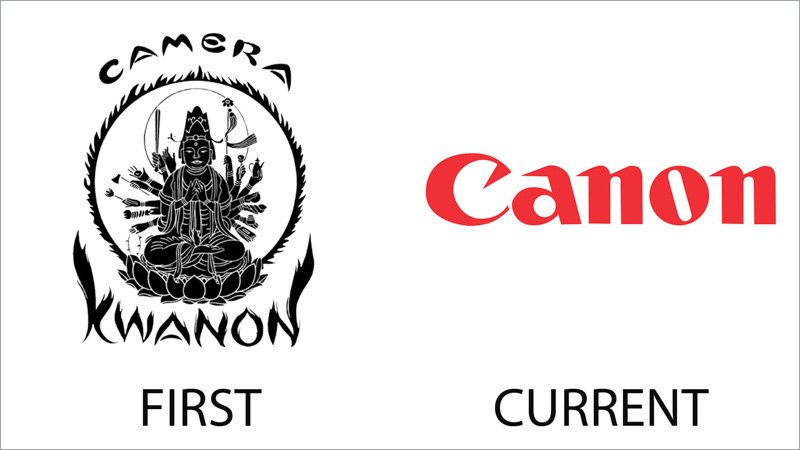
The original logo of Canon was very ornate and detailed, even though it was executed in black and white. The badge was composed of a Buddhist god image enclosed into a circular frame with small flames and accompanied by stylized lettering “Camera Kwanon”, with the second part also drawn in flames.
As for the current Canon badge, it is completely different — with no graphical details, and in a bright scarlet-red shade. There is a huge difference between these two badges, which perfectly show the progress plans development of the company.
Coca Cola
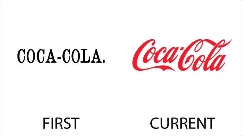
The very first logo of Coca-Cola was also composed of just lettering, but it was a classy uppercase inscription in a traditional serif typeface, with slightly narrowed glyphs. The logotype was set in black, against a white background.
The current Coca-Cola badge, with the red cursive lettering, is one of the most recognizable insignias in history. The secret of its success is in simplicity mixed with elegant lines, sharp tails with smooth bars, a bright color accent, and a very friendly look.
Burger King
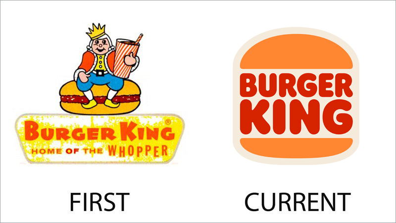
The first logo of Burger King was too cartoonish and looked, amateur. It was a drawing with a king sitting on a burger and holding an enlarged paper glass with soda water. The emblem was accompanied by a horizontally stretched trapezoidal banner with red lettering written on it on two levels.
The current badge perfectly shows the company’s success and transmission to a new level. The minimalistic and cool Burger King logo is composed of a bold rounded sans-serif inscription set between two orange buns, against a light cream background. The soft contours, interesting concept, and intense color palette made this badge truly iconic.
Audi
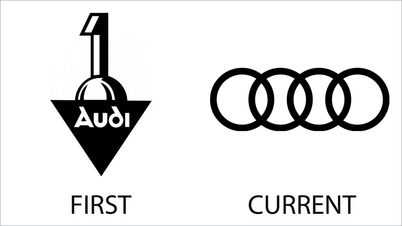
The first and the current bases of the famous German automaker have nothing in common at all. Although the inscription from the initial badge has been used by the company for decades, the latest redesign only uses a graphical part on the badge.
The first Audi logo was composed of a solid black triangle pointing down, accompanied by bold white lettering in a custom typeface, and a stylized digit “1” standing on half of a sphere.
The iconic four-ring emblem has been with Audi for decades. It is a legacy, left for the brand after the Auto-Union. The current logo depicts a very minimalistic version of the rings — plain black on a white background.
Apple
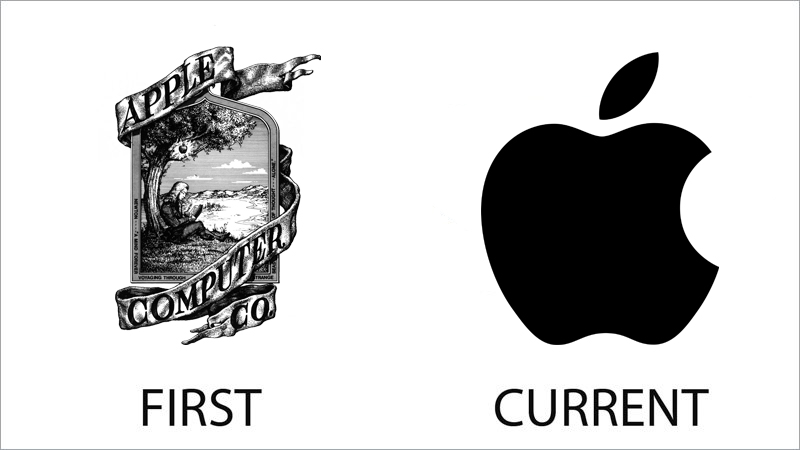
Apple is the brand with the most dramatic visual identity evolution. From an ornate classic badge with lots of details, depicting the historical moment where an apple fell on Isaac Newton’s head, with an ornate ribbon around it and elegant serif lettering, to a super minimalistic humorous emblem, which became the world’s most recognizable logo of the 20th century.
The current Apple badge is set in flat plain black color with no gradients, no framing, and no lettering. It is laconic, simple yet powerful, and confident.
Amazon

The original Amazon badge was all about the River with the same name. The enlarged capital letter “A” in solid black became a canvas for vertically drawn white waters of the river Amazon, which started in the center of the letter’s bottom line, and finished at the top left part of it. The emblem was underlined by a lowercase inscription with the full name of the website.
The current Amazon badge has been with the company for years and has only undergone minor changes since it was first introduced. The lowercase lettering with the orange arched arrow from “A” to “Z”, which shows the assortment of goods on the platform, and looks like a smile, perfectly represents the essence of the company and its purpose.
Adidas
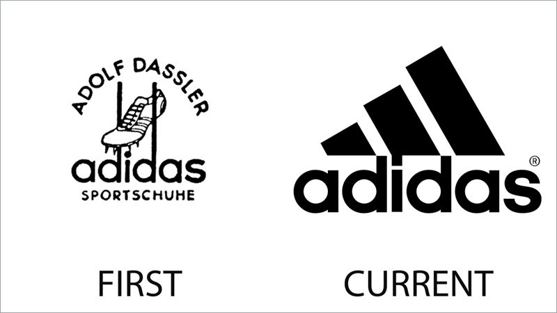
Not many people remember the very first badge of Adidas, as its current version has been with the German brand for decades, and is considered to be one of the most iconic visual identity designs of the 20th century.
The original Adidas badge featured a drawing of a football boot with three stripes, drawn above the lowercase sans-serif “Adidas” lettering and enclosed between the two elongated bars of the “D”s. The emblem was covered by an arched “Adolf Dassler” inscription, celebrating the founder of the brand, and the “Sportschuhe” tagline, pointing to the company’s specialization — sports footwear.
Xerox
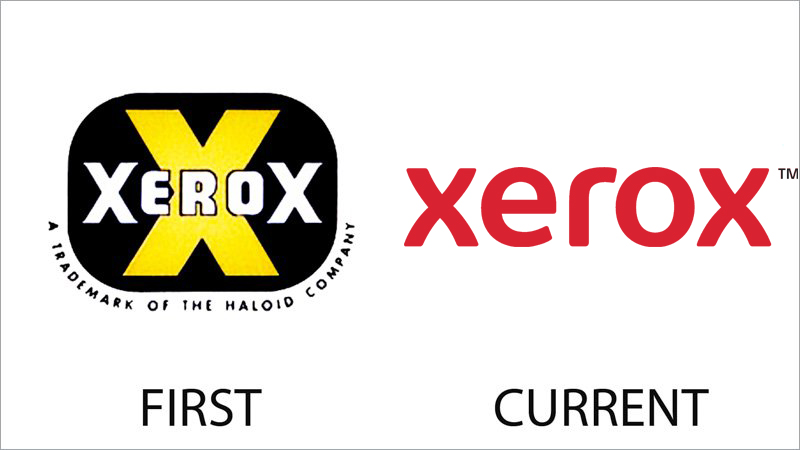
Both versions of the Xerox logo are based on the lettering, but the original one has the logotype as an accompaniment, and the current one — as the only element.
On the first Xerox badge, the white inscription was written across a solid black banner with an enlarged yellow “X” on it, and the two “X”s in the logotype were drawn larger than other letters. As for the current version, all the characters feature the same size, and the same color, but only in both lowercase “X”s the contours are unique, with the softened bars, creating a stylish elegant shape.
Walt Disney

The very first Walt Disney logo was a celebration of the main character the studio created, Mickey Mouse. The little mouse in his shorts was drawn walking between the lettering, happily smiling and waving to everyone. This badge didn’t stay with the company for a long time, and a few years after was replaced by the emblem, which by today has become iconic.
The Cinderella castle from the current Disney badge has undergone several redesigns throughout the history of the studio but kept its contours, sharp thin lines, and, of course, the bold custom logotype.
Volkswagen
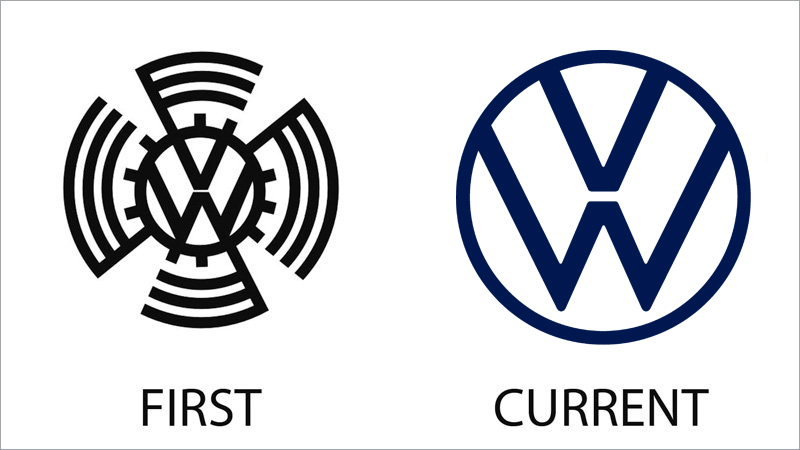
The Volkswagen logo is a greatexample of consistency and loyalty to its roots. The main element of the German automaker’s badge has remained the same throughout the years.
On the first version of the badge, the iconic roundel with the “VW” lettering was set in black and enclosed into a gear-like frame with four stylized flags coming out of it and creating a swirl.
As for the current version, it is super minimalistic — with the abbreviation enclosed into a thin circular frame, executed in dark blue, and drawn against a white background.
Twitter

If Volkswagen is about legacy and conservation, Twitter is the company, that has made a fast and dramatic transmutation from the initial version to the current one.
The very first badge of social media featured a three-dimensional logotype in two shades of green, with the bold narrowed letters smooth and voluminous.
The iconic Twitter bird, which is familiar to the whole world today, is set in a flat 2D manner, in a bright shade of blue, and has no lettering accompanying it. Two completely different strategies, and in this example we can see what works better.
Starbucks
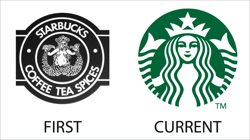
The Starbucks visual identity history is about evolution. The company did not change its initial badge, but modernized it, adding bolder lines and changing the color palette of the badge, at the same time removing all the unnecessary elements.
The initial Starbucks logo featured a full-sized image of a mermaid set in white and black and enclosed into a wide circular frame with lettering in white capitals written around it. The current logo is the laconic version of the original badge — drawn in green and white, with only the upper part of the mermaid’s body, and without any inscription.
Snapchat
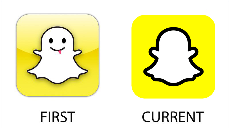
Snapchat has also shown itself as a pretty conservative platform in terms of visual identity. The white ghost on a yellow background has been with the company since the very beginning.
Although, on the first version of the Snapchat logo, the ghost had a face, and was even sticking out its tongue, while the current badge only shows us an outline silhouette. The background was also slightly different — the original icon was in gradient and glossy yellow, and the new one has a flat and bright one. The progress from “too much” to “just perfect” can be clearly seen here.
Shell

The visual identity history of Shell is also about evolution. The badge of the company has always featured only one element — an image of a shell, but in the first version, it was executed in black and white, with unconfident and blurred lines, and was placed differently.
The current Shell badge is considered to be one of the most iconic logos of the century, and it is all due to the perfect balance of colors, lines, and shapes. The Shell on the badge is located vertically and drawn in a yellow and red color scheme, which represents power and energy.
Procter and Gamble
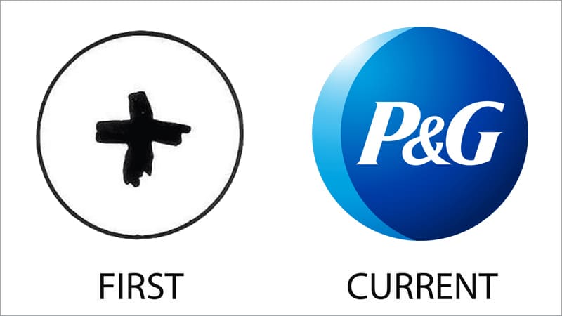
It might sound funny, but to our mind, the original specter and Gamble badge looks much more modern and cool, than the current one. It was a bold hand-drawn Plus-sign in flat black, set against a white background and enclosed into a thin black circular frame
As for the current version of the logo, the only element it has kept from the original one is the shape. The circle of the Procter and Gamble logo is executed in two shades of blue, with a white sparkly on the top left part, and a bold white italicized monogram in the center. A bit boring, isn’t it?
Playboy
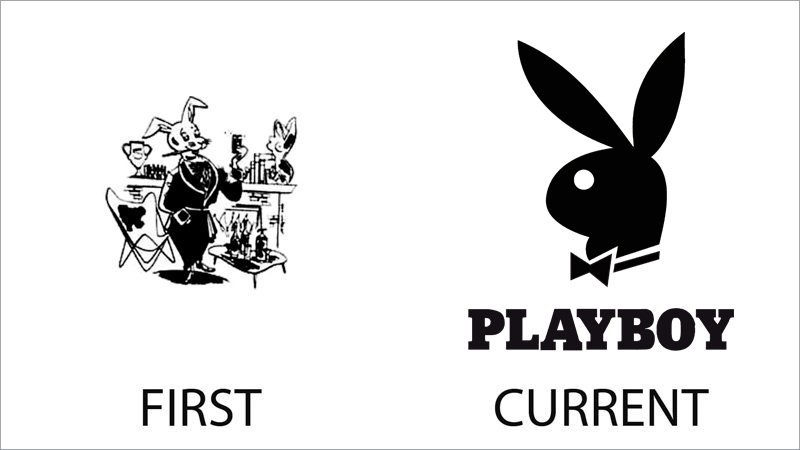
The logo of Playboy has always had a bunny on it. But the original bunny was completely different from the one we all know today. It was a detailed caricature of a white animal in a black robe, standing in the room with many details around. No lettering was present on the logo.
As for the current badge, it features a stylized solid black profile of a bunny set above a bold uppercase lettering in a heavy serif typeface, looking elegant, professional, and evoking a sense of excellence and sophistication.
Pepsi
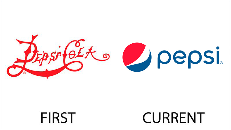
Not many people know, that the very first logo of Pepsi was very close to the current badge of its main competitor, Coca-Cola. Same lines and color, even though it was executed in a wishbone style, the similarity is just obvious.
However, the company found its unique style pretty fast, and the first versions of the Pepsi globe saw the light already in the 1950s. The current badge is composed of a stylized globe in red, white, and blue, and a lowercase blue logotype in a custom sans-serif typeface.
Nokia

The original Nokia logo has nothing in common with the current visual identity design of the Scandinavian company. It was an emblem with a fish swimming through a circular frame with uppercase lettering written around its perimeter. All elements of the badge were executed in white and black, looking very traditional, and supporting the classic serif font or the inscription.
The current Nokia badge is set in intense blue, and features a bold uppercase logotype in a custom sans-serif typeface, which yells “quality and expertise”. The minimalistic logo of the company is super professional and perfectly balanced.
Nintendo
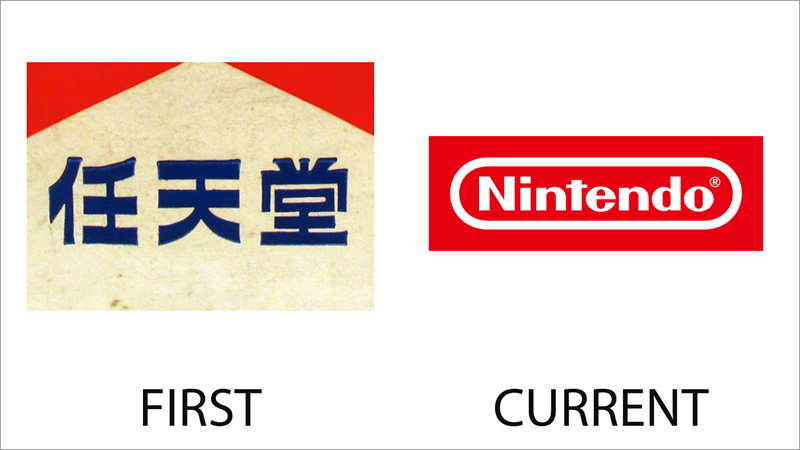
Isn’t it funny, that the original version of the Nintendo badge resembles the iconic Marlboro insignia, with the white triangular part of a banner cutting into a solid red top part of the badge? Although the bold blue hieroglyphs set across the white part of the logo leave no doubt — it’s not Marlboro.
The current Nintendo badge adopted the scarlet shade of red from the original version, but that is it. The new concept is based on a bold white title case logotype placed on a solid red background and enclosed into a horizontally stretched oval frame in white. Laconic, bright, and powerful.
Nestle
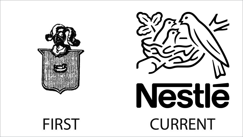
The original Nestle logo was based on a traditional heraldic crest, with a feather-decorated knight helmet placed on its top, replacing a usual crown. The crest was drawn with a vertically-striped black-and-white pattern and a small white bird in the center.
The evolution of the logo has made it up to three birds, which are now placed in one nest, with a mother feeding her babies. The emblem is accompanied by an iconic logotype with the elongated bar of the capital “N”, bent to the right and covering the whole inscription.
Mozilla Firefox
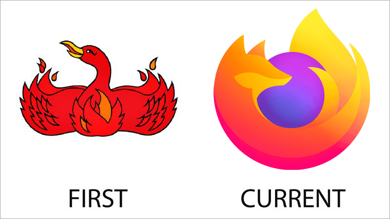
The visual identity of the Mozilla Firefox browser has always been based on fire and flames, although the original version of its logo depicted a Phoenix bird, drawn in red and orange, with its wings spread to the sides and slightly curved up. The image had no additional lettering on it and looked bright and memorable.
As for the current version of the Mozilla Firefox badge, it is executed in a three-dimensional manner, with lots of gradients in both the stylized orange Fox and the purple sphere, the animal is spooning around. The new logo looks super cool and progressive, with its color palette standing for unity, creativity, and passion.
MTV
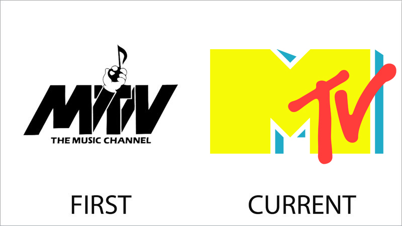
The first logo of the first music tv channel was nothing special. A bold stylized inscription in black with all the characters connected by thick diagonal lines, and a hand in a white glove coming out of one of them. The glove was holding a black note, showing the purpose of the channel. The emblem was underlined by a delicate uppercase inscription in black capitals of a confident sans-serif typeface.
The current MTV logo is all about colors: bright yellow heavy “M” with a white and blue shadow is accompanied by red handwritten “TV” in smooth rounded lines, overlapping its right vertical bar.
Mcdonalds
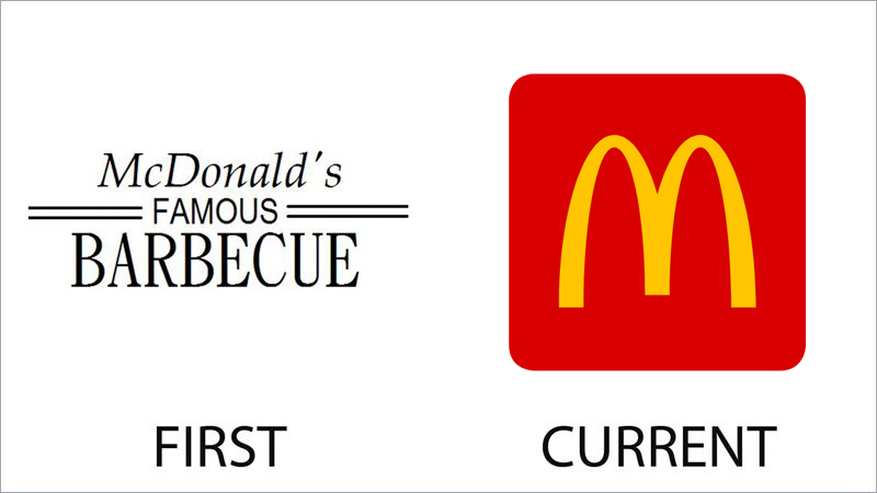
The first concept of McDonald’s visual identity was introduced by the company in 1940 and has stayed active for more than a decade, being slightly modified in 1948. It was three-lines lettering in black, written against a white background and accompanied by four horizontal lines in the middle. Nothing else.
The iconic “M” formed by two arched was first introduced in 1961 and has evolved into a clean and bright badge the whole world knows today by 1968. The current logo of the fast food chain depicts a dark yellow “M” on a solid red background, with no additional lettering.
Lego
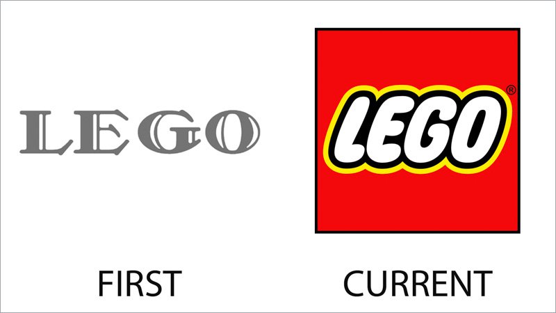
The iconic Lego logo we all know today was introduced only at the beginning of the 1980s, and before that, the company has been in a long experimental search for the perfect visual identity design. It all started from an elegant uppercase lettering in a fancy serif typeface, with unique diagonally set elongated serifs, and the bold bodied of the letters accompanied by thin white lines, which added volume and excellence.
As for the current version, it is composed of a slanted uppercase inscription in a rounded sans-serif font, outlined in black and yellow and placed on a solid red background.
Kodak
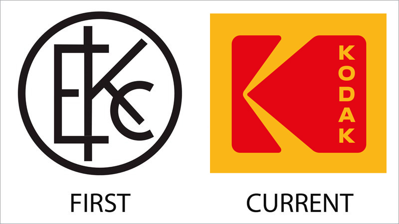
The badge, used by Kodak from 1907 to 1935 was a tradition for those times circular medallion with a black “EKC” monogram in straight clean lines. The thickness of the black frame was equal to the thickness of the letter lines, which made the logo super balanced and professional.
As for the current Kodak badge, its first version was introduced in 1971 but had a different placement and typeface of the lettering. Today the badge is composed of a massive red letter “K” stylized like a camera in profile, set on a solid yellow background and accompanied by a vertically oriented uppercase lettering in bold yellow capitals of a modern sans/serif typeface, written along the right border of the emblem.
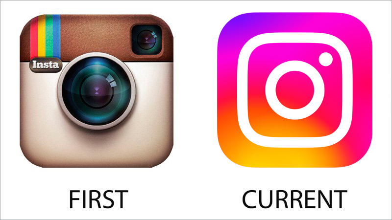
One more example of a smooth visual identity evolution is Instagram. The badge of the famous social media has always featured a square image of a camera with rounded angles as the only element of its badge. The original version depicted a stylized Polaroid cam in a brown color palette with four colorful stripes in the upper right corner.
As for the current Instagram badge, it is designed in a more abstract and minimalistic way, with the bold white contours of the camera elements placed on a gradient background with shades from purple to orange.
KFC
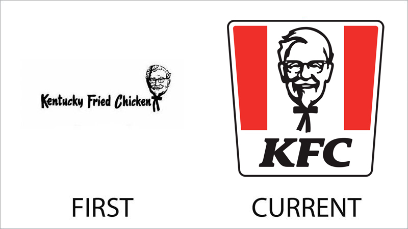
Some things change, and some don’t. The portrait of Colonel Sanders, the founder of the KFC fast-food chain, has never left the badge of the company. And the style of the drawing has barely changed since the introduction of the original logo version. The first badge featured a bold custom lettering in black, followed by a white outlined portrait of the colonel.
The same portrait can be seen in the current version, with the black-and-white image placed on a white background, surrounded by two red vertical elements, and accompanied by a bold black “KFC” lettering under it.
IBM
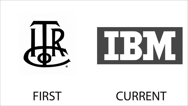
The company, known today as IBM was established under the name International Time Recording Company, hence the abbreviation of the first versions of its logo featured the “ITRC” lettering. The initial badge looked very elegant and sleek, with bold black lines, diagonal cuts, and small sharp serifs.
The current IBM logo was introduced in 2018, but its predecessor saw the light in the early 1940s. For several decades the IBM logo has been executed in light blue and changed to the gray and white color palette only with the latest redesign.
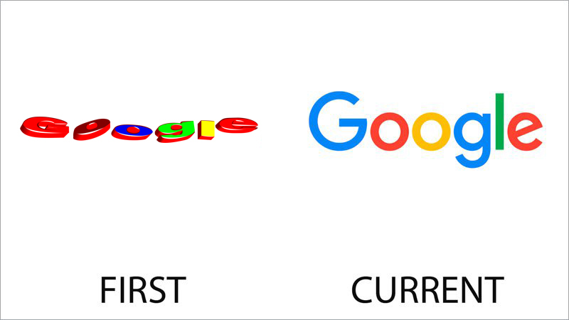
Actually, the first logo of Google saw the light in 1995, when the company was launched under the name BackRub, but today we are discussing the badge, designed for the current name of the company in 1997. It was a very bright three-dimensional lettering with the characters laying unevenly. Each letter was set in its color and had a red shadow.
This multicolor design is reflected in the current Google logo, but with more style and precision. The Google logo version, introduced in 2015 was the first in Google history to use a sans-serif typeface. The badge looks simple, modern, and very vivid.
Dell
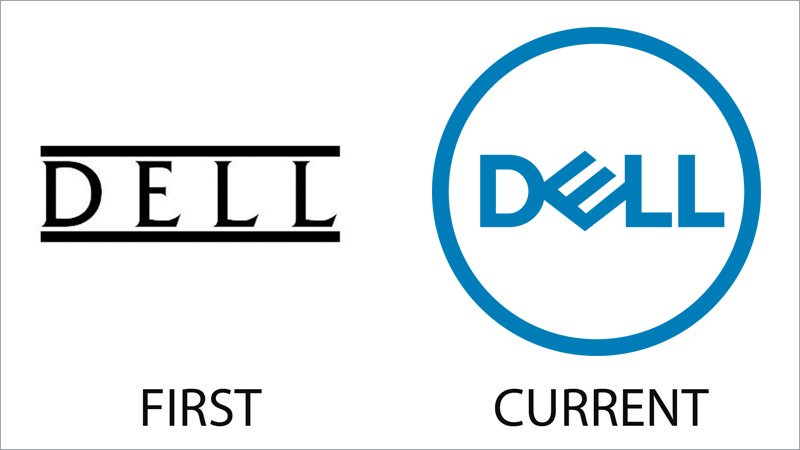
The original version of the Dell logo has only stayed in use for a couple of years and was replaced by the predecessor of today’s iconic badge already in 1989. The initial version featured an elegant uppercase logotype in black, enclosed between two bold horizontal lines.
As the current badge of the company, it was designed in 2016, with medium-weight blue lettering placed against a white background and enclosed into a circular frame of the same color. The most recognizable element of the logo is a diagonally oriented “E”.


