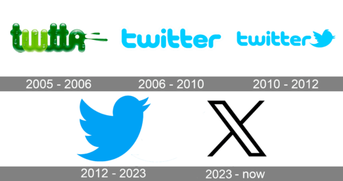
Twitter appeared in 2006, it was not the first social network in the world, but it became probably the fastest-gaining popularity, displacing its competitors from the leading positions. Both social media and its iconic blue emblem are today known all over the globe. The Twitter logo went through a sequence of changes. Today, the Twitter bird is so well-known that it does not need text to be recognizable.
Meaning and history
In 2005, the podcasting startup Odeo was exploring new ventures when Jack Dorsey, an ambitious employee, envisioned a revolutionary text service concept. This service was designed to allow individuals to broadcast messages to a select group, marking the inception of a future global marketplace of ideas. Noah Glass, an innovative American software developer and a key figure at Odeo, proposed the memorable name “twttr” for the service, laying the groundwork for a brand that would soon undergo a significant rebrand to become the Twitter we know today.
The microblogging pioneer, Twitter, made a big impression from its San Francisco base when its first official tweet was posted on March 21, 2006. This tweet, a simple message from the founder Jack Dorsey saying “Just setting up my twttr,” not only marked the launch of a new era in social communication but also reflected the ambition behind the platform. This very tweet would later achieve a remarkable sentimental value, being sold as an NFT token in March 2021 for an astonishing 2.9 million USD by Hakan Estami. The auction’s proceeds were dedicated to aiding African communities affected by COVID, showcasing Twitter’s commitment to making a positive impact beyond its online presence.
Despite a modest beginning with only 5,000 registered users two months after its inception, Twitter’s founder saw this as a second chance rather than a setback. By 2007, the service had exploded in international popularity, thanks in part to its unique features like the username system, profile picture customization, and the ability to post threads—a series of tweets allowing for extended communication.
Twitter’s influence continued to grow, reaching a milestone with the billionth tweet in mid-2009. This achievement underscored its role as a global town square, a vision further amplified by the new Twitter bird logo and brand guidelines introduced as part of its rebranding efforts. The platform became an accelerant for unlimited interactivity, especially evident during events like the 2010 World Cup, where tweet volumes surged to 3,000 per second.
Under the leadership of Twitter CEO Linda Yaccarino, the company has continued to evolve, introducing innovations like the mobile app and audio features, adhering to the future state of unlimited interactivity. The introduction of new logos, special alphabets including Unicode, and templates has helped maintain Twitter’s position as a leading online financial services company. Figures like Sawyer Merritt and designers like Martin Grasser have contributed to its aesthetic and functional evolution, ensuring that Twitter remains at the forefront of digital communication.
Moreover, Twitter’s adaptability is evident in its response to challenges, such as implementing temporary limits for unverified accounts to ensure the integrity of its global conversation space. The platform’s ability to make a big impression, whether through its commitment to aiding global causes or its role in shaping the future of online interaction, continues to be fueled by its foundational ambition and innovative spirit. As it moves forward, Twitter, with its iconic brand and the leadership of figures like Linda Yaccarino, remains a symbol of the global marketplace’s dynamic and interconnected future.
What is Twitter?
Twitter is the name of one of the world’s most popular social media and microblogging platforms, which was established in 2006, and today has over 1,3 billion users all over the globe. Twitter was founded by Jack Dorsey, Noah Glass, Evan Williams, and Biz Stone.
The Musk Era
On October 28, 2022, Elon Musk officially bought the social network Twitter for 44 billion USD. The co-founder of PayPal, the owner of Tesla and SpaceX did so six months after his initial offer to buy the platform. As the first action Musk took as head of the new company, he tweeted “the bird is freed” and fired the entire management of the platform, including CEO Parag Agrawal. In addition, Musk dissolved Twitter’s board of directors and announced the dismissal of 50% of the staff.
And this is when one of the loudest acquisitions of 2022 started to cause more and more resentment and opposition. The world is split into two categories: the ones who support the Musk vision of social media, and those, who vote for the old management and approach.
Why did Musk need this? As was explained by the businessman, Twitter for Musk is a digital city, the basis of which should be freedom of speech and democracy. Right after the acquisition, the new CEO announced the most urgent tasks, which are to add new features to the product, implement open algorithms, defeat spam bots, and authenticate all people.
2005 – 2006
Some of the earliest versions of the Twitter logo, which have never actually reached the status of the official emblem, reflect the name “twttr”. These logotypes were designed by Biz Stone and varied by style and color schemes. For instance, there was a nature-inspired emblem featuring the dark and light green colors and drops of dew on the characters. Also, there was a bright, multicolor retro Atari-inspired logo.
We can mention two bubble designs. One of them featured a magenta bubble with the white word “twitter” placed inside, while the other had a green filling with an alternative name of the service – “smssy” – also in white. Both the bubble designs included a tagline “An Odeo Thingy” right under the name of the service.
The first Twitter prototype was utilized as an internal networking service for Odeo.
2006 – 2010
By the time the site was launched publicly in 2006, the company had developed an emblem on the basis of a blue bubble font. The typeface was designed by Linda Gavin. The name of the service was given in the way it is used now – “twitter” (with both the vowels and no capital letters). The light blue letters with a white outline were placed inside a rectangular shape with a light blue filling.
2010 – 2012
Next to the wordmark, a little blue bird could be seen. The very first bird was bought by one of the Twitter employees for as little as $15 on the iStock website. It was among the illustrations offered for sale by a UK graphic designer Simon Oxley. Originally, the bird looked very different from the current version. It was a slender creature with a stylized eye and two paws. The original icon faced to the left. It was called Larry after Larry Bird of the NBA’s Boston Celtics.
Interestingly enough, Simon Oxley himself did not even know that such a promising company chose his picture until he was told about it by a friend. However, as far as businesses are not allowed to turn iStock icons into their official logos without any changes, Twitter had to redesign the bird completely.
Larry faced to the right, had a light blue belly and two wings but no paws. The following version looked rather similar in terms of shape, but acquired several cartoony details that were probably supposed to make it look friendlier. The beak grew open, while the eye got a black pupil. Also, the bird received a fluff on its head, an eyebrow, and two thin black paws.
The cartoony Larry did not last long and was soon replaced by a cleaner silhouette image. Probably the most notable change referred to the shape of the wings. The paws were removed once again and the bird acquired a classic look that is rather similar to the way it looks today.
2012 – 2023
On June 6, 2012, the company introduced an updated logo claiming that it will not make any other changes to it for a while. The person responsible for the project was Twitter’s creative director, Doug Bowman.
The first thing, the designers got rid of the name of the service, assuming that the bird alone was enough to instantly identify the brand. The beak has been pointed higher, toward the sky, while the fluff on top has disappeared. In addition to this, the head has grown smaller, while the number of the feathers on the wing has been reduced by one. The bird also changed its name from Larry the Bird to the Twitter Bird.
2023 – Today
Twitter owner Elon Musk was the man behind the logo update. In order to develop it, the famous logo in the form of a blue bird was replaced with the image of the letter X – the 21st letter of the Latin alphabet. It should be noted that the appearance of the letter X on the logo of the social network was chosen for a reason. The fact is that Twitter merged with X Corp, registered in Nevada, back in April 2023. Consequently, Twitter Inc. ceased to exist.
Geometry behind the symbol
The Twitter logo, simple as it may seem at first glance, has a very interesting geometry behind it. In fact, the picture is built up of parts of perfect circles. This means, that every part of the bird can be defined with the help of portions of circular arcs (one or two circles). If we compare the 2012 logo with the previous one, we will see that this was not true for the earlier version. Although there were quite a few circular arcs, some of the curves did not match up.
Of course that is in no way an innovative approach. It has already been used in several very popular logos, including those of Apple, Pepsi-Cola (an older version), and iCloud.
Logo and the golden ratio
One more artistic concept the Twitter logo relies upon is the golden ratio. The proportions of the smaller and the bigger circles are rather close to the golden ratio, and there is every possibility that these proportions were chosen by the designers intentionally.
Font
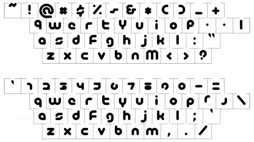
In 2012 the company got rid of the text in its logo. As the designers explained, “There’s no longer a need for text to represent Twitter”. Earlier versions of the logo utilized a bubbled typeface created by Linda Gavin.
This bold rounded typeface looks pretty similar to such commercial fonts as Modulus Pro Black and Aristotelica Pro Display Heavy, with thick bars and softened edges. Although, the custom Twitter typeface has its lowercase letters horizontally extended, and the contour of the “R” differs from any of the analogs.
Color
Blue is a very popular color for networking services, so the choice seems quite natural in case of Twitter.
The company chose the most delightful and fresh shade of blue — light turquoise, which represents communications, unity, and joy, along with such qualities as wisdom and meaningfulness. Turquoise is also often associated with freedom, and this is what the initial target of the service was — to give its users the freedom to express their thought and doubts. Along with white, a color of transparency, the main idea of the online platform is elevated to the top.
Icons
What is the bird from the Twitter logo?
The bird, depicted in the Twitter logo, looks pretty much the same as the mountain bluebird, which can be found in North America. The bird represents freedom and creativity, reflecting the essence of the brand and its character.
One of the most recognizable icons in contemporary visual identity diversity is definitely the Twitter one. This hummingbird-like creature is known to the whole world simply as the Twitter bird. And of course, it has always been executed in light blue and white color palette, a symbol of freedom, self-expression, loyalty, and trust.
Doug Bowman, creative director of Twitter, explains the Icon straight and simple: “Twitter is the bird, the bird is Twitter”. Why bird? The bird reflects the essence of the microblogging service, as it is associated with the name (“tweet” – chirp, chirp), represents freedom and limitless possibilities, and also shows how short messages spread as quickly as a flap of wings.
Though the first image appeared on the official Twitter logo only in 2010, the idea of a blue flying creature was born four years earlier, in 2006. The bird changed its contours and style but kept its spirit and idea.
The most famous Twitter bird icon was designed in 2012.
What does the Twitter logo symbolize?
The iconic blue and white logo of Twitter with a small playful bird represents first of all the name of this social media platform, as it is synonymous with the chirping of the birds. Apart from this literate meaning, the Twitter birdie is also a symbol of freedom and communication, and its blue and white color palette stands for reliability and safety.
What is the current Twitter logo?
Since 2010, the main element of the Twitter badge is a little blue bird on a white background, which can turn white when placed over a solid blue square of the platform’s icon. The bird looks like a tender playful hummingbird, which symbolized friendship, caress, and communication.
Is the Twitter logo a bird?
Yes, the Twitter logo depicts a bird, drawn in solid sky-blue over a white background, with the shades in the secondary version alternated, and the bird turning white, with the background getting colored in blue. This bird badge has already become iconic and is considered one of the most recognizable icons in the world. The bird from the Twitter logo even has a name — it’s called Larry Hird.


