![]() Mickey Mouse Logo PNG
Mickey Mouse Logo PNG
Mickey Mouse is one of the most famous cartoon-heroes ever created. The character was drawn in 1928 by Walt Disney and became the company’s symbol in the same year. Mickey was the major animated personage to get his star tile on the Hollywood Walk of Fame.
Meaning and history
![]()
The logo of the most famous mouse in the world hasn’t changed much since its introduction in 1928. The only difference between the emblem’s versions was in the thickness of the lines and shadowing of the inscription, though with the last redesign the brand started to set its wordmark in two levels, instead of the usual line.
What is Mickey Mouse?
Mickey Mouse is the name of the Disney Mascot and the most famous mouse in the world. This animated hero was created by Walt Disney in 1928, and 50 years after, in 1978, Mickey got his star on the Hollywood Walk of Fame, which made him the first animated celebrity to receive this honor.
1928 — 1930
![]()
The original Mickey Mouse logo, created in 1928, featured a custom sans-serif inscription with its extra-bold letters overlapping each other. The shapes had sharp cuts and angles, which could look strict, but the “dancing” positioning of the letters made the whole emblem friendly and playful.
1930 — 1932
![]()
The redesign of 1939 added a shadow to the inscription and placed some letters a bit further from each other to create a light and fresh feeling. The “Walt Disney’s” additional lettering above the logo was enlarged and made more visible in comparison to the original versions
1932 — 1935
![]()
In 1932 the letters became narrower and glued to each other, though each of the white symbols gained a thick black outline, which didn’t let the logotype become messy and blurred.
1935 — 1937
![]()
The color first comes to the Mickey Mouse visual identity in 1935, and this is when the iconic logotype gets its red shade. The “Walt Disney” part of the emblem is drawn in yellow and has a distinct black outline, which allows placing the badge on any possible background.
1937 — 1953
![]()
The three-dimensional version of the Mickey Mouse logo was introduced in 1937 and stayed with the brand for more than fifteen years. It was a fancy gradient pink logotype, where all the letters gained a thick “brick” shape, and the “Walt Disney” inscription get a new bold sans-serif typeface and a glowing texture.
1953 — 1999
![]()
The logo we all know today is fully based on the version, created in 1953. The logotype from the 1950s boasts bright red lettering in a black outline, where playful massive shapes look light and cool. The jumping line reflects the character of the main cartoon’s hero and represents the plot and mood of the series.
1999 — Today
![]()
The redesign of 1999 placed the “Mickey” part above the “Mouse”, and cleaned the contours of the lettering, making it stronger and more professional. As for the “Walt Disney” inscription, it was replaced by the iconic “Disney” logotype with the smooth curved “D”.
Font and color
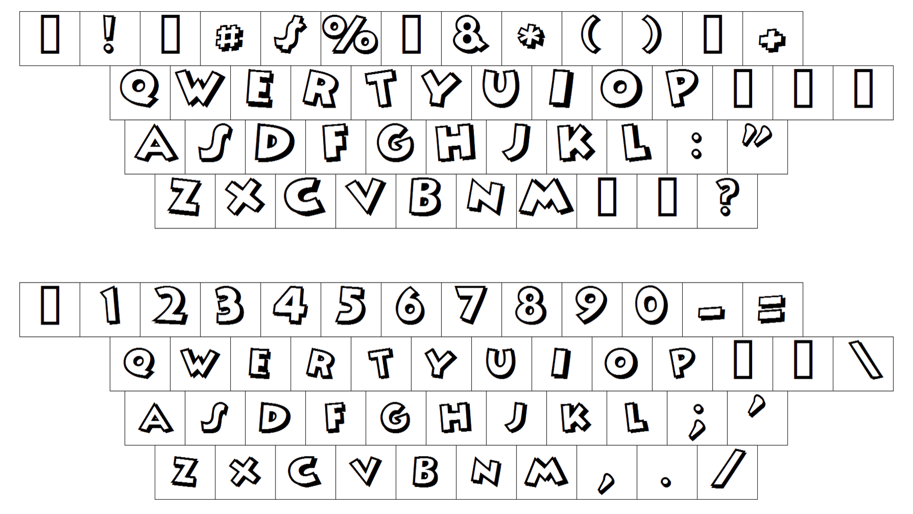
The cartoonish Mickey Mouse typeface resembles amateur graffiti drawings and is very close to such fonts as That’s All Folks Outline Bold, PAG Marina, and Kobalt Kartoon, with wide lines and sharp angles of the jumping symbols.
The red and black color palette of the visual identity is a representation of warmth, love, and laughter the main character of the cartoon series brings to its fans. This combination also shows the brand as a professional one and t to its expertise and high quality of content.