

![]() P&G Logo PNG
P&G Logo PNG
The earliest P&G logo appeared in 1851. It was a very simple cross, which we may hardly percept as a commercial badge today. However, even in this “primordial” form it did serve the purpose of identifying the company.
Meaning and history
![]()
The history of the Procter & Gamble company started in 1837. It was in that year that William Procter, a candle maker, met James Gamble, a soap maker. Soon they began working together, and at the end of August of the same year the company, which today people all over the world hear about, was officially founded.Already in 1859, the company’s sales reach $1 million.
In 1915 the company for the first time goes beyond the American market, building its first production facilities in Canada.
It is with Procter & Gamble associated with the emergence of the popular expression “soap opera”. The fact is that in 1933, the radio show Ma Perkins, sponsored by Procter & Gamble’s Oxydol detergent, was on the air in America. The popularity of the series leads to other soap operas being sponsored by the company.
In 1993, for the first time in the company’s history, more than 50% of its sales are made outside the United States.
In 2002, P&G celebrates its 165th anniversary. The company has achieved $40 billion in sales and has 12 brands in its portfolio with more than $1 billion in sales each.Today the company has more than 300 brands in its portfolio.
What is P&G?
P&G is the shortened brand name for Procter&Gamble, a global manufacturer of consumer goods, which was established in the United States as a producer of soaps, and grew into the worldwide famous distributor with thousands of goods in its portfolio.
1845 – 1853
![]()
The barge workers working on the Ohio River used the cross to mark cases containing P&G star candles, and the company eventually gave it the status of its official trademark.
1853 – 1859
![]()
In 1853 a new emblem, depicting a single star in a circle, was created.
1859 – 1875
![]()
This time, there were 13 stars (symbolizing the 13 original colonies) and a moon in a round shape.
1875 – 1882
![]()
In 1875 the logo was given a facelift, as a result of which it became more transparent.
1882 – 1890
![]()
The “Moon” logo underwent a series of modifications in 1882, 1890, 1930, and 1985.
1890 – 1930
![]()
In 1890 the circular badge gained a wide white frame in a double black outline. Around its perimeter, there was a bold and modern “Procter&Gamble Products EST. 1847” written in black uppercase letters. The moon face on this version was thinner and almost merged with the framing.
1930 – 1989
![]()
The redesign of 1930 removed the framing with the lettering and refined the graphical part of the P&G logo, adding thin monochrome stripes to the background and drawing the moon face with more details.
1989 – 1998
![]()
Subsequently, the company had to phase out the man in the moon logo because it was rumored to include Satanic symbols.
1944 – 1953
![]()
The logo created for PG in 1944 featured hand-drawn monochrome lettering, with the letters “P” and “G” ExtraBold and enlarged and the uppercase “And” in smaller narrowed rounded letters set between them. The smooth uneven contours of the symbols made the badge look friendly yet confident.
1953 – 1989
![]()
The redesign of 1953 kept the idea and color palette of the previous version, but changed the contours of both letters and written the “And” in a cursive lowercase serif font. The main letters were now also executed in an elegant serif with interesting lines.
1989 – 1990
![]()
The blue color first appeared on the P&G logo in 1989. It was a solid sans-serif lettering with the company’s name set in the left from the rounded emblem, introduced earlier, but this time executed in royal blue and white.
1995 – 2003
![]()
The company adopted a simple wordmark, which was changed in 1995 and 2003.
2003 – Today
![]()
The redesign of 2003 made the P&G logo simple yet timeless and professional. It is now composed of a slanted serif lettering in the same intense blue and white color palette, which represents reliability and protection.
2012 – Today
![]()
The blue lettering turned white in 2012. And now the elegant and sleek “P&G” monogram in a custom serif typeface is placed on a circle, drawn in two shades of blue, with the darker one used for the bigger part of the badge, and a thin light blue line on the left.
Brands under P&G
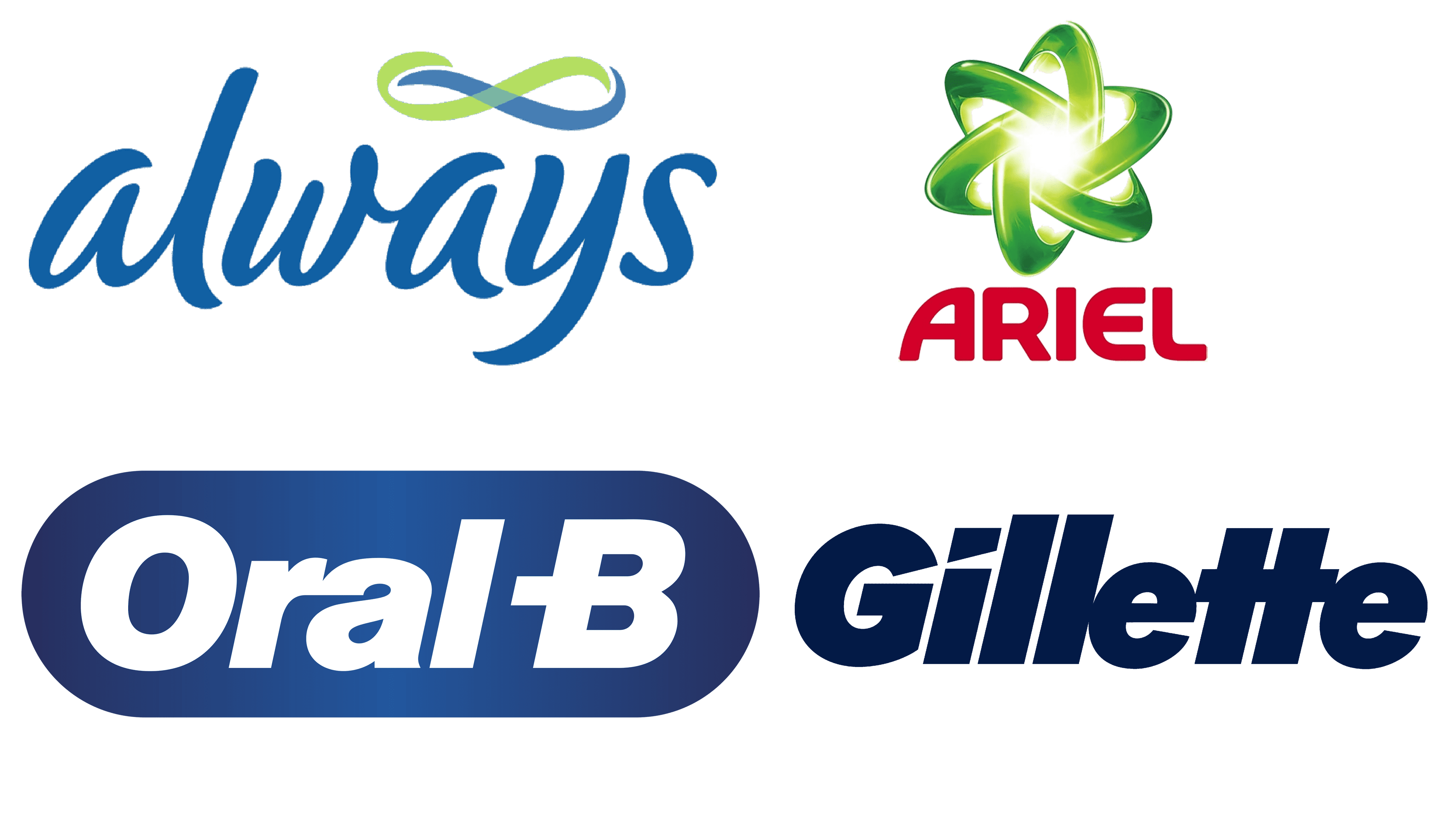
P&G mostly owns brands, related to personal hygiene. The most famous and prominent names include Gillette, Ariel, Always and Oral-B.
![]()
Gillette is a brand of razors, created in 1901 and acquired by P&G in 2005. The company’s long-time emblem was their name, written in a collection of ordinary sans-serif letters. In the latest version, they are bold, very dark blue and slightly tilted to the right. Some of their tips are also clipped to make them seem shaven off.
![]()
Ariel is a brand of laundry solutions, introduced in 1967. It’s a British brand with a strong presence on the European market. Their emblem depicts a molecule with a bright shining core and rings of floating particles around it – three in green, one in red. Beneath it, there was the name of the brand itself, in red sans-serif.
![]()
Always is an American company that produces products for female hygiene, pads most notably. It was started in 1983, and now it’s one of the top manufacturers of such products in the world, with many sub-brands all over the globe. The logo is a white, lowercase lettering with a cursive, hand-written style. Often, there is a blue background behind.
![]()
Oral-B is an American manufacturer of oral hygiene products – most notably, toothpaste and mouthwash. It’s active since 1950, then acquired by Gillette and later, by this extension, became part of P&E. Their current logo is a light blue oblong with the brand’s name inside – in white, bold sans-serif letters.
Font
![]()
The P&G insignia features a minimalistic serif type (presumably, Helvetica). Both the letters are capitals and are italicized.
Color
![]()
The standard wordmark features a dark shade of blue and the white background, while the more intricate corporate logo includes several shades of blue, which are used as a background for the white letters.


