IBM is an IT corporation from the United States, which was established in 1889 as ITRC, standing for International Time Recording Company. One of the world’s leading companies in its segment, IBM specializes in producing software and hardware, along with providing various services, including support and consultancy.
Meaning and history
The saga of IBM began in 1911, conceived by Charles Ranlett Flint, and officially adopted the name International Business Machines Corporation in 1924, a move that signaled its ambition beyond mere computing tasks. This era heralded the evolution of IBM from a modest beginning into a titan of the technology industry. The narrative of IBM’s journey is rich with milestones of innovation, including its pioneering development of the IBM 8-bar logo, a symbol of reliability and innovation, which found its place in the Museum of Modern Art as an emblem of design excellence. The company’s history is punctuated with transformative achievements, such as the introduction of the System/360 in the 1960s, which marked a revolution in computing technology by offering a family of computers that could meet a wide range of processing needs.
IBM’s relentless pursuit of innovation propelled it through the decades, leading to its current stature as a leader in the fields of artificial intelligence, quantum computing, and cloud services. This journey was guided by a clear set of guidelines and a commitment to copyright respect, ensuring that IBM’s creations, from its sans-serif font to its innovative technologies, remained distinct and protected. Today, IBM stands not only as a custodian of its own rich history but also as a forward-looking innovator, continually adapting to the shifting sands of technological advancement. Its focus on hybrid cloud, AI, and quantum computing is a testament to its enduring commitment to driving innovation and delivering value to its clients and the broader community.
What is IBM?
IBM, standing as a titan in the tech landscape, merges innovation with its iconic IBM blue, symbolizing trust and excellence. With a footprint in over 170 countries, its ventures into AI and cloud computing are reshaping industries. This strategy, underpinned by a legacy of pioneering in the early days of computing, continues to drive IBM’s commitment to technological evolution and global influence.
1889 — 1914
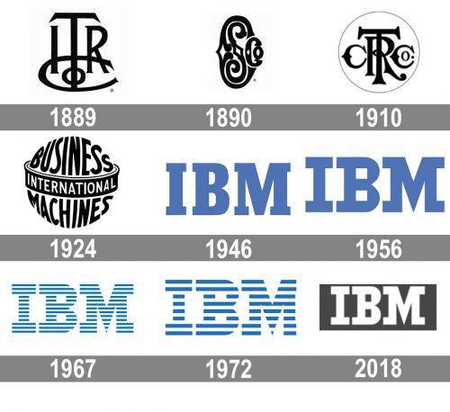
IBM was established as a result of a merger of two businesses — International Time Recording Company and Computing Scale Company. The logo of the first one was introduced in 1889 and featured an elegant and stylish ITRCo monogram, executed in a straight yet sleek serif typeface in a monochrome color palette.
1891 — 1914
The logo of Computing Scale Company boasted a smooth and ornate CSCo lettering, where the bold Las” was placed inside a wishbone “C” and was followed by a smaller “Co”.
1910 — 1924
The companies merged into Computing-Tabulating-Recording Company in 1910, having its logo created in the same year. The new monogram, enclosed in a very thin circular frame, was executed in a bold and elegant custom typeface, where both “C”s were written in a wishbone-style, “R” had it’s tail elongated and curved, and “T” was straight and strict.
1924 — 1947
The company was renamed International Business Machines in 1924, and the new logo appeared in the same year. It was a bold sans-serif inscription, stylized as a globe, with “Business” on top and “Machines” on the bottom written in black and separated by a white black “equator” with the white “International” lettering on it. The image was meant to show the willingness of the company to enter the international market and to grow into a big player.
1947 — 1956
International Business Machines becomes IBM in 1947. The new logo is minimalist yet solid — it is composed of a calm and light blue logotype with the capital letters executed in a square and massive shape of a serif typeface.
1956 — 1967
The redesign of 1956 keeps the color palette of the IBM logo untouched, but refines its typeface, elongating the serifs and making them more visible. Another changed was made to the negative space of the letter “B”, which turned into two white squares.
1967 — 1972
The first version of the today-iconic striped IBM logo was introduced in 1967. It was a modified version of the previous emblem, where the blue inscription was horizontally cut into 13 equal strips.
1972 — Today
 The number of stripes was reduced to eight in 1972. Now the logo started looking bolder and more confident, and the use of the darker shade of blue monkey elevated the sense of solidness and strength. This redesign was held by Paul Rand, and the emblem, created by a famous designer, is still used by the brand.
2018 — Today
In 2018 the company decides to bring back its original “full” logo, created in 1956 but changes its color palette. Now it is a white “IBM” inscription, placed in a dark gray horizontally-oriented rectangle.
Font
The logotype of IBM is executed in a bold custom serif typeface, which was based on one of the traditional fonts, such as Galería or Egiziano, but with circles in the letter “B” replaced by squares and the serifs of the “M” cut from the inside and speed to the outside.
It is a strong inscription with individual character and spirit. Straight lines of the letters and distinct square cuts of its edges evoke a sense of power, influence and a perfect reputation.
Color
Guess why IBM is sometimes referred to as “Big Blue”? The blue color scheme of the logo the company used from 1972 to 2016 is the most important reason for this. However, the nickname can also be explained by the fact that the company used to have a dress code with blue suits.
What is the meaning of the IBM logo?
The official IBM badge, introduced in 2018, represents the name of the company, written in the uppercase of a custom geometric serif font with heavy lines, clean contours, and straight massive serifs on the ends of the bars. The gray and white color palette of the badge stands for the professionalism and reliability of the company and evokes a sense of protection, confidence, and stability.
Why are there 8 bars in the IBM logo?
The eight blue stripes from the most iconic logo of the IBM brand, used by the company from 1972 to 2018, have emerged from the thirteen stripes on the previous version, and represent motion, dynamics, and progress. Also, the striped patternwas adopted by the designers of the IBM badge as a symbol of the brand’s product availability, and its tech orientation.
How was the IBM logo created?
The iconic IBM logo with the uppercase lettering in a distinctive geometric typeface was designed by Paul Rand, who wanted to reflect the digital technology idea in a hand-drawn emblem. The straight clean lines were drawn by hand, although look like computer-created insignia.
Who made the IBM logo?
The most iconic design of the IBM visual identity was created by the famous American designer Paul Rand, who is also responsible for the badge redesign, held in 1972, with the thirteen stripes replaced by eight bolder ones.


