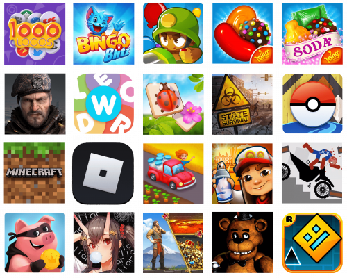
We live in a time when it is hard to imagine anyone who has never played a game on a mobile phone. The most popular applications on Google Play have tens of millions of downloads. In our today’s review, we’ve gathered 20 of the most popular Android games to take a closer look at their logos. After all, the emblem of the application is one of the most important points when choosing from tens of thousands of options. So let’s try to understand what is the key to success, using the example of the Android games that have gathered the most downloads.
State of Survival: Zombie War
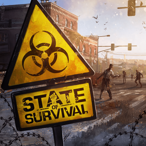
Action-strategy game, where everyone can plunge into the atmosphere of the post-apocalypse. The aim of the game is to build your city and protect it from zombies. After all, the Zombie Infection has spread around the world and taken over the entire civilization. It was this “Infection” or “Plague” that became the main character of the logo of the popular game. The icon is composed of a yellow road sign with the plague symbol on the triangular part and the name of the game on a rectangular one, which is set on the bottom. The whole sign is drawn on a background with a very sad ruined city landscape, executed in a brown color palette.
Last Shelter: Survival
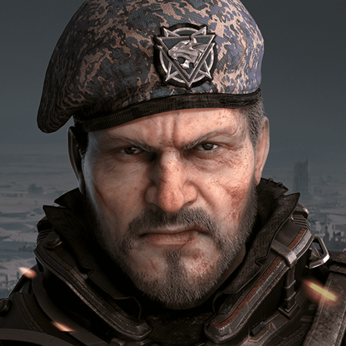
This is another post-apocalyptic strategy game where the player needs to develop his fortress and heroes to fight against zombies. It is an online game where players from all over the world can join alliances or feud in real-time. The Last Shelter: Survival logo is a portrait image of a man wearing a military beret. The grey shades of the soldier’s camouflage are supported by the deep gradient background in darker hues. The man looks very brutal and on his face, you can see a Willingness to fight and an absolute refusal to give up. There are no additional elements or lettering on the icon, it works great as it is.
Geometry Dash
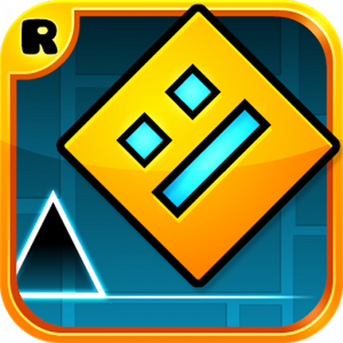
The colorful foreground game Geometry Dash is very popular among players of different age categories. As the name implies, the main characters here are geometric shapes. As levels are passed, the player will discover new shapes, but from the very beginning, the star of the arcade is the square. The aim of the game is to help the square overcome obstacles, which are also very geometric. It’s not hard to guess that the main character of the game logo is also a square. A yellow figure with a grimace of three blue rectangles is located diagonally on a blue background. Under the square, we see a small black triangle, and in the upper left corner, there is a small icon with the developer’s logo — RobTop Games.
Bingo Blitz — Bingo Games
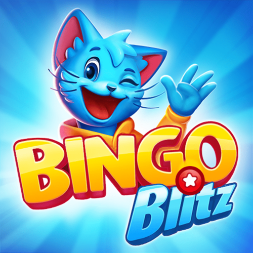
As the name suggests, Bingo Blitz is a classic bingo game, with different modes. The rules of this game are known to everyone, so there is nothing new and surprising here, but the bright colorful design and a large choice of game rooms is what makes Bingo Blitz different from other games of this genre. The Bingo Blitz logo is as bright and juicy as the whole game. The smiling and winking cat, drawn in blue, waves from behind the yellow and blue inscription with the name of the game. All elements are on a blue background with rays of two shades emanating from the center of the composition. Looking at this badge you can surely say that with this game you will have some fun.
Five Nights at Freddy’s
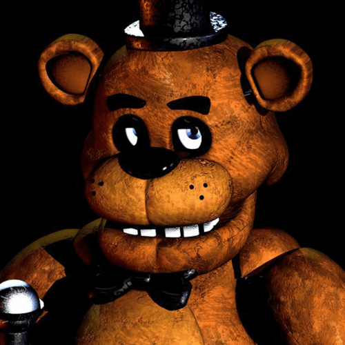
Even though Five Nights at Freddy’s is a rather creepy and macabre horror, the game has a huge number of fans of all ages. Broken and stitched toys are the main characters of this mobile game. The goal is to keep an eye on the security cameras and defend yourself when danger appears. Freddy, the main character of the game, is a creepy-looking toy bear. He’s the one featured on the Five Nights at Freddy’s logo. The bear is drawn in brown shades, smiling and looking up innocently. The dark brown background only escalates the scary feeling when you look at this badge.
Wordle!
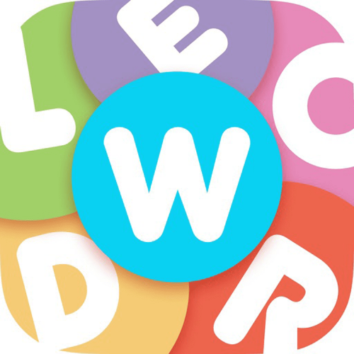
Wordle! is a logic puzzle game where the player must create or find words from chaotically arranged letters. A great game that you can spend hours playing without noticing it. The Wordle! logo is as simple as the game’s essence — letters and color splashes. The badge is composed of six colorful circles, and on each of the circles, there is one of the letters of the game’s name. Pink for the “O”, red for the “R”, yellow for the “D”, “L” is written on a green circle, and “E” has a light purple background. All these letters are set around the bright blue circle with the “W” in the center. It is a very bright and friendly badge, which perfectly reflects the essence of the game.
Zen Match
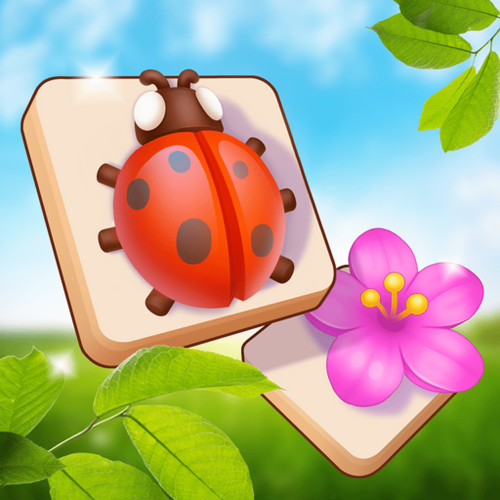
Zen Match is a classic puzzle game where the player has to assemble lines of at least three identical elements. The game’s graphics are built around the Zen concept. In addition to the puzzle mode, Zen Match also has a “build your own Zen room” mode. It is this addition that allows us to assume that the main part of the game’s fans is female. The logo of Zen Match also looks pretty feminine. There are two white square cards drawn on a blue and green background. One of the cards depicts a ladybug in its classic red and black palette, and the other — a bright fuchsia-pink flower. Very lively and delightful.
Ragdoll Turbo Dismount
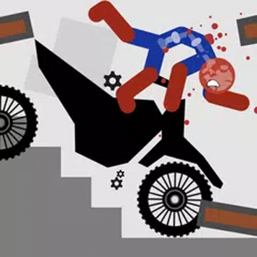
Ragdoll Turbo Dismount is a cool simulation game where you have to do as much damage as possible to a human figure on a motorcycle. The game features very fancy and modern graphics, which you can see not only in the process of “breaking” the motorcyclist but also on the logo. The Ragdoll Turbo Dismount logo depicts an abstractly-drawn figure of the man in a blue sports suit with red arms and legs and blood spots around his head. The man is falling from the black motorcycle, set on a geometric background in two shades of gray with some brown details. The geometry of the badge is very well balanced, with all elements but the man’s figure having straight lines and corners.
1000 Logos Quiz
1000 Logos Quiz is a new application for those who like puzzles and trivia-style games. Created by the professional team of the 1000Logos website, this game features thousands of logos to guess. The badge of the game is also all about different popular logos — here you can see the signifiers of such companies as McDonalds, Twitter, Starbucks, KFC, and many more. The main background of the icon is purple, with the contours of insignias drawn all over it. As for the central part of the composition, it features a glossy yellow banner with the name of the game in red, set over a bunch of white circular icons with colorful logotypes on each.
Bloons TD 6
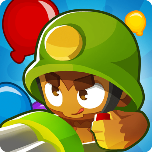
Bloons TD 6 is a colorful arcade puzzle game with strategy elements. In this game, the player will have to control fighting monkeys, and destroying balloons. The goal is not to miss a single balloon. The game is all about intense colors and funny caricatures, and its logo is set in the same style. On the Bloons TD 6 icon, we can see one of the fighting monkeys in a green helmet. The creature looks very funny, though its face is all about determination and willingness to fight. The monkey is set on a bright blue background with a large red balloon in the upper left corner, and a small yellow one — peeking out from behind the green helmet on the right.
Evony: The King’s Return
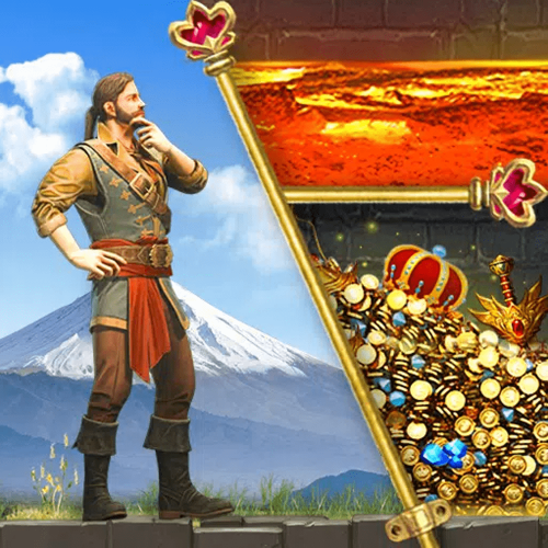
This is an MMO strategy game where the player’s goal is to build and fortify his city and defend it from enemies. This game allows you to fight against enemies in real-time, but first, each player has to choose one of the states for which he will fight. The Evony: The King’s Return logo is very complex and has a lot of details and small elements. The icon is divided into three parts by two golden pins with dark-pink jewels on their tops. The lady part of the logo depicts a man in a historical costume drawn on a background with a snowy mountain and white clouds. The right part of the badge is divided into two sections — with burning lava on top, and a king’s treasury at the bottom. In the treasury, you will find gems, coins, and a red crown on top of it.
Evertale
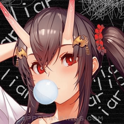
Evertale is an adventure role-playing game with beautiful anime-style graphics. The goal of this real-time multiplayer game is to fight monsters and, of course, to win. The game has thousands of fans all over the world, and this is not only the merit of the story but, in many ways, the bright colorful pictures. Even though the game itself is executed in bright and pleasant colors, its logo is rather gloomy. On the Evertale icon, we can see a portrait of a girl with a thorny crown on her head. The girl blows a bubble of bubble gum. And this white circle is the center of the composition. The drawing is set on a black background with many white “Liar” inscriptions handwritten all over it.
Candy Crush Soda Saga
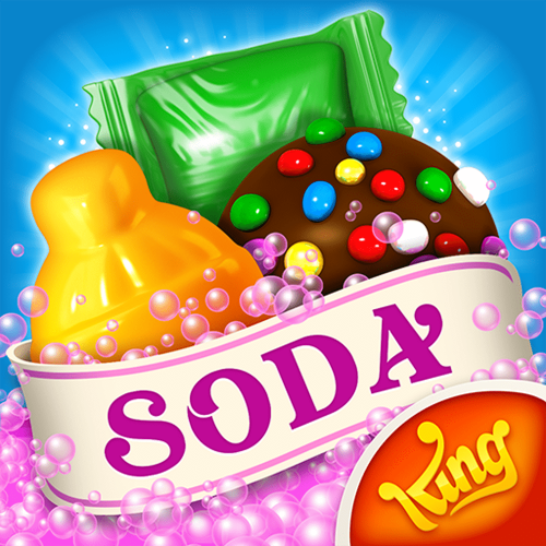
The younger sister of the super popular Candy Crush puzzle by today has become almost as popular as its predecessor. The goal of the game is basically the same as the original – to collect rows and more complex shapes from the same candy. The main difference between the two Candy Crush games is the graphics and, of course, the logo. The Candy Crush Soda Saga logo features an image of three candies drawn over a bright blue background and overlapped by a light pink ribbon with the uppercase “Soda” lettering. The inscription is set in a dark and intense shade of pink, the same shade is used for the ribbon’s outline. The small bottom part under the ribbon is colored in a medium-bright shade of pink, and complemented by a red roundel in the bottom right corner, with the yellow developer’s logotype written on it.
Coin Master
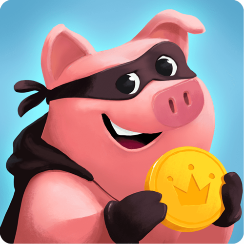
Funny and bright game for fans of casinos and slot machines. In Coin Master player builds and strengthens his village while playing in the casino and getting nice prizes. Here all is simple and colorful, and the same approach the creators of the game applied to the design of the logo. The Coin Master badge depicts a caricaturish pig with a black scarf with eye slits tied around its head. The pig also wears a sleeveless black hoodie and gloves and is holding a large golden coin in its hands. On the coin there is an elegant grow drawn in a darker shade of yellow. The blue background of the logo has some light gradients and looks very fresh and tender.
Minecraft
Minecraft is probably one of the most popular and downloadable games that exist today. Here every player can create their own world. The game is distinguished by its unique pixel-based graphic style, which is instantly memorable and recognizable. The color scheme of the game is not the most attractive, but Minecraft is a game not about beauty and graphics, but creativity and imagination. The Minecraft logo is executed in a green and brown color palette and features the iconic pixel pattern all over the badge. The thin upper part of the badge is set in various green squares, while the main part of the logo is all brown. The “Minecraft” lettering in voluminous gray cubic letters with black sides is written across the center of the icon.
Candy Crush Saga
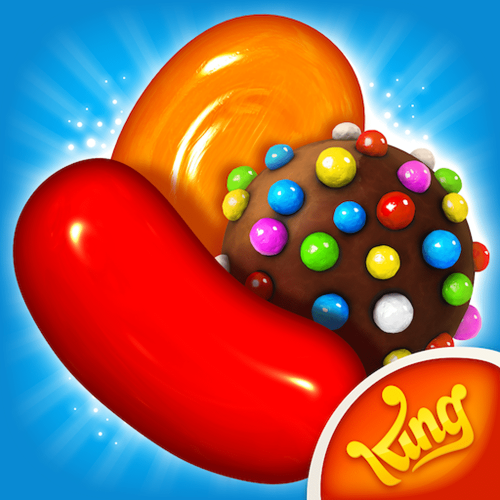
This Colorful puzzle game, in which the player assembles puzzles of juicy candies as he travels through sweet worlds, needs no introduction. Candy Crush Saga has tens of millions of fans around the world. Bright candies of different shapes and colors have become iconic today. The logo of the super popular arcade features an image of the three most recognizable sweets in the game — long red drage, oval orange candy, and a round chocolate with small colorful sprinkles all over it. The candies are set on a light blue background and have a gradient outline, which adds distinction to the badge. The name of the game’s developer is written in the corporate typeface on a small red badge in the bottom right corner of the icon.
Township
Township is a colorful and vivid city-building simulator game, in which the player manages his city, creates and maintains infrastructure, as well as engaged in the development of agriculture and industry. The Township logo repeats the graphics style of the game and shows one of its characters. The badge of this game features an image of a small red pickup truck with a cheerful red-haired girl waving from its window. The car, with five large bottles of milk in the back, drives down the road past a bed of carrots. On the Township logo, we can see all the main colors: red, blue, yellow, green, and orange. Just like the game itself — aiming to provide the players with a variety of activities for a perfect pastime.
Pokémon GO
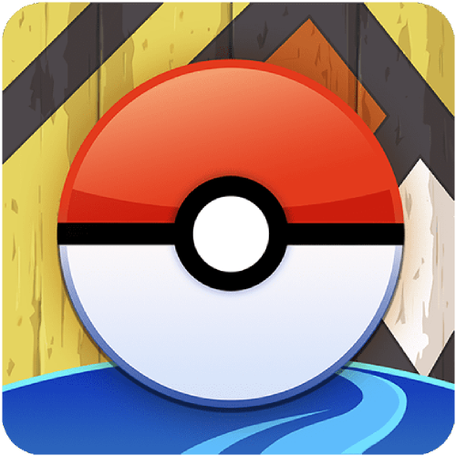
Another game that doesn’t need a detailed introduction is Pokémon GO. There is hardly a person today who hasn’t heard of this augmented reality game at least once. Walk around your city and use your phone camera to find unusual creatures, throw Pokeballs at them, and add them to your collection. Pokeball is what appears on the game’s laconic but bright logo. The ball, divided horizontally into red and white halves, with a white circle in the center, occupies almost the entire space of the game’s emblem. The background of the icon features a bright blue bottom part and a geometric yellow, black, red, and white pattern on the main area. The Pokeball is outlined in dark shades, which makes it look voluminous and bright.
Roblox
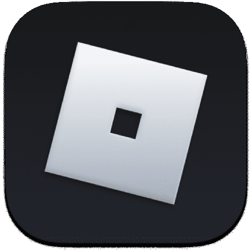
ROBLOX is an extremely popular online game where everyone can create their own world. The game has a huge number of tools that allow players to realize their ideas as easily and freely as possible. Roblox has very recognizable graphics, with rich colors and simple geometric shapes. It is the geometry of ROBLOX that is depicted on the logo of the Android version of the game. The Roblox emblem is super minimalistic and hence stylish and progressive. It is a solid black icon with a massive square drawn on it with a slight inclination. The square is set in a light cold shade of gray, which is very close to white, and has a small black square in the center, which makes the figure look like the letter “O”. And yes, it is the “O” from the primary Roblox logo.
Subway Surfers
An action arcade game that has become incredibly popular due to its richness and variety of activities. The player has to run away from the guard, collecting coins and passing other tests along the way. The main character of the game is a young boy who likes doing graffiti, and he is the one we see on the logo of Subway Surfers for Android. The badge features a colorful and delightful background with a city landscape and an enlarged portrait of a boy in a white cap with a red visor. The boy is holding a paint spray can in his hand, ready to start drawing graffiti. The can is set in light blue and has an enlarged stylized letter “S” written on it and pointing to the two Capital “S”s in the name of the game.


