The fast food restaurant chain KFC specializing in fried chicken has over 20,000 restaurants all around the world. In terms of sales it is beaten only by McDonald’s. The company belongs to Yum! Brands, which is also the owner of Pizza Hut and Taco Bell.
Meaning and history
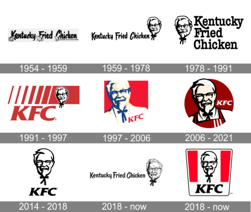
The original KFC logo was created by Lippincott & Margulies in 1952. From that time on, the stylized face of Colonel Sanders, the founder of the fast food chain, has been an essential part of the company’s branding. The logo was black and white. The name of the restaurants, “Kentucky Fried Chicken”, was included in the emblem as it is.
In 1978 Colonel Sanders got a facelift. The work was done by the same agency, Lippincott & Margulies. Colonel’s smile became a bit different, and he got a neater hairstyle. Next to the face, there was a “Kentucky Fried Chicken” inscription, this time in a bit different type.
Who is the man in KFC logo?
“Colonel Sanders” featured on the KFC logo is not a fictional character but the actual founder of the company, Colonel Harland Sanders. He was born in 1890 and grew up on a farm in Indiana. Sanders started selling fried chicken from his restaurant in 1930.
It was only in 1991 that the now well-known abbreviation “KFC” became a part of the logo. Some sources mention that the reason for this was that the company wanted to get rid of the word “fried”, as it supposed an unhealthy food choice. The red color was added to the logo, as well as a sort of horizontal gradation. Also, the same year the mansard roofs on restaurants were modified and got the red strips.
Who owns KFC?
One of the world’s most famous fast-food chains, KFC, was established by Colonel Harland Sanders, and today is managed by Tony Lowings, who has become a KFC CEO in 2019.
1954 – 1959

A handwritten style of font with brush strokes on the ends is used to write the full name of the chain. To add character and uniqueness, all the letters “C” in the inscription are italicized. The logo is completed by four chickens that just popped out of their eggs. They are positioned next to all the capital letters.
1959 – 1978

This KFC logo was designed in 1959 and featured a wordmark, Kentucky Fried Chicken, in a hand-drawn typeface with enlarged first letters “K”, “F” and “C”.
The KFC emblem, which is a Colonel Sanders portrait, was placed on the right of the wordmark.
1978 – 1991
The first logo redesign of 1978 put the emblem on the left side on the wordmark, which was now written in three floors, using enlarged lettering. The typeface was modernized and the main element is the “K” elongated tail.
1991 – 1997
Kentucky Fried Chicken changes its name to KFC and the logo is changed dramatically. In 1991 the color appears in the KFC visual identity.
The Colonel’s portrait is now executed in blue and white, which makes it look alive and friendly.
The wordmark in bold red lettering is accompanied by a red rectangular on the top of it.
The new KFC logo is bright and remarkable, reflecting the powerful and energetic brand with big plans and ambitions.
1997 – 2006
In 1997 the KFC logo was redesigned by Landon Associates agency. It is now composed of a square emblem featuring a red and white background with the Colonel’s portrait and KFC wordmark in red, placed on his tuxedo.
When the chain received this logo, it simultaneously made quite a few changes in the restaurants’ interior and exterior design. The mansard roof was replaced by a flat one, while the tower grew thicker.
2006 – 2018
In 2006 the logo was redesigned again. It is now a deep red circle with a refined image of the Colonel, who is now wearing apron instead of a tuxedo.
The KFC wordmark in white is placed on the left of the Colonel’s face.
During this period the company also uses a monochrome version of the emblem, like a tribute to the original logo from 1952.
2014 – 2018
The KFC logo from 2014 featured all the iconic elements on their places but executed in a monochrome color palette and with not many additional details. The portrait was set above the KFC wordmark in bold black serif typeface without any framing or solid background.
2018 – Today

The logo presented in 2018 was not new. It was a modified 1959 version. The font was slightly changed to have cleaner ends. The main update was the portrait, which now got a more realistic and detailed appearance. It was a good move to bring back the old brand image and tell the world that the company has preserved the values of its founder no matter how many years have passed since.
2018 – Today
The last redesign of the KFC logo was in 2018. The shape was changed to trapeze and the portrait was refined. The white and red background features three vertical lines. The Colonel’s face in black contour is placed on the white line with the KFC italicized wordmark underneath it.
The KFC logo is bright and welcoming, it is a perfect option for the fast-food industry, which evokes a sense of warmth and hospitality.
Font

The simple italic type used for the “KFC” characters in the current emblem has been used since 1991. The font for the “Kentucky Fried Chicken” inscription has changed more than once, becoming more and more minimalistic.
Color
Basically, the color scheme (red, black, and white) has stayed the same since the 1991 version of the logo was created. However, if you take a closer look at the latest emblem, you will definitely notice the difference in the shade of red used: it has become a bit darker, less bright.
What does the KFC logo represent?
The logo of KFC represents the historical heritage of the company, depicting the portrait of the founder of the brand, Colonel Sanders. Harland Sander’s image is accompanied by bold KFC lettering and a timeless and powerful color palette, composed of red, black, and white.
Why did KFC choose its logo?
KFC has been with its logo since the very beginning of the company. And the depiction of Colonel Sanders has always been its central element. As the colonel had a perfect reputation in Kentucky and was a local celebrity, it was very logical to use his portrait for the emblem.
Is the KFC logo a body?
The logo of KFC is not a body, but a portrait. Portrait of a man, who founded the brand, and the portrait, that has never left the badge of the fast-food chain, becoming synonymous with KFC, and one of the most recognizable badgesin history.
What is the new KFC logo?
The new KFC logo is a refined and brightened-up version of the previous badge, with the black contoured portrait of Colonel Sanders, placed on a white background of a trapezoid, with two solid red elements on the sides and a bold uppercase “KFC” lettering written in black along the bottom line of the badge.
What does the KFC Logo symbolize?
The KFC logo symbolizes stability and professionalism, with its color palette pointing to the progressive approach and energy, and the graphical element — to the company’s value of its roots and historical heritage.
Who is the guy in the KFC logo?
The man on the logo of KFC is Harland Sanders, the Colonel, and founder of the KFC restaurant chain. The first logo with his portrait was introduced in 1952 and was accompanied by the “Kentucky Fried Chicken” lettering. Since that time the portrait of the Colonel has never left the KFC badge.
What does the red in KFC mean?
The red color on the KFC badge stands for the powerful and influential brand with a strong international reputation. At the same time, red is a very warm color, which evokes a sense of caress and love, making the restaurants of the chain cozy for the customers, and creating a loving and warm atmosphere in all the locations.


