One of the most popular tobacco brands at the US market is manufactured by Philip Morris USA, which is a branch of the Altria company. The most important manufacturing plant is located in Richmond, Virginia.
Meaning and history
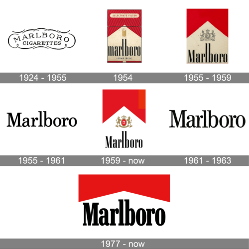
The visual identity of one of the world’s most famous tobacco brands has always been simple and strict. The text-based logo was redesigned only three times since the beginning of the company’s history and until the creation of the iconic identity, we all know today. And all the previous versions were more or less the same — a minimalist and traditional inscription in an elegant color combination.
1924 – 1955
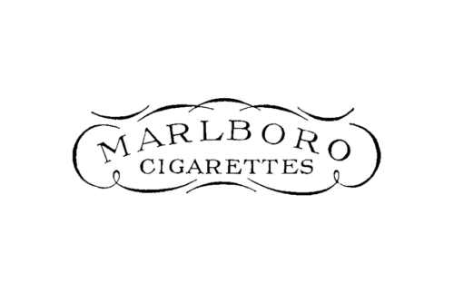
The original logo for Marlboro was designed in 1924 and stayed with the brand for only four years. It was a nameplate in all capitals with the “Cigarettes” tagline in smaller letters. Both parts of the logo were executed in the same typeface — a custom and elegant serif font.
The first logo was executed in black, which made it easy to place it on packages and documents with any additional details and lettering.
1954
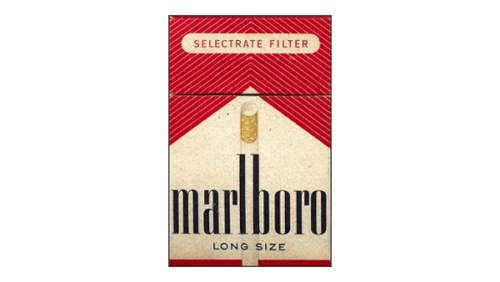
This image depicts a vintage pack of Marlboro cigarettes instantly recognizable by its bold red color. The Marlboro brand name dominates the center in a large, black font, demanding attention. A thin red banner stretches across the very top of the pack, a design element indicative of this earlier packaging style from 1954. Just above the brand name, “Selectrate Filter” is written in a smaller yet contrasting red lettering. Below “Marlboro” sits “Long Size” in black, specifying the cigarette length.
1955 – 1959
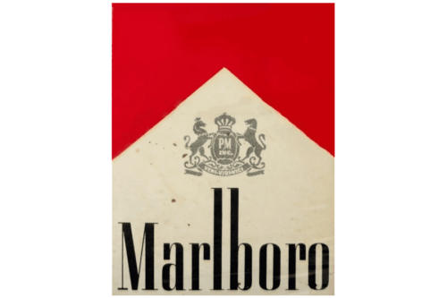
Marlboro’s logo takes a bold turn. A stately crest, crowned and guarded by mythical creatures, sits atop a sleek chevron, weaving a rich history into the modern design. The intertwined initials “PM” for Philip Morris, the parent company, act as a cornerstone, anchoring the brand’s heritage. This fusion of modern lines and classic iconography reflects a brand that reveres its past while driving toward the future. The textured and aged background adds a touch of depth and tangibility to the visual identity.
1955 – 1961
Delving deeper into the design elements, the word “Marlboro” is emblazoned in a custom typeface known as “Marlboro Bold.” This font, specifically crafted by the Leo Burnett advertising agency in 1954, plays a crucial role in establishing the brand’s identity. Its bold strokes and confident presence perfectly capture the spirit of Marlboro.
The Marlboro logo embodies a minimalist yet impactful design. Set against a clean white background, it allows the typography to take center stage, creating a modern and memorable visual impression.
1959 – Today
In the 1980s the Marlboro logo was slightly redesigned. Keeping the style and color palette of the previous version, the wordmark was slightly modified and the emblem was added to the pack.
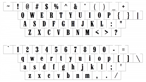
The inscription of the new version is executed in a thick condensed serif font, the one close to OL Corvinus Bold Cond. It looks more confident and modern than all the previous logotypes, reflecting the authority and expertise of the brand and its huge experience.
As for the emblem, it is a heraldic symbol, depicting two rampant lions in gold, holding a red medallion with the crown on top. Two white letters, “PM”, standing for Philip Morris Group, are placed on a red background. This seal is a quality mark and a sign of the brand’s affiliation with one of the world’s most reputable and influential corporations.
1961 – 1963
The Marlboro logo is a “wordmark,” meaning it relies solely on the brand name for its visual identity. However, the execution goes beyond mere lettering. Here, “Marlboro” is rendered in a captivating black script font, where the letters gracefully intertwine and flow seamlessly into one another. This artistic choice imbues the logo with a sense of balance and harmony, fostering a feeling of sophistication and heritage.
1977 – Today
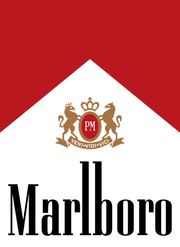
The Marlboro logo, with its timeless simplicity, enjoys unparalleled recognition around the world. It features a bold red chevron, a dynamic symbol that evokes a sense of forward motion and progress. The word “Marlboro” is prominently displayed in black, creating a striking contrast that ensures optimal readability.
Red, the brand’s signature color, is strategically chosen. It pulsates with energy, strength, and a hint of passion, perfectly aligning with the Marlboro image. Black, on the other hand, provides a sense of balance and sophistication. It can also be interpreted as symbolizing purity, freshness, and a touch of elegance.
The font selection is both practical and stylish. It utilizes a clean and simple typeface, yet with slightly elongated letters that add a touch of dynamism and intrigue. This subtle design choice helps the logo stand out and contributes to its overall memorability.
In conclusion, the Marlboro logo exemplifies the power of minimalism. Every element, from the color choices to the font selection, is meticulously crafted to create a concise, memorable, and easily recognizable symbol that embodies the brand’s essence.
Symbol
Currently the company doesn’t exhibit any emblems apart from the official one, yet it would be unfair not to mention Marlboro Man, the main hero of the brand’s advertisements. It is definitely one of the most recognizable corporate symbols even today, many years after the ban on tobacco advertising. The TV advertisement with a lone cowboy enabled Marlboro to go the way from a 1% market share to the 4th largest cigarette seller in the US.
Current emblem
The visual center of the Marlboro emblem is the black wordmark. It is placed on the white background having a mountain-like shape. The rest of the emblem is has red color. In addition to this, there is a golden crest, depicting the “P” and “M” characters, with a rampant horse on both sides. These letters are the initials of Philip Morris (the name of the company that produced and marketed the Marlboro cigarettes).
Font
The bold and condensed serif type featured in the emblem is perfectly readable and doesn’t look offbeat. Probably the most characteristic characters are “a” and “r”. The font is called Neo Contact. It was created by the German type foundry URW++. The type was developed in the so-called Egyptienne style.
Color
The color scheme of the Marlboro logo is based on the combination of red, black and white. Unlike many other modern logos that are given in a variety of colors, the Marlboro symbol could hardly be imagined in another color scheme. Some of the qualities these colors are associated with include passion, courage (red), purity (white), elegance and mystery (red).


