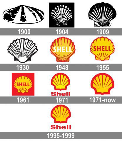
Over its more than 100-year history the Shell logo has made a way from a rather true-to-life depiction of a seashell to a stylized emblem. The birth of the Shell brand can be considered the end of the 19th century. By that time Shell was already engaged in the transportation of oil from the Far East, but it had a powerful competitor – the American company Standard Oil. Standard Oil painted its transportation tanks blue. In order to distinguish itself from its background, Shell chose a different color – deep red. This is how the foundations of the Shell visual identity style were laid. Today the Shell emblem is one of the world’s most recognizable corporate symbols.
Meaning and history
The visual identity of one of the world’s most reputable oil and gas companies has always been based on the graphical representation of its name, Shell. Since the very beginning of the brand, in 1900, the shell has been the main element of the logo, and only gained additional lettering twice, in the 1940s and the 1950s.
1900 – 1904
The very first she’ll be created in 1900 and featured a slightly naive and not very confident monochrome drawing of a laying shell, with black stripes over a white body and a delicate black outline.
1904 – 1909
The emblem was redrawn in 1904 and now the shell was placed vertically, and drawn more detailed, with many black and white stripes, red lurching its structure. To make the look of the logo more powerful, the image was placed on a black background.
1909 – 1930
The contours of the shell were refined and gained a darker shade in 1909, and the need for a black background disappeared, and the emblem was pretty balanced and solid on its own.
1930 – 1948
The redesign of 1939 made the shape of the shell beater and the count outs — bolder. The image started looking more modern and sleek, with minimized accents and distinct lines.
1948 – 1955
The iconic yellow and red color palette was adopted by the company in 1948, and this was the time when the lettering was placed over the shell, written in bold white sans-serif with clean straight contours and thick lines.
1955 – 1971
In 1955 the contours and accents of the shell were minimized, and the lettering changed its color to red, having its lines shortened and made more delicate. Later, in 1961, the company started placing its iconic yellow shell on a red background.
1961 – 1971

A red rectangle appeared behind the logo. Other than that, the design remained unchanged.
1971 – 1995

The shape of the shell was updated – it now resembled the rising sun. We can say that this version used fewer strokes by looked more meaningful and expressive. The type appeared more solid and strong due to its flatter proportions.
1995 – 1999

The squarish theme disappeared from the wordmark. The letters lost some of their weight. They were more rounded and now looked more fragile than in the previous version.
1971 – Today
The current Shell emblem was designed in 1971 by Raymond Loewy and features a sleek art-deco style shape with a rounded top part and rectangular bottom. The yellow image has a thick red outline and a minimum of red stripes over its body. The cleanest and neatness of the lines make the emblem look elegant yet strong and confident.
As for the wordmark, today it is not an official element of the Shell visual identity, though still can be seen on some of the stations and products. The wordmark in a bold traditional sans-serif featured red color and looks simple yet elegant.
Who designed the Shell logo?
In 1971, Raymond Loewy developed the logo for Shell, which the company has been using ever since with only minor updates. Loewy (1893-1986) was an exceptionally prolific industrial designer. The list of his works includes not only commercial emblems, like logos for BP and Exxon, but also such projects as Air Force One livery, Coca-Cola fountain dispenser, and Lucky Strike package.
Symbol
As soon as in 1994, however, the picture was replaced by a seashell, which also left an impression of a photograph. The 1909 version featured slightly different proportions, yet it still had a photographic quality.
Emblem
In 1930, Shell modified its emblem once again. The changes were subtle, yet they resulted in a cleaner, detailed image. As a result of a series of minor modifications in 1948, 1955, 1961, 1971, and 1995, the Shell logo became what it is now.
Font
Several earlier versions of the emblem included the name of the company, but the standard logo that is used today does not feature a wordmark.
Color
The color scheme sports red and yellow. Shell opted for this sunny, optimistic combination as a way to emphasize its connection to California and Spain, where quite a few Californian settlers were from. Also, there exists a legend, according to which Mr. Graham, a Scotsman by birth, suggested red and yellow, because they were the main colors of his native country’s Royal Standard.
Oil logo
There have been several cases in Shell’s history when the word “Oil” was included in its emblem. One of the older logotypes sported the lettering “Oil company” – the explanation that was probably necessary when Shell was less known. Also, some of the versions of the Shell Oil logo included the lettering “Premium Oil” and “Shell Helix Motor Oils.”
Gas logo
The stylized depiction of a seashell in the Shell Gas logo looks the same as in the company’s primary logo, while all the rest is different. For instance, the color palette is based on blue and white, which can be partly explained by the fact that the color of gas is blue. The word “Gas” is given in cursive letters with a flame in the letter “A.”
What does the Shell logo represent?
First of all, the iconic Shell logo represents the name of the brand, depicting a scallop shell in a yellow and red color palette. The colors on the Shell badge also have their history. In 1915, the Shell Company of California first built service stations, and they needed to stand out from the competition. They used bright colors that would not offend the people of California: because of the state’s close Spanish ties, red and yellow, the colors of the Spanish flag, were chosen.
Why is the Shell logo a Shell?
Not many people know, that the roots of the famousoil brand Shell are traced to a completely different field. The founder of the company , Marcus a Samuel, started his business path from selling antique boxes and chests, which were decorated with shells. The company grew and expanded, but the scallop shell has became an inevitable part of its identity, as a tribute to the brand’s heritage and its founder.
What is the brand with the Shell logo?
The most famous logo with a shell on it belongs to the Royal Dutch Shell group, one of the world’s leaders in the oil and gas segment. This badge with the scallop shel in red and yellow is considered to be one of the most iconic emblems of the last two centuries.
When did Shell change their logo?
Throughout its long and bright history, the Shell corporation has changed its logo about ten times, with the original version depicting a horizontally laying shell in black-and-white, and the latest redesign, held in 1995, introducing a bold and intense yellow and red scallop shell above the extended red logotype.


