

![]() Nestle Logo PNG
Nestle Logo PNG
Nestle has modified its logo at least six times throughout its more than 150-year history. Here, we look back at some of the early versions of the Nestle logo.
Meaning and history
![]()
The history of Nestlé began in 1867, when its founder, Henri Nestlé, created the “Farine Lactee Henry Nestlé” (“Henri Nestlé’s milk flour”), which saved the life of a child who was allergic to mother’s and cow’s milk. Within a short time, Nestlé’s formula gained recognition and was soon being sold in many European countries.
Thus, in 1867 Henri, giving the company his last name, began to create its history. As the company logo, Nestlé decided to use his family coat of arms with a nest and chicks, as in the Swiss dialect the word nestle translates as “little nest”.
Nestle is a legend, and so is its visual identity. The badge, known in every corner of the world has undergone several redesigns throughout the long company’s history, but its main symbol remains unchanged for more than a century.
What is Nestle?
Nestle is an international corporation, engaged in the production of food and drinks, which was established in Switzerland in 1866, and named after its founder, Henri Nestle. Today the company is one of the world’s largest and most reputable in its segment, owning dozens of brands, which are known all over the globe.
1866 – 1868
![]()
Since the very first logo, introduced in 1866, the visual identity concept of the famous Swiss company has been based on the family name of its founder, Henri Nestle, which translates from German as “The Nest”.
The original logo depicted the Nestle family crest, composed of a traditional shield with its upper line a bit elongated to the sides. In the middle of the shield there was an image of a bird sitting in the nest, and the crown on top of the crest was replaced by a feathery metal helmet. This logo stayed with the company for only two years.
1868 – 1938
![]()
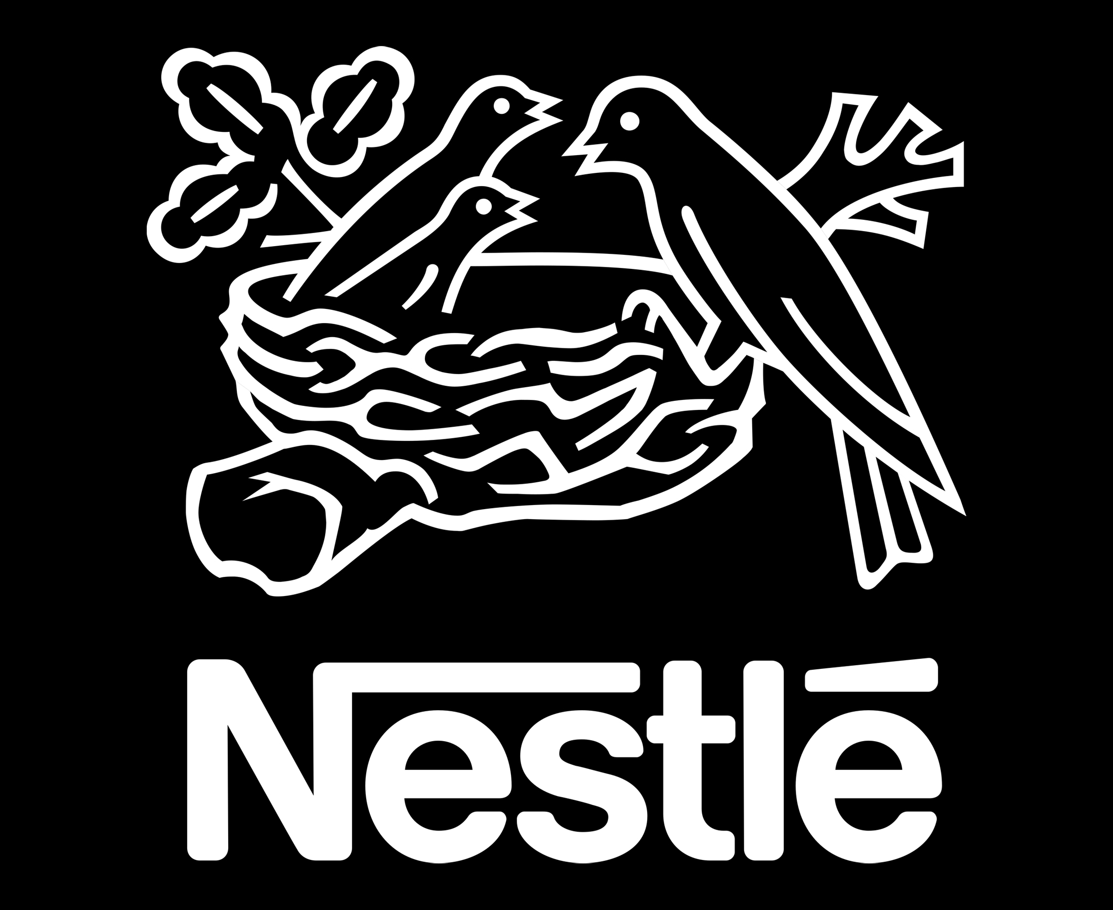
The unique emblem was designed for the brand in 1868 and featured an image of the nest with four birds in it. It was a pretty detailed picture, where the branches and oak leaves could be seen.
1938 – 1966
![]()
The redesign of 1938 brought a wordmark to the logo. The bold black “Nestle” lettering was written over the nest emblem, which was redrawn in simpler lines with fewer shadows and accents.
1966 – 1988
![]()
In 1966 the bold rounded typeface of the nameplate was changed to a stricter and more geometric one. The lines were clean and straight and the cuts and serifs were distinct and confident.
1988 – 1995
![]()
In 1988 the emblem was even more simplified — now there were only two baby birds instead of three, and the whole picture looked more modern and stylized. The wordmark got replaced and now it was set under the image, executed in a modern custom sans-serif with the bar of the “N” elongated and stretched above the inscription, extended till the “T” and then appearing above the “E”, making an “é”.
1995 – 2015
![]()
Both graphical and text part of the Nestle visual identity is being refined in 1995. The typeface was changed to a cleaner and sleeker one, with the angles softened and lines thickened, while the image became less detailed and more solid.
2015 – Today
![]()
The redesign of 2015 kept the iconic composition of the Nestle logo almost untouched, just the emblem was enlarged, which made the whole logo look more balanced and solid.
2018 – Today
![]()
The redesign of 2018 has introduced an iconic Nestle logo in a new color palette — the black contours of the nest with the birds, and the recognizable logotype, are now set in a brownish-golden shade, which is instantly associated with chocolate, sweetness, and warmth.
Font
![]()
The wordmark uses a simple sans-serif type with a recognizable “N” character.
Color
![]()
The original emblem featured the combination of brown and white, while the current logo may use either a grey-and-white or a black-and-white color scheme.
What is the meaning of the Nestle logo?
The iconic Nestle logo with the mother bird and her two kiddies, sitting in a nest, symbolizes love and caress, showing maternal tenderness and attention. Apart from these deep emotional meanings, the badge just depicts a feeding process, and the company specializes in food products.
Why did Nestle change their logo?
Throughout the long history of the Nestle company, the logo of the brand has been changed several times, with each redesign bringing more distinctive and modern contours and bolder lines. The latest redesign was held in 2015, to create a more progressive look and to give better readability and legibility to the badge, for looking stronger and brighter on mobile devices.
Is Nestle a bird?
Nestle logo depicts three birds, a mom, and two babies. The bird theme on the logo of the company is explained by its name, as The surname of Henri Nestle, the founder of the company, is translated as the “Small Nest”. Also, the historical coat of arms of his family depicts a bird in a nest. The Nestle bird is a blackbird of a thrush.
Is Nestle French?
Nestle was established by Henri Nestle, who was Swiss-German, and Nestle is not a French, but a Swiss company. Although it is one of the world’s largest companies in the food products segment, so today it doesn’t really have a nationality and is Global.


