Instagram is a popular media sharing and social network platform, which has been around since 2010. Introduced by Kevin Systrom, it grew into a massive international network by 2012, when Facebook purchased it. Older versions of the Polaroid logo also used a camera image, although in a more minimalist style.
Meaning and history Instagram iconos
Instagram logo has pretty much paved the platform’s way. Over its brief history, the network has changed a couple of logos. All based on the shape of an instant camera, the known Instagram logo versions have been reflective of the network’s key designation – sharing photographs.
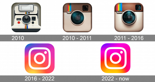
2010
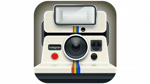
The original Instagram logo was designed by the company co-founder, Kevin Systrom. There was a knock-off Polaroid camera with a rainbow stripe. As the project was originally used for taking and sharing photos (as well as applying filters), the design choice looked pretty natural, and the retro feeling it had was reflecting the original idea of the application. The light milky shade of the camera body looked unique and made the logo stand out in the list of social media competitors. Though the badge stayed in use for just a few months, it was a great beginning of the iconic cam logo era.
2010 – 2011
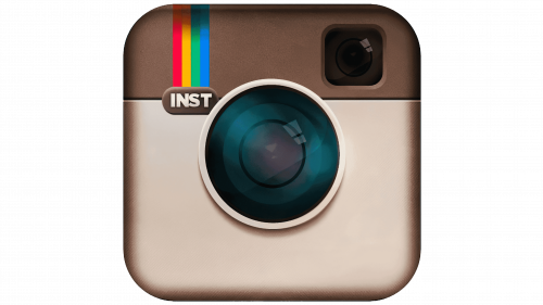
And yet, later that year Systrom decided to use professional help and hired designer and photographer Cole Rise. He was inspired by the Bell & Howell camera from the 1950s. The color palette remained the same, beige and brown, but the shades of the camera body and details were intensified. The new badge was simpler and more memorable due to the use of minimalist shapes and accents. The upper left corner of the camera featured a vertically oriented rainbow flag with the “INST” uppercase lettering in sans-serif set under it.
2011 – 2016

The emblem was slightly updated, but the overall look remained the same. This version made a debut on Instagram v2.0. The leathery texture was added to the upper part of the camera on the badge, the lens got more gradient gloss, which made it look more natural and vivid. The gradients on the camera body got more contrasting, which also added more vitality to the image, making it realistic. The uppercase sans-serif “INST” under the rainbow (which got wider and more visible now), was replaced by a bold serif “Insta” with only the first letter capitalized.
2016 – 2022
The new Instagram logo was unveiled together with an updated application interface. While many users criticized the design, it has remained unchanged for years. The sleek minimalist design of the new logo version is based on the previous Instagram badges but redrawn abstractly and flatly. The gradient orange-to-pink square with rounded angles has a bold camera contouring drawn over it in white. The main shape of the camera repeats the shape of the icon and features a contoured circle in the center and a solid white dot in the upper right corner.
2022 – now
The redesign of 2022 introduced a refreshed version of the Instagram logo from 2016, refining its color palette, but keeping the concept and shapes. The new badge is also executed in gradients from orange to purple, but all shades became lighter, hence now the icon looks even brighter. As for the main elements of the badge, they all stayed at their places — gradient background with a white softened square contour and a circle in the middle, plus a solid white dot in the upper right corner.
Meaning and history Instagram logotype
What is Instagram?
Instagram is one of the most popular social networks, with more than 1 billion users from all over the world. In addition to the usual photos that users share, the app has more and more additional features, added by its creators for people to have even more fun using it.
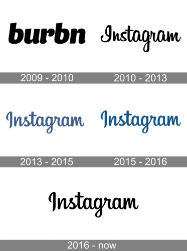
2009 – 2010
For several months in the very beginning of the world’s most popular social media platform’s history, it was called Burbn, and the its stylized name in the lowercase of a custom cursive font with curved and rounded ends of the distinctive and stable lines, — was the only element of the badge. It was set in plain black against a white background, with no additional details.
2010 – 2013

The wordmark from the original Instagram logo was executed in a fancy handwritten typeface with the cursive letters written neatly and accurately. The elongated lines and curved tails of some letters were balanced by some shorter bold strokes. Not all the symbols of the inscription were connected to each other, and this is what added the same imbalance to the composition. On the original version, the Instagram logotype was executed in simple black color.
2013 – 2015

The redesign of 2013 switched both the color palette and the typeface of the Instagram logotype. Now it was calm sea-blue shade for the straightened and softened up cursive lettering. The inscription was set in bolder lines with all letters (except for the capital one) connected to each other. The labra got shorter, hence the main curved (on the first “I” and the “G”) were gone, and now the wordmark looked professional and more modern.
2015 – 2016

In 2015 the Instagram insignia was slightly refined again, but this time the typeface hasn’t been touched, just the shade of blue became darker and deeper, standing for creativity, loyalty, and professionalism. In the new shade, the whole inscription started looking more confident and chic.
2016 – Today

The iconic Instagram typeface remained untouched with the redesign of 2016, but the color was changed back to the original black, which looks more logical with the new bright gradient emblem. The monochrome inscription is a perfect addition to the vivid and colorful graphical part of the logo, which also looks very balancing in the application itself, leaving all the accents to the photos of the users.
App logo
The new Instagram logo design is based on the previous one. Though it does retain all key features of the old logo, it is dramatically different. The change sparked heated debates across the Instagram community.
Symbol
Now, Instagram logo is a minimalistic sunset-colored outline of the original Polaroid cam image.
Black and white
The black-and-white version of the Instagram visual identity repeats its official colorful version in terms of lines and style, though looks completely different without an iconic pink and yellow gradient.
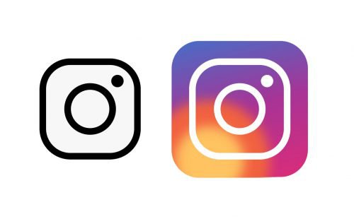
The monochrome logo of the most famous social media service is available in two versions: a solid black square with rounded angles, boasting a thick white contoured figure, repeating the shape of the icon, a contoured white circle in the center, and a small solid white dot placed in the upper right corner of the smaller square; and the newest version, designed in 2020, where the contoured Instagram logo is executed in black and placed on a white background.
The second emblem looks more stylish and fresh, due to the use of more white color and fewer lines in the composition, as the contoured square with rounded angles is placed directly on the backgrounds being a frame of the emblem and the emblem itself.
The monochrome version of the Instagram logo works just like the original one and can be seen with or without the inscription.
Font
The Instagram logotype is as recognizable as the graphical part of the social media visual identity, and its custom cursive lettering is associated with bright moments and friendship.
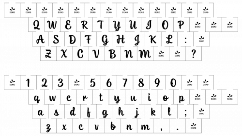
The Instagram lettering is executed in a smooth and elegant typeface, which was designed exclusively for the app, though looks pretty similar to such fonts as Avangard Regular and Blue Vinyl Regular, but with some lines modified and elongated. The contours of the logotype are clean and sleek, which makes the classic shapes of the letters look tender and friendly.
 Despite its visible simplicity and naivety, Instagram’s inscription looks very confident and modern, and when used in the monochrome version — it gets even more power and distinction, with the strong contrast between black and white, making the logo timeless and iconic.
Icons
Instagram Icon is the main part of the brand’s visual identity. And it’s the concept hasn’t changed since the inception of the first version in 2010. The first icon was a brown camera, simple, pretty realistic yet stylish, just enough to satisfy an audience of the application, which in the beginning consisted mostly of photographers.
What font is used on the Instagram logo?
The elegant Instagram lettering is executed in Billabong Regular font, which looks similar to such typefaces as Bluestar Regular and Avangard Regular, with their smooth rounded letters, connected by soft and elegant lines.
In 2016, however, the brand decided to update its policies and identity when it realized how diverse its audience had become over the years. Users were no longer photographers-now it’s millennials, Generation Z, and over-influential brands. The bright colors of the new logo reflected the spirit of this evolving and extremely diverse audience and became a real magnet for creativity.
The Instagram icon is composed of a bright gradient square background with rounded angles, with a thick white outline in the middle, and a circle outlined in white, placed inside the square. On the right of the circle, there is a solid white dot. Simple yet effective and memorable.
Can you use the Instagram logo?
You are allowed to use the Instagram logo on your business cards, or your website, but you have to strictly follow the brand guidelines, to make the logo look exactly as it is supposed to.
How do I get the Instagram icon?
You can get an Instagram icon on the official website of the platform, follows by the I extraction of how to add an address to your page, and how to link it directly to your account.
Is there an Instagram logo Emoji?
There is jo Instagram logo emoji in the official emoji packs on Android and Apple, however, online you can find and download the Instagram emoji, which is licensed under the open-source Creative Commons Attribution 4.0 International license.
Can I print the Instagram logo?
Yes, you can print an Instagram logo by downloading it in the needed graphical format from the internet, and simply using your printer, like with any other document or image.
Video
How to download a photo or video from Instagram


