

![]() Adidas Logo PNG
Adidas Logo PNG
At the heart of Adidas lies a commitment to excellence, innovation, and a deep connection with the sports and lifestyle sectors, symbolized through its extensive operations across the globe. Born from humble beginnings, Adidas has undergone a remarkable transformation, emerging as a leader in both athletic and fashion industries. Its dedication to delivering high-quality, performance-driven products is evident through its diverse range of offerings, from sneakers to shirts, and pants, all designed to cater to the needs of a wide array of consumers, including athletes, celebrities, and everyday enthusiasts. A pivotal aspect of its operation, underscored by the adidas wordmark, is the strategic expansion across continents, allowing Adidas to customize its products to resonate with the unique preferences of people worldwide. This expansive network not only showcases Adidas’s extensive reach but also its ability to foster a personal connection with individuals, breaking down cultural and geographical boundaries.
Incorporating elements such as the badge of sport and the meticulous craftsmanship inside of an adidas shoe, Adidas stands as a testament to quality and innovation. The brand’s history is punctuated with milestones, such as the endorsement by sports icons and the adoption by musicians, which have solidified its place in popular culture. Adidas’s journey, from a cobbler’s workshop in a small town to a beacon of global sports fashion, reflects its enduring legacy and the universal appeal of its products.
Meaning and history
![]()
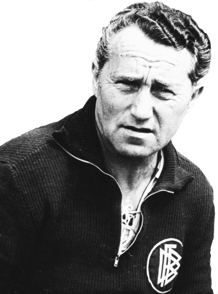
When Adolf Dassler started making sports shoes in his mother’s laundry room in Herzogenaurach, Germany, he probably didn’t even dream that this was the start of one of the world’s largest sports brands.
In 1924, his older brother Rudolf started to work with him. In the course of time, their products gained recognition. By the WWII, Adolf and Rudolf sold around 200,000 pairs of shoes annually.
What is Adidas?
Adidas is the name of the iconic sportswear brand, which was established in Germany in 1924. Today the company is considered to be the largest European manufacturer of sports fashion and the second-largest sportswear brand in the world.
After the brothers split up in 1947, each of them founded his own company. Adolf Dassler registered Adidas AG, while Rudolf registered a company called Ruda. Although both the brothers used the same mechanism to coin the names for their companies (combined the first letters of their names and surnames), Adi’s acronym proved to be more successful, while Ruda was soon renamed Puma.
1924 – 1931
![]()
This logo presents an intricate design featuring a black and white emblem encircled by text ribbons. The emblem showcases a stylized fort, representing solidity and tradition, while the surrounding text pays homage to the brand’s origins with the names “Gebrüder Dassler Schuhfabrik” and the phrase “Für Turnen, Spiel u. Sport überlegen,” emphasizing the brand’s commitment to superior athletic footwear.
1931 – 1938
![]()
The logo shows a vintage Adidas logo from 1931, with a bold, black shield and stylized white wings featuring a central cleat at the heart. This emblem symbolizes the brand’s focus on groundbreaking athletic footwear, with the wings representing speed and the cleat signifying the brand’s roots in sports shoe innovation. The name “Dassler” is prominently displayed above, connecting the brand’s legacy with its future.
1938 – 1949
![]()
The original logo featured the second name of the co-founders, Dassler. Below, you could see a boot carried by a bird (the emblem probably was supposed to show how light the boots were). The design was placed inside a shield.
1949 – 1950
![]()
After the company was split into two separate firms, the name “Adidas” started to be used. The original Adidas logo featured the company name. The extended ends of the “D’s” were “holding” a shoe. The name of the founder, Adolf Dassler, was arched above it.
1950 – 1971
![]()
Only the name of the firm was left. It was given in white inside a rectangle with rounded corners. The ends of the “a’s” grew sharper.
1967 – Today
![]()
The sharp ends of the “a’s” were replaced by regular ones, the dot was replaced by a square, the ends of the “s” grew longer. On the whole, the design became heavier. This wordmark is often used even now.
1971 – Today
![]()
In addition to the wordmark, the so-called trefoil was added. While you could still see the iconic three stripes, there was also a new element, which was supposed to represent the diversity of the Adidas range. This version is still used for the Adidas Originals line.
1991 – Today
![]()
While keeping the three stripes, the designer added more power and weight to the emblem. The stripes grew bolder and were rotated. You can see this version on the products from the Performance line, while originally it was created for the Adidas Equipment range.
2002 – 2022
![]()
Here, the three stripes adopt a lighter, more refined look. They go across a black circle, with the name of the brand placed below. Used in the Adidas Style range.
2005 – 2021
![]()
This is the most commonly used Adidas logo. The iconic stripes are placed to the left of the lowercased lettering “adidas.”
2022 – Today
![]()
The new Adidas logo presents a bold and abstract interpretation of the brand’s iconic three stripes. In a monochromatic palette, the three black bars are positioned diagonally, ascending from left to right. The minimalist design evokes a sense of upward movement and progression, symbolizing both the athletic ascent of Adidas’ clientele and the brand’s forward-thinking approach. The bars vary in length, with the shortest on the left and the longest on the right, creating a dynamic visual rhythm that conveys speed and agility. This contemporary rendition of the classic motif retains the heritage of the original while embracing a sleek, modern aesthetic.
Old logo (Three stripes)
How come that the three stripes that have been the core of the Adidas logo for about 70 years made their first appearance on products made by another company?
Back in the 1940’s, Finnish company named Karhu Sports manufactured footwear embellished with three stripes. Adolf Dassler liked the design and the way it looked on the sides of the shoes so much that he decided to buy it. As Karhu Sports was experiencing financial problems due to WWII, its owner eventually agreed to sell the trademark to the emblem for an equivalent of €1,600 and two bottles of whiskey. Now, Adolf Dassler started to put the three stripes on sides of the footwear produced by his company.
The logo debuted on Adidas footwear in 1952, following the 1952 Summer Olympics. Dassler himself felt absolutely in love with the emblem and even referred to his firm as “The three stripes company.”
Who designed the Adidas logo?
The name of the person who designed the original three stripe logo is unknown. The emblem was bought by the company founder, Adolf ‘Adi’ Dassler, from a now-defunct brand Karhu Sports. In 1971, the trefoil logo was unveiled, which was also chosen by Dassler.
It wasn’t the brand’s only logo, though. Another, a more complex emblem was developed for print/marketing purposes. Here, a sports shoe was depicted with the words “adidas sportschuhe” below and “Adolf Dassler” above. The shoe was sandwiched between the extended stems of the “d’s.” The company opted for one of the bold versions of the ITC Avant Garde Gothic font.
We should also mention the variation of the three stripes theme unveiled in 1962. It was then that the legendary tracksuits with the stripes going down the sleeves and legs were first introduced. No need to say that such tracksuits have become classic and are still sold today.
Trefoil symbol
![]()
In 1971, in advance of the Olympic Games in Munich, the company unveiled the so-called Trefoil. It combined the iconic three stripes with three shapes resembling leaves. The word “adidas,” in a slightly different type, was placed below.
One of the reasons why the brand would want to modify the old Adidas logo was that the company was trying to accentuate the fact how much it had grown since Adolf Dassler established it in 1948. However, the brand hasn’t got rid of the original logo altogether – it’s still used on some items. For instance, the Trefoil emblem is used on the Originals range of clothing and trainers; it can be seen on such items as the California t-shirt and Pharrell Williams Tennis Hu trainers.
Mountain emblem
![]()
By the end of the 1980s, the company was looking for ways of updating its brand identity. That was a challenge, though, as the emblem was to stay instantly identifiable and preserve an apparent connection to its iconic Trefoil predecessor. This could have been the reason why as much as seven years passed between the moment when the logo was designed (1990) and when it was unveiled (1997).
Now, the three bars were positioned vertically then turned 30 degrees, which created a mountain shape. The mountain concept was used as the embodiment of the determination an athlete has, his focus and goal-oriented mentality. In this way, the company was trying to imply that the equipment bearing the mountain logo was designed to help a person achieve his high goals.
Taking into consideration the Adidas meaning cited above, it was only natural that the emblem was initially used as a sport logo, i. e. placed only on sports equipment, but in the course of time it acquired the status of the standard logo across all apparel.
Horizontal stripes

In the course of time, the need for a new logo became obvious. And again, a simple repositioning of the iconic stripes created an entirely new impression. This time, the black stripes were placed horizontally. Their length was modified, too: the lower line was the longest, the one at the top was the shortest (about one-third of the longest line), while the second stripe was twice as long as the shortest one. The stripe design was placed next to the wordmark insignia, which apparently remained unchanged.
Other versions
![]()
Today, the company uses more than one emblem, so the logo shirt is bearing depends on the range it belongs to. For instance, the Adidas Style Essentials range, which deals with the fashion market, typically uses the logo where the signature three stripes are placed inside a circle shape.
Also, in advance of the 2008 Olympics, the company unveiled a new logo, a combination of the Trefoil symbol and the Olympic torch.
Who created the logo?
Although the company hasn’t revealed the names of all the team members, we do know that at the time the Three Bars Adidas logo was being developed, the Global Creative Director at Adidas was Peter Moore, one of the most influential names in the athletic footwear industry. He had a strong influence on the concept.![]()
Moore’s experience in sportswear exceeds thirty years. He became the first global creative director at Nike and was among those who helped the brand achieve its current role. After developing the first Air Jordan concept in the mid-1980’s with his colleague Rob Strasser, he left the company to co-found a sports marketing company Sports Inc. based in Portland. Also, his partnership with Rob Strasser resulted in creating Adidas America Inc. in Portland, where Moore became the Worldwide Creative Director.
Font

The evolution of the Adidas logo, much like the journey of the Dassler Brothers Shoe Factory from its humble beginnings, intertwines a story of innovation and tradition. Since its inception in 1949, Adidas has not only been a beacon for athletes like Jesse Owens, who clinched gold medals wearing Dassler Brothers’ shoes, but has also navigated the ebb and flow of design trends with remarkable agility. The logo’s backbone, the ITC Avant Garde Gothic font, reflects not just a brief history of Adidas but the broader narrative of post-First World War resilience and evolution.
The Adidas symbol has undergone subtle yet significant transformations, akin to the shifts in the world of sports, where obstacles like adapting to different browsers or combating malware in digital spaces parallel the challenges faced. The nuances in the shape of letters and their weight in the Adidas logo hint at evolutions that are both a nod to the past—like the legacy of the Dassler brothers—and a step into the future, where modern legends like Kanye West continue to shape its identity. The iterations of the logo, with changes from a circle to a square dot above the “i” in 1971, and the proportional adjustments of the “d’s” to the “a’s,” mirror the meticulous setup required by a system administrator to ensure extra security against bots, scripts, and potential security issues in a shared network. Despite these changes, the essence of the Adidas logo—a symbol that has graced high-traffic products from the NFL to the NBA—remains steadfast, a testament to the brand’s commitment to maintaining a consistent identity amidst the currents of change.
Color
![]()
The company has been exceptionally consistent in the color scheme of its primary emblem. The black logo on the white background has been used ever since the company started its work. And yet, as this is the type of emblem that is placed on a wide range of products of varying colors, it’s only natural that a designer has to adjust the color of the symbol each time.
For instance, in case of a black background white logo seems an entirely appropriate choice. It can also be often seen on the apparel of many other colors, including blue and dark purple. At some point, the company used a blue logo extensively, but the current official Brand Guidelines list this version as an outdated one. The document also forbids altering the color scheme of the emblem, for instance, using a purple or green.
What is unique about the Adidas logo?
The Adidas logo has several versions used by the company for different collections, but the unique and unifying thing for all of the badges is the Trinity. Each of the logos has there elements in its graphical part. Whether it’s a triangle made up of three stripes, a globe with three sharp arched lines, or a trefoil with three white horizontals on it. This loyalty makes Adidas’ visual identity unique.
What is the hidden message in the Adidas logo?
The hidden meaning behind the iconic logo is Adidas is the progress and motion — for the three tripes in a triangle, and three main markets for the brand — Asia, Europe, and North America.
Why is the Adidas logo a triangle?
The shape of the Adidas logo is a triangle, formed by three bold stripes of different lengths, which are meant to represent the three steps that each athlete moves through as he or she perfects and unlocks his or her potential. As for the triangle itself, it has always been associated with perfection and unity.
Why is the Adidas logo so successful?
The Adidas logo has become iconic by today and is considered to be one of the most famous and successful badges in history. And there is a reason for it: the badge of the sportswear manufacturer is minimalistic yet very stable and confident. It has no age and looks stylish and contemporary whenever and whenever it is used. The simple shapes, thick lines, and stable letters make up a statement.


