

In the vast universe of brand identities, logos serve as the silent ambassadors of companies worldwide. Among the myriad of designs, those incorporating triangles stand out for their dynamic symbolism and versatility. Triangles are not just geometric shapes; they are powerful symbols of stability, direction, and innovation. As we delve into the realm of the most famous logos adorned with triangles, we embark on a journey through the essence of visual storytelling and brand recognition. This article aims to uncover the stories behind these iconic emblems, exploring how simple lines and angles come together to convey messages of strength, progress, and aspiration.
Key Elements in Triangle-Infused Logos:
- Stability and Balance: The broad base of a triangle conveys stability, a quality that brands often wish to communicate to their audience.
- Direction and Movement: The pointed tip of a triangle suggests forward motion, embodying the idea of progress and innovation.
- Hierarchy and Power: Triangles are often used to signify strength and leadership, making them a popular choice for corporations and institutions.
- Mystery and Spirituality: In some cultures, triangles are laden with mystical significance, adding a layer of depth to the logo’s meaning.
- Simplicity and Memorability: Despite their complex symbolism, triangles are fundamentally simple shapes, making logos easy to recognize and remember.
Did you know?
The triangle is one of the strongest geometric shapes used in architecture and design, capable of bearing heavy loads while maintaining stability? This principle of strength is often mirrored in the branding strategies of companies that choose this shape for their logos.
As we explore the most famous logos with triangles, we uncover not just the visual appeal of these designs, but the strategic thinking and storytelling that breathe life into these symbols. From high-tech companies to fashion brands, these logos encapsulate the essence of their identities, demonstrating how a simple triangle can leave an indelible mark on the world of branding.
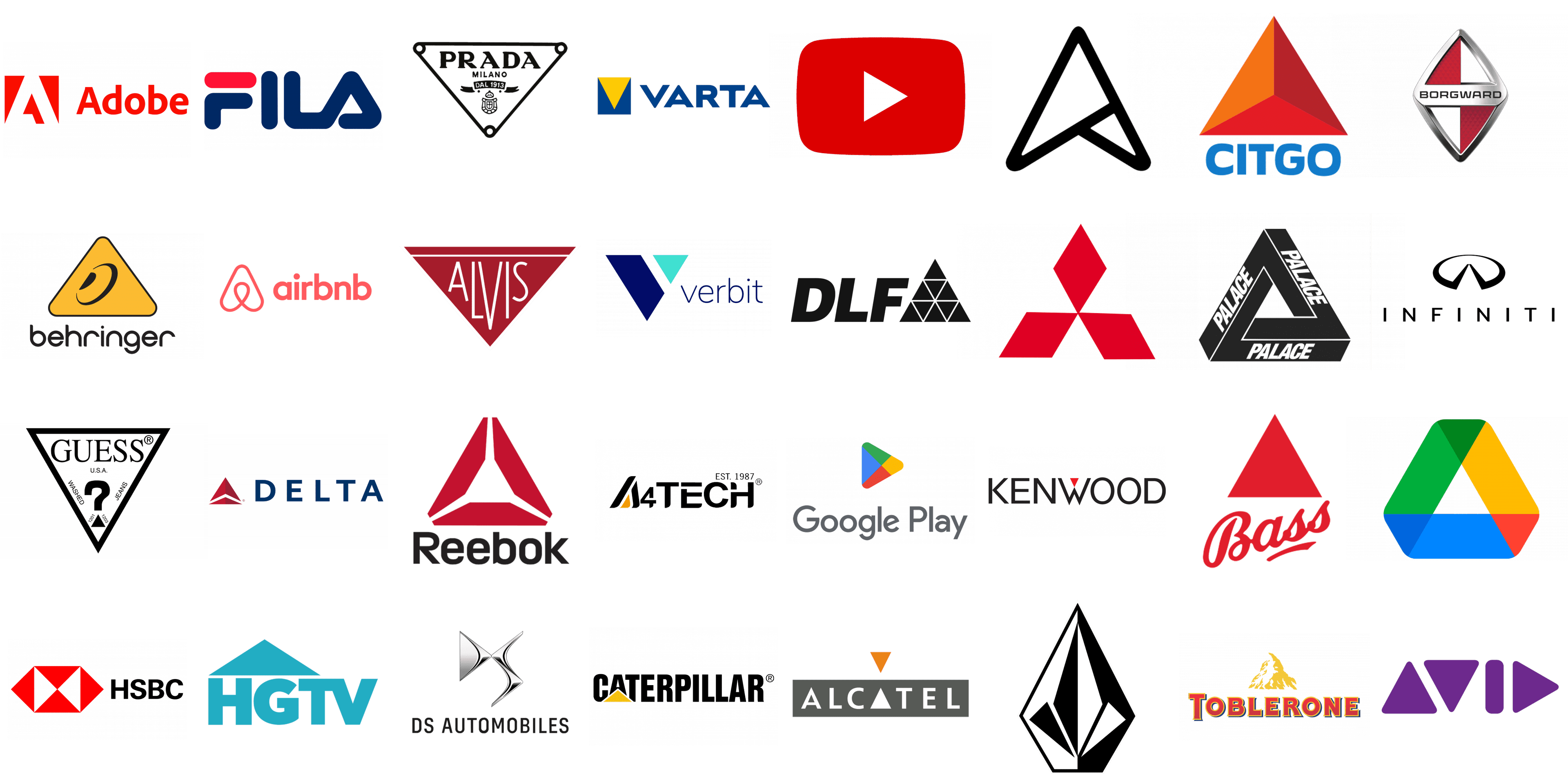
Google Play
![]()
Google Play stands as a cornerstone of Google‘s digital empire, offering an extensive suite of services beyond its role as the primary marketplace for Android applications. It seamlessly integrates Google’s offerings across music, books, movies, and television, creating a comprehensive ecosystem for digital entertainment and productivity. The logo, characterized by its vibrant use of color and simplistic design, centers around a play button icon encapsulated within a triangle. This triangular shape is not just a play symbol but also a metaphor for forward movement and innovation. It’s framed by a spectrum of colors that signify the diversity of content and experiences available through the platform, encapsulating Google’s philosophy of accessibility and creativity.
Prada
![]()
Prada, an epitome of Italian luxury, has etched its name in the annals of fashion history with its avant-garde approach to style and innovation. Established in Milan by Mario Prada, the brand has transcended its humble beginnings to become a beacon of high fashion, known for its meticulous craftsmanship and transformative designs. The logo, particularly noted for its triangular plaque, is a testament to Prada’s heritage and meticulous attention to detail. This geometric form is not just a design element but a symbol of the brand’s foundation in quality and luxury. Embossed on Prada’s products, the triangle serves as a hallmark of authenticity, denoting the brand’s commitment to excellence in a minimalist yet profound manner.
HGTV
![]()
HGTV has redefined home and lifestyle television, offering viewers a window into the art of home improvement and design. With a focus on making the dream home a tangible reality for its audience, HGTV combines practical advice with inspirational ideas. The network’s logo captures the essence of its mission through the clever use of a triangle to form a stylized roof over the “H,” embodying the idea of home and shelter. This triangular motif is more than just an architectural element; it represents the network’s dedication to creating spaces that people love. Through this simple yet symbolic design, HGTV communicates its commitment to transforming houses into homes, fostering a sense of belonging and creativity.
Bass
![]()
Bass Brewery, with its storied history steeped in brewing tradition, has been a pioneer in the beer industry since its establishment in 1777. Renowned for its signature pale ale, Bass has become synonymous with British brewing heritage, boasting a legacy of quality and innovation. The logo’s red triangle is not only a historic emblem, being the first trademark registered in the UK, but it also signifies the brand’s pioneering spirit and enduring excellence. This iconic triangle, bold and unmistakable, stands as a beacon of the brewery’s commitment to craftsmanship and tradition. It’s a visual representation of Bass’s storied past and its continuous pursuit of brewing perfection.
Airbnb
![]()
Airbnb revolutionized the travel industry by connecting people looking for unique accommodations around the world with local hosts. More than just a service, Airbnb has cultivated a community based on shared experiences and the idea of living like a local. The logo, affectionately named the “Bélo,” is a masterpiece of design, encapsulating the essence of belonging in its abstract form. At its heart, the logo features a shape that combines elements of a heart, a person’s head, and a location pin, culminating in a triangular form. This design is a symbol of trust, connection, and the endless possibilities of travel. The triangle at its core is a reminder of Airbnb’s mission to break down barriers and create a world where everyone can feel they belong, anywhere they go.
Infiniti
![]()
Infiniti, the luxury vehicle division of the Japanese automaker Nissan, is renowned for its commitment to elegance, innovation, and performance. Since its inception in 1989, Infiniti has sought to craft vehicles that not only push the boundaries of automotive technology but also provide a luxurious experience that appeals to discerning drivers around the world. The Infiniti logo, with its two central lines reaching for the horizon within a circle, subtly incorporates a triangular form through the negative space created by the lines. This design symbolizes a road stretching off into infinity, mirroring the brand’s name and its aspiration towards endless possibilities and pioneering in the luxury automotive sector.
YouTube
![]()
YouTube, a subsidiary of Google, stands as the quintessential platform for sharing and discovering videos across the globe. From its early days in 2005, YouTube has grown to become a digital behemoth, hosting content ranging from amateur vlogs to professional media. The YouTube logo is instantly recognizable, featuring the company’s name beside a red play button icon inside a red rectangle. While the logo does not contain a triangle in the traditional sense, the play button itself—a central element of the design—forms a right-angled triangle, embodying the action of playing videos and symbolizing the platform’s core function of bringing dynamic content to life.
Guess
![]()
Guess is an American brand famous for its trendsetting denim jeans, fashion accessories, and luxury clothing items. Founded in 1981 by the Marciano brothers, Guess quickly rose to prominence with its innovative designs and has remained a staple in the fashion industry. The Guess logo is elegantly simple, featuring the brand name in a stylish, bold font. While the logo itself does not directly incorporate a triangle, its marketing and design aesthetics often play with geometric shapes and sharp lines, invoking a sense of cutting-edge, contemporary fashion. The essence of Guess lies in its ability to blend modern chic with timeless appeal, a quality that, while not triangular in form, is bold and distinctive in nature.
Volcom
![]()
Volcom, a brand that epitomizes the spirit of youth culture, skateboarding, surfing, and snowboarding, prides itself on fostering creativity and rebellion against the establishment. Founded in 1991, Volcom’s ethos, “Youth Against Establishment,” resonates through its products and branding. The Volcom logo, known as the “Stone,” does incorporate a triangular shape, albeit in a unique and stylized manner. This logo, which appears as a diamond but can be interpreted as two triangles conjoined at the base, symbolizes the brand’s commitment to dynamic sports and its stance against the conventional. The triangle, in this context, represents the brand’s foundation in action sports, innovation, and non-conformity.
Verbit
![]()
Verbit, a relatively newer entrant, leverages artificial intelligence to provide transcription and captioning services, aiming to revolutionize the way we interact with audio and video content. With a focus on accuracy and speed, Verbit caters to educational institutions, legal firms, and media companies, ensuring accessibility and compliance. The Verbit logo is sleek and modern, encapsulating the brand’s forward-thinking approach. While the logo primarily focuses on typography, the design elements surrounding the brand and its digital presence often utilize geometric shapes, including triangles, to convey technology, precision, and the digital nature of its services. These triangular motifs are emblematic of Verbit’s cutting-edge technology and its mission to bridge the gap between human expertise and AI efficiency.
Citgo
![]()
Citgo Petroleum Corporation, an American refiner, transporter, and marketer of transportation fuels, lubricants, petrochemicals, and other industrial products, stands as a notable player in the energy sector. Founded in 1910, the company has grown to symbolize reliable energy solutions across North America. The Citgo logo is instantly recognizable by its trimark of three interlocking triangles, each representing the company’s core values of integrity, respect, and excellence. These triangles are colored in red, white, and blue, echoing the American flag and emphasizing Citgo’s commitment to quality and service in the United States. The geometric precision and symmetry of the triangles convey stability and forward momentum, mirroring the company’s dedication to innovation and community support.
Reebok
![]()
Reebok International Limited, a foundational figure in the landscape of global fitness and lifestyle brands, has championed athletic wear and accessories designed to empower consumers in their fitness journeys. Since its inception in 1958, Reebok has been synonymous with quality and innovation in athletic footwear and apparel. The logo, known as the Reebok Delta, represents change and transformation in people’s lives through fitness. While not a traditional triangle, the Delta logo comprises three sections that form a triangular shape, symbolizing the physical, mental, and social changes that occur when people embrace an active lifestyle. This emblem reflects Reebok’s mission to inspire and enable athletic achievement, highlighting the brand’s focus on progression and improvement.
Caterpillar Inc.
![]()
Caterpillar Inc., commonly known as CAT, is a global leader in the manufacturing of construction and mining equipment, diesel and natural gas engines, industrial turbines, and diesel-electric locomotives. With a heritage that dates back to 1925, Caterpillar has established itself as a symbol of durability, reliability, and innovation in heavy machinery and engineering. The company’s logo, recognized worldwide, is characterized by its bold, uppercase letters in a distinctive font, with an emphasis on the “CAT” abbreviation. A key element of Caterpillar’s visual identity is the yellow triangle positioned underneath the first letter ‘A’ in “Caterpillar.” This yellow triangle is not merely a design choice but a significant emblem that underscores the brand’s commitment to quality and excellence. The triangle, with its broad base, symbolizes stability and strength, reflecting the foundational values of Caterpillar. Its yellow color is synonymous with the machinery and equipment that Caterpillar produces, standing out for visibility and safety in construction and industrial settings.
Adobe
![]()
Adobe Inc., a leader in the software industry, specializes in creative and multimedia software products, renowned for revolutionizing how we create, deliver, and optimize content. Founded in 1982, Adobe’s suite of software has become indispensable to creatives worldwide. The Adobe logo is straightforward yet bold, featuring the letter “A” against a red background. While the current logo does not incorporate a triangle in a literal sense, the letter “A” itself suggests a triangular shape, pointing upwards towards innovation and creativity. This subtle nod to the triangular form emphasizes Adobe’s commitment to leading the digital media revolution, pushing the boundaries of digital experiences.
Mitsubishi
![]()
Mitsubishi, a conglomerate of autonomous Japanese companies, has created a vast corporate presence across industries such as automotive, finance, electronics, and more, embodying a spirit of innovation and diversity. The Mitsubishi logo, consisting of three red diamonds arranged in a triangular formation, is rich in symbolism and history. The design reflects the brand’s name, which translates to “three diamonds” in Japanese. These diamonds, arranged to form a triangle, represent reliability, integrity, and success. The triangular arrangement conveys strength and unity, embodying the Mitsubishi Group’s philosophy of cooperation and growth. This emblem is a powerful representation of Mitsubishi’s commitment to excellence and its enduring legacy in global business.
Avid Technology, Inc.
![]()
Avid Technology, Inc. is a trailblazer in the world of digital multimedia, renowned for its advanced software and hardware for video and audio editing. As a catalyst for creative professionals across film, television, and music industries, Avid empowers creators to entertain, inform, and enlighten audiences worldwide. Its logo is a marvel of geometric design, constructed entirely from triangles that converge to form the word “Avid.” This triangular motif is not merely artistic but symbolic of Avid’s commitment to innovation, precision, and the dynamic nature of digital media creation. The use of triangles reflects the company’s ethos of building robust, forward-thinking solutions that propel the creative process into the future.
Varta AG
![]()
Varta AG stands at the forefront of energy technology, specializing in the development and manufacture of high-performance batteries. With a legacy that dates back to the early 20th century, Varta has evolved into a key player in the power supply sector, catering to everything from consumer electronics to automotive industries. The company’s logo features a distinctive blue square, inside of which lies a vibrant yellow triangle, pointing upwards. This design captures Varta’s commitment to innovation and excellence in energy solutions. The triangle, a symbol of energy and motion, reflects the company’s drive for sustainability and advancement, while the square signifies stability and reliability, foundational values of the Varta brand.
Delta Air Lines, Inc.
![]()
Delta Air Lines, Inc., a giant in the aviation industry, offers an extensive network of domestic and international flights, serving millions of passengers annually. Known for its reliability, customer service, and operational excellence, Delta connects the world with its vast array of destinations. The logo, known as the “widget,” is an iconic symbol featuring a triangle pointing upwards, signifying the ascent of an aircraft. This triangular form is split into two parts, creating a dynamic and forward-moving appearance that reflects Delta’s ambition and its role as a leader in global travel. The simplicity and boldness of the triangle encapsulate Delta’s commitment to connecting people and places with efficiency and grace.
DS Automobiles
![]()
DS Automobiles, a French automotive manufacturer renowned for its luxury vehicles, stands at the confluence of sophistication and innovation. Since its inception, DS has been dedicated to offering a blend of avant-garde technology and distinctive designs. The logo, a masterpiece of geometric artistry, showcases the brand initials “DS” crafted entirely from triangles. This unique design choice speaks volumes about the brand’s commitment to precision and forward-thinking. The triangular elements within the letters evoke a sense of dynamism and progress, mirroring the brand’s ethos of pushing the boundaries in automotive design and technology. The use of triangles not only differentiates the DS logo from its competitors but also symbolizes the brand’s vision of merging elegance with cutting-edge engineering.
Kenwood
![]()
Kenwood, a global leader in designing and manufacturing consumer electronics, is synonymous with quality, innovation, and reliability. Known for its wide range of kitchen appliances and audio equipment, Kenwood combines functionality with style. Within the logo, particularly in the letter “W,” lies a small, red triangle. This subtle yet impactful design element serves as a testament to Kenwood’s attention to detail and its commitment to excellence. The red triangle adds a touch of vibrancy and energy, reflecting Kenwood’s passion for creating products that enrich people’s lives. It’s a symbolic nod to the brand’s drive for perfection and its status as a pioneer in the consumer electronics market.
Fila
![]()
Fila, an Italian sporting goods company, has become a global icon in sportswear and athletic footwear, celebrated for its fusion of performance and style. The brand’s logo is instantly recognizable, with the letter “A” designed in the shape of a triangle. This design choice is not arbitrary; it embodies Fila’s dynamic approach to sportswear, suggesting movement and agility. The triangular “A” represents the brand’s foundation in innovation and its dedication to crafting products that empower athletes and fashion enthusiasts alike. Through this distinctive design, Fila communicates its commitment to excellence and its heritage of Italian craftsmanship, appealing to those who value both function and fashion.
Alcatel
![]()
Alcatel, a brand known for its telecommunications and networking equipment, embodies the principles of innovation, accessibility, and user-friendliness. The logo cleverly uses a white triangle instead of the second “A” to signify clarity, precision, and technological advancement. This design element reflects Alcatel’s mission to simplify communications through cutting-edge solutions. The white triangle in the background of the brand name emphasizes Alcatel’s commitment to purity, simplicity, and the future of technology. It serves as a visual metaphor for the brand’s commitment to breaking down communication barriers and ensuring connectivity and accessibility for all.
Palace
![]()
Palace Skateboards, a revered name in the skateboarding and streetwear scene, is celebrated for its edgy designs and cult following. While the brand’s logo might not feature triangles in a literal sense, Palace’s aesthetic often plays with geometric shapes and bold typography, which resonates with the skate culture’s penchant for defiance and individuality. The brand’s logo, known for its distinctive Penrose triangle or “impossible triangle,” encapsulates Palace’s ethos of challenging conventions and embracing the unconventional. This optical illusion symbolizes the brand’s innovative spirit and its commitment to pushing the boundaries of design and fashion. Palace’s use of geometric motifs, including the play with triangular forms, underscores its position as a trendsetter in the streetwear domain, appealing to a community that values authenticity and creativity.
Behringer
![]()
Behringer is a multinational group of companies that specializes in a wide range of audio equipment and musical instruments. Founded by Uli Behringer in 1989, the company has become known for providing affordable, high-quality audio products for both professional and amateur musicians. The logo features a distinctive orange triangle with a thin black border, encapsulating an ear’s silhouette formed by black lines within. This graphic not only symbolizes the company’s focus on sound but also its commitment to listening to and meeting the needs of its customers. The triangle, a shape often associated with stability and precision, reflects Behringer’s dedication to reliable audio engineering and innovation.
DLF Building
![]()
DLF Limited, one of India’s premier real estate companies, has a significant presence in building luxury estates, commercial complexes, and other real estate developments. The DLF Building logo employs a bold, black triangle that houses nine smaller triangles, collectively forming a larger geometric figure. This intricate design symbolizes unity and structure, mirroring the company’s approach to creating interconnected and harmonious spaces. The use of triangles within triangles suggests the meticulous planning and architectural innovation that DLF brings to its projects, representing the company’s foundation in strong, forward-thinking development strategies.
Asus
![]()
Asus, a global technology leader known for its motherboards, personal computers, monitors, graphics cards, and routers, integrates the essence of innovation and quality into its products. The logo presents a black arrow pointing upwards, crafted entirely from triangular shapes. This design not only embodies the company’s direction towards progress and upward growth but also symbolizes its commitment to precision and excellence in the tech industry. The triangular composition of the arrow reflects the idea of convergence — of technology, ambition, and user experience — driving Asus towards achieving peak performance and innovation.
A4Tech
![]()
A4Tech, a company specializing in the design and manufacturing of personal computer peripherals and accessories, is recognized for its innovative and user-friendly products. Within the logo, the letter “A” cleverly incorporates a small orange triangle, which serves as a subtle yet powerful element highlighting the company’s attention to detail and creativity. This small triangle within the “A” symbolizes A4Tech’s focus on precision and the cutting-edge nature of its technology, suggesting a forward-thinking approach to developing products that enhance user interaction and experience.
Borgward
![]()
Borgward is an automotive brand with a history of producing cars that combine elegance with innovative engineering. The logo is a striking diamond shape composed of four triangles — two red and two white — arranged in a checkerboard pattern. This design is not just visually appealing but also rich in symbolism, representing the brand’s commitment to balance and harmony in vehicle design and performance. The alternating colors of the triangles signify the dynamic blend of tradition and innovation that Borgward stands for, illustrating the brand’s dedication to creating vehicles that are both timeless and forward-looking.
Adidas
![]()
Adidas, a titan in the sportswear industry, has long been celebrated for its fusion of performance, style, and innovation. Founded by Adi Dassler, the brand’s mission has always been to provide athletes with the best possible equipment. The Adidas logo, particularly the version with the three stripes, is iconic and universally recognized. However, it is the Trefoil logo that explicitly incorporates a triangular shape within its design. The Trefoil logo, representing the diversity of the Adidas brand, features three leaf shapes that come together to form a triangle, symbolizing the global connection of the brand to athletes around the world. This triangular motif within the Trefoil highlights Adidas’s commitment to excellence, diversity, and the unifying power of sports.
Toblerone
![]()
Toblerone, the Swiss chocolate bar known for its distinctive triangular prism shape, is a masterpiece of confectionery design. Created by Theodor Tobler in 1908, the chocolate’s form is inspired by the mountains of Switzerland, specifically the Matterhorn. Toblerone’s logo cleverly incorporates a bear silhouette within the mountain, which is also a nod to the city of Bern, where the chocolate was first made, often referred to as the “City of Bears.” The triangular shape of the chocolate pieces themselves not only makes Toblerone unique but also serves as a symbol of the Swiss Alps’ majesty and the innovative spirit of its creator.
Google Drive
![]()
Google Drive, a file storage and synchronization service developed by Google, allows users to store files in the cloud, synchronize files across devices, and share files with ease. At the heart of its visual identity is a logo that cleverly embodies the concept of storage and accessibility through a triangular shape with significantly rounded corners. This logo doesn’t just signify direction or movement; its geometry is a nod to the cloud computing model—fluid, dynamic, and interconnected. The intersections of different colors within the logo form smaller triangles, adding layers of depth and representing the integration of various Google services. These subtle triangular forms symbolize the seamless and multifaceted nature of Google Drive, highlighting its capability to bring diverse data together in a cohesive and user-friendly environment.
HSBC
![]()
HSBC, one of the world’s largest banking and financial services organizations, has a logo that is as iconic as its reputation. The logo features a hexagon that is symmetrically divided into six segments, composed of four red and two white triangles. This geometric arrangement is not only visually striking but also rich in symbolism. The red triangles represent the bank’s dynamism and its global reach, while the white spaces symbolize openness and clarity in HSBC’s dealings. This symmetrical hexagonal design reflects HSBC’s balance between robust global operations and its commitment to transparency and customer trust. The use of triangles within the hexagon stands as a testament to the bank’s foundation in strength, stability, and forward-thinking.
Alvis
![]()
Alvis, a name synonymous with innovation in the automotive and aeronautical engineering fields, boasts a logo that perfectly encapsulates its heritage and craftsmanship. The logo is designed as a triangle, within which the brand name “Alvis” is inscribed. The typography mirrors the triangular motif, with the letters at the edges being smaller and those in the middle larger, thereby reinforcing the triangular form. This design choice is not merely aesthetic but symbolic, reflecting Alvis’s principles of precision, balance, and excellence. The triangular shape of the logo and the typographic arrangement suggest motion and progression, emblematic of Alvis’s commitment to advancing technology and design. Through this simple yet profound emblem, Alvis communicates its legacy of innovation and its forward-looking vision.
Conclusion
In the ever-evolving tapestry of brand identity and visual communication, logos stand as the quintessential embodiment of a company’s ethos, values, and aspirations. Among the myriad designs that brands employ to etch their identity into the minds of consumers, those that incorporate the humble yet profound triangle distinguish themselves with a unique blend of simplicity and depth. This exploration into the world of the most famous logos adorned with triangles offers a glimpse into how this basic geometric shape, with its three corners and three sides, transcends its simplicity to become a powerhouse of symbolism and visual appeal in the corporate universe.
Enriching Perspectives on Triangle-Infused Logos:
- Societal and Cultural Resonance: Triangles resonate across various cultures and epochs, embodying principles of harmony, divinity, and balance. Logos that harness these aspects tap into a deeper cultural and societal psyche, crafting a brand image that is not only recognizable but resonant on a near-universal scale.
- Innovation and Evolution: In the fast-paced digital age, the triangle symbolizes the pinnacle of innovation and the forward thrust of evolution. Tech companies and startups, in particular, leverage the directional quality of the triangle to project a forward-thinking and cutting-edge image.
- Memorability through Simplicity: The genius of employing triangles in logo design lies in their inherent simplicity. This geometric shape, familiar to all from the earliest stages of learning, ensures that logos are instantly recognizable and easily recalled, a vital attribute in the crowded marketplace.
- Adaptability and Flexibility: The triangle’s shape allows for a multitude of interpretations and adaptations, making it an incredibly flexible tool for designers. Whether it’s pointing upwards, signifying growth and success, or downwards, indicating stability and grounding, the triangle molds itself to the narrative the brand wishes to convey.
Intriguing Fact: The triangle is the only geometric shape that, when all external forces are removed, retains its form, a property known as ‘structural integrity’. This characteristic makes the triangle a symbol of resilience and endurance in the face of adversity, a quality many brands aspire to embody.
“The triangle is not merely a shape; it is a narrative in itself, a visual metaphor that speaks of goals, challenges, and victories. In the realm of logos, it serves as a beacon of ambition, guiding the brand on its journey towards its zenith”.
In conclusion, our journey through the landscape of logos featuring triangles reveals the profound impact a simple geometric shape can have on brand identity and perception. These logos are not just marks of ownership; they are a silent dialogue between the brand and its audience, conveying messages of stability, direction, innovation, and resilience. As we look to the future, the enduring legacy of triangle-infused logos continues to inspire designers and brands alike, reminding us that within the confines of geometry lies endless potential for creativity, symbolism, and connection.


