

![]() Verbit Logo PNG
Verbit Logo PNG
Verbit is the name of an Israeli startup, which was launched in 2017 by Eric Shellef, Kobi Ben Tzvi, and Tom Livne. The idea of the company is in developing software for transcription. Verbit is based on Artificial Intelligence technology.
Meaning and history
![]()
Verbit was founded in Israel in 2017, by three colleagues, who saw the opportunity in the niche, which was completely free, yet very actual — capturing and transcription. This led to the top-notch software, based on a combination of Artificial and human intelligence, which allows the creation of captures and subtitles for various spheres of business.
Among the clients of the company are the world’s loudest names and largest brands, such as CNN and Google. Apart from them, the customers of the Israeli unicorn startup include various universities and online platforms.
What is Verbit?
Verbit is a unicorn company, established in 2017, which by today has become one of the most successful startups using Artificial Intelligence technology. The company is based on creating software for fast online transcription.
In terms of visual identity, despite the young age of the company, it has already had one logo redesign, as the original one seemed not the best option for the management of Verbit. The only thing, kept by the brand from its initial badge was the shade of the color accent — bright turquoise, a hue standing for energy and uniqueness.
2017 – 2020
![]()
The original Verbit badge, created in 2017, was set in a very laconic and minimalistic style, with the lowercase logotype followed by a small graphical emblem on the right. The inscription was set in a bold serif typeface with distinctive contours of the characters, executed in a dark, almost black, shade of blue. As for the emblem on the Verbit badge, it was a bright turquoise tick symbol with the bars arched, resembling the wings of a bird.
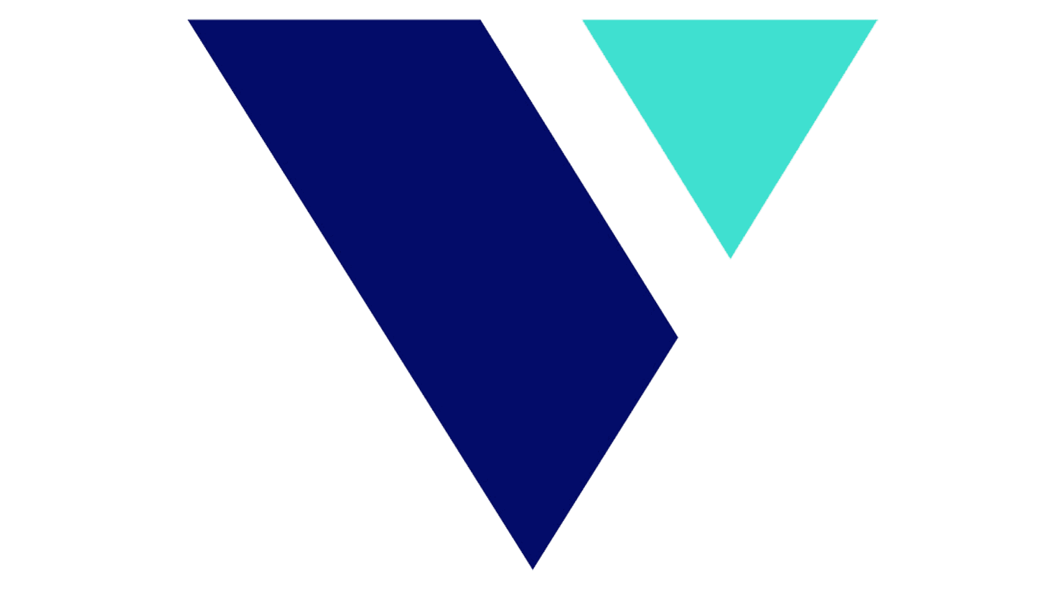
2020 – Today
![]()
At the r the redesign, held by Verbit at the beginning of the 2020s, its badge gained more modern and confident shapes and a more professional character. The new badge is composed of an enlarged geometric emblem, and lightweight lowercase lettering, set on its right. The Verbit emblem is a heavy triangle, pointing down. The geometric figure is composed of two fragments — a large dark blue one, and a small turquoise triangle, set in the upper right corner. The shade of a larger element is supported by the color of the clean sans-serif inscription, while the small triangle repeats the hue of the emblem from the previous logo version.
Font and color
The modern lowercase lettering from the official Verbit logo is set in a clean and smooth sans-serif typeface with full-forged shapes of the characters and slightly rounded ends of the lines. The closest fonts to the one, used in this insignia, are, probably, Puck Thin or Slate Std Extra Light, but with some minor modifications.
As for the color palette of the Verbit visual identity, it is based on deep blue and turquoise, with a plain white background, which creates a bright contrast and adds cleanliness and distinctions to the elements of the badge. The color palette of the Verbit logo stands for reliability and trustworthiness, along with the professionalism and expertise of the company.


