Nissan is a multinational company, established in 1933 in Japan. Today it is the largest producer of electric cars across the globe and the world’s sixth-biggest automobile manufacturer.
Meaning and history
The name of the company, Nissan, can be translated from Japanese as a “sun product” or a “birth of the sun” (“ni” stands for “sun”, and “ssan” means “birth” or “product”). And the brand’s visual identity has always been a good reflection of the name’s meaning.
Nissan always aimed to give new designs and technologies to the world’s automotive industry, showing the value of its roots and heritage.
What is Nissan?
Nissan is a Japanese automobile manufacturer, which was established in 1933. Today the company has three car marques (Nissan, Infinity, and Nismo), under which it produces cars, luxury automobiles, trucks, and commercial vehicles, which are distributed all over the world through several Nissan subsidiaries, located on different continents.
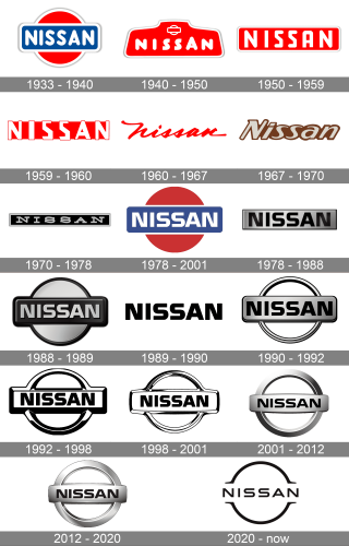
1933 – 1940
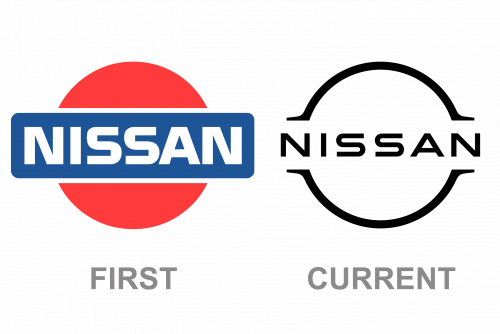
The first Nissan logo featured an iconic emblem in the red, blue and white color palette, where the sun symbol, the circle, was colored red, with a blue rectangular and white lettering.
The wordmark in all-caps was executed in a bold strong typeface, making the brand’s name bright and confident.
1940 – 1950
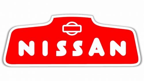
In the 1940s the brand experimented with its logo’s shape. During that period of time the Nissan logo featured a creative geometric figure with 6 angles, four of which were rounded, and two, on the upper part of the logo, were sharp.
The wordmark was executed in a friendly and dynamic hand-drawn typeface with smooth lines and the enlarged letter “A”. The edges of the letters “S” were cut, which created a vivid sense.
The color palette featured red as the main color with framing and lettering in white.
The “rising sun” emblem was placed above the wordmark, contoured in fine white lines.
1950 – 1959
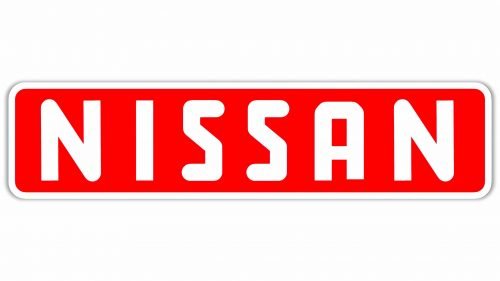
At the beginning of the 1950s, the brand simplified its logo, by using a rectangular with all-caps lettering on it. The color palette remained red and white, while the font became stronger and the letters — bigger.
The red rectangular had rounded angles and a white framing, which made it look soft and stylish.
1959 – 1960
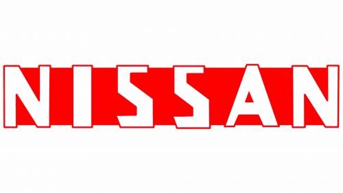
The new Nissan logo was based on the previous version, but the lettering became more angular and there was no frame this time.
The sharp and straight lines of the typeface were a reflection of the progress and power of the brand.
1960 – 1967
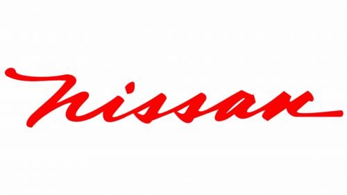
The Nissan logo from the 1960s features cursive lettering with sharp lines. It looks modern and elegant. The wordmark is now executed in red in a white background. It is a minimalistic and sophisticated visual identity, which stands out among other brand logos.
When placed on cars the wordmark is silver, which makes it look more expensive and stylish.
1967 – 1970
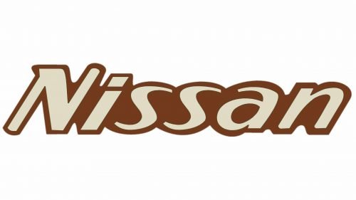
The company was trying to find a perfect balance for the wordmark and had a 3-years long experiment with an italicized rounded typeface, which was complemented by a brown color palette. It was a short period and not typical for the brand at all.
1970 – 1978
Nissan brings the rectangular framing back. The wordmark is in all-caps again, with a traditional serif font. The thin and straight line of the letters makes the logo look clean and neat, it is now modern and evokes a sense of technologically-centered approach.
1978 – 2001
The brand comes back to its roots. The Nissan heritage is celebrated in its “new-old” logo, which features an iconic emblem and a wordmark placed in the rectangular.
The lettering is confident and strong, the custom typeface makes the logo memorable and recognizable. The color palette is minimalistic and features monochrome with gray.
1978 – 1988
In 1978 the Nissan logo started being executed in a classic black and silver color palette, with solid plain letters engraved on a horizontally-oriented metallic banner. The typeface of the inscription repeated the one from the previous version, but the characters started looking more geometric in the new scheme.
1988 – 1989
The redesign of 1988 has brought back the iconic geometry of the Nissan logo, placing a horizontal rectangular banner across the solid circle. Both elements were set in silver and black, with the background of the circle in matte silver being supported by the letters, written on a plain black banner. The logo looked very powerful and confident.
1989 – 1990
In 1989 the Nissan badge got executed in a very minimalistic style — plain black letters set against a white background, with no additional elements or shades. The bold flat logotype looked very brutal and masculine, evoking a sense of quality and precision.
1990 – 1992
The concept of a circle with a rectangle was brought back to the Nissan logo in 1990, but with some significant modifications. The banner was set in matte silver, with the black lettering supported by a black outline of both the softened rectangle and the ring, which replaced the solid circle from the badge of the end of the 1980s.
1992 – 1998

The silver shades were removed from the Nissan visual identity in 1922, keeping the concept with the ring and the banner, but executed in black-and-white. The simplicity of the color scheme and the geometric shapes in the badge worked perfectly together, showing the company as a very professional one.
1998 – 2001
The contours of the iconic Nissan badge were refined in 1998, and the lines got smoother and more elegant, while the color palette now consisted of mainly white, with the black accents being minimized, and used for letters and the framing of the logo.
2001 – 2012
The 2001 Nissan logo is based on the previous version, but today it is more sleek and stylish, using silver colors, which make it bold and high-end.
The letters are perfectly spaced and the lines of the typeface make the wordmark look great both when placed on the emblem, and when used on its own.
2012 – 2020
The redesign of 2012 has slightly switched the color palette of the Nissan badge, making the silver hue warmer and more yellowish, with the glossy surface getting matte and sleek. With the new light shades, the badge started looking more voluminous, with the lettering banner getting spherical.
2020 – now
The logo, introduced by Nissan in 2020 is a sleek minimalist badge, executed in flat monochrome, and repeating the shape of the iconic emblem but in a modern and stylish way. The black capitalized inscription is placed between two arches, forming a recognizable Nissan circular logo. The ends of the arched are Ali Gates and sharpened, making the two parts look a bit like horseshoes and adding sophistication to the logo the whole world knows for many years, making it look different and creative.
The Emblem
Nissan borrowed its emblem from the sister company, Datsun. One of the most recognizable brand icons in the world is a representation of the red rising sun, a heraldic symbol of Japan.
The Nissan emblem is composed of a circle with a rectangular, placed horizontally on it.
The company’s emblem was created in the 1930s and has undergone several modifications during its history, but they all mainly touched color palette and font of the wordmark, which is placed in the emblem’s rectangular.
However, since the 1950s until the 1980s Nissan didn’t use its famous emblem in its visual identity at all. The logo during that time was designed around the brand’s wordmark.
Font
The typeface of the Nissan logo, pivotal in crafting the brand’s modern identity, epitomizes a blend of sophistication and functionality. This bespoke font, carefully chosen for the Nissan wordmark, is characterized by its clean lines and balanced proportions, which echo the brand’s ethos of innovation and reliability. The medium’s thickness and flexibility are meticulously calibrated to ensure legibility and impact across various applications, from the centerpiece of the logo to digital platforms and business cards. The font’s design process was inspired by Nissan’s commitment to “shisei tenjitsu o tsuranuku,” a guiding principle meaning to pierce the truth of things, which is reflected in the clarity and precision of the typeface.
This font stands as a testament to Nissan’s past iterations and milestones, encapsulating the brand’s journey through its iterations and reflecting a forward-looking perspective that resonates with today’s digital connectivity demands. The choice of typeface is a strategic one, aligning with the brand’s vision for the future while paying homage to its rich heritage. It conveys a sense of stability and elegance, making it a powerful tool in Nissan’s visual identity, particularly in how it connects with customers on social media, in digital advertising, and through the overall ownership experience. The typeface, therefore, is not just a component of the logo but a crucial part of Nissan’s branding, symbolizing the company’s dedication to excellence and its role in shaping the future of mobility.
What does the Nissan logo represent?
The Nissan logo is a rethought and modernized representation of the motherland of the brand, Japan. The circular ring around the minimalistic and stylish lettering on the badge stands for the sun, which is also present on the National flag of Japan but drawn in solid red. The open contour of the circle on the Nissan logo represents motion and energy, which makes the company move forward and develop.
Why did Nissan change their logo?
Nissan changed its logo in 2020 to show its progressive approach to business, production, and design. With its new badge, the company states that it is growing and developing, following the latest trends in visual identity design, and applying innovative technologies to the manufacturing of its vehicles.
Is Nissan changing their logo?
The last time the Japanese automaker changed its logo was in 2020, with the badge becoming more minimalistic and progressive than ever. So the answer is yes, Nissan is constantly enhancing and modernizing its visual identity, to show its progress and growth and to reflect the innovative approach the company uses in all of the spheres of its business.


