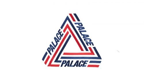
The logo of the Palace Skateboards brand is basically the Penrose Triangle (Penrose tribar) featuring the word “Palace” on each of the sides.
Meaning and history
Palace was founded in 2009. It is a skateboard shop and clothing brand headquartered in London, UK. Originally, it was worn primarily by its founder Lev Tanju and his skate team.
The Palace logo was developed by Fergus Purcell, also known as Fergadelic. He is a London-based designer and illustrator best known for his works for Marc By Marc Jacobs, Stüssy, and his labels Tonite and Silas.
Palace is a legendary manufacturer of skateboards and streetwear with a distinctive logo – a triangle with the brand name spelled out on each side.The English brand Palace Skateboards has quickly evolved from a small production for local skateboarding collective to one of the streetwear industry’s most famous brands. The company, founded by Lev Tanju in 2009, produces products inspired by 1990s aesthetics.
In literally no time this brand has become something extremely popular and chic. Palace produces only small runs of each collection, emphasizing exclusivity. The brand’s boutiques queue for new collections.
What is Palace?
Palace is a famous British brand of skateboards and street fashion apparel, which was established by ex-skater Lev Tanju in 2009. The logo of the brand has already become iconic. This triangle with the name of the company written on each side, decorates hoodies and t-shirts, loved by many, including celebrities and sportsmen.
According to Purcell, the founder of Palace Lev Tanju told him that triangles are the inspiration behind many designs. Purcell, in his turn, decided to make the triangle the key element of the logo. Interestingly, Tanju has often given Purcell credit for the whole logo as if he has forgotten about his words.
The infinite-repeating theme is very prominent in the design. It appears to be looping around again and again endlessly. This theme symbolizes eternity. It represents the brand’s strive for never-ending change for the better.
Also, Purcell wanted the design to have “implied size.” Even if the Palace Skateboards logo is pretty small, it “has a quality of being epic,” according to him.
Font and Color
The lettering from the iconic triangular emblem of the Palace brand is set in a slightly condensed and italicized heavy sans-serif font with modern and stable contours of the uppercase characters. The closest fonts to the one, used in this insignia, are, probably, Neue Helvetica Std 97 Condensed Black Oblique, or Neue Helvetica Paneuropean 107 Condensed Extra Black.
As for the color palette of the Palace’s visual identity, it is built around the classy and minimalistic combination of black and white, which looks powerful and modern, and makes it possible for the logo to be placed on a background of any color and the brand loves experimenting with designs.


