Google Drive is a service created by Google to store, synchronize and share files. The software was launched in 2012 and today has over one billion users worldwide. Google Drive offers not only websites but also applications for both iOS and Android operating systems.
Meaning and history
Google Drive is a unique service, available since 2012 and actively developing over the past few years. Google Drive is a special space dedicated to the owners of Google mailboxes and designed for storing, making edits, and synchronizing files. The developer is the Google company.
Before the appearance of Google Drive, Google Docs acted asstorage, but after the appearance of the new service, all data is redirected to it. In October 2012, Docs, Presentations, and Tables were separated into separate services, and in April 2014, mobile applications for these areas appeared. In May 2018, the company announced the creation of the Google One subscription service.
The principle of Google Drive does not differ much from that of Dropbox or iCloud Drive. It is a hard drive, accessible from any device and at any time when there is access to the Internet.
What is Google Drive?
Google Drive is the name of one of the Google services, which was designed at the beginning of the 2010th with the aim to help users store and share files in various formats. Today the software is widely used by professional and amateur users all over the globe.
2012 – 2014
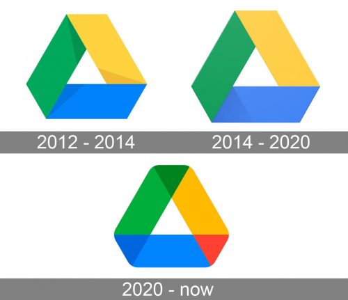
The original Google Drive visual identity was created in 2012 and stayed with the Google service for a couple of years. It was an abstract geometric shape composed of three parallelograms in yellow, green, and blue, and forming a white triangle pointing up with the negative space. All three colorful segments of the emblem featured thin dark triangles on their edges, which stood for shadows and added volume and motion to the image.
2014 – 2020
The Google Drive logo is memorable and meaningful. The company designed an icon, which looks strong and bright, at the same time keeping the main product’s idea in it.
The logo depicts a white triangle enclosed in a geometric frame with its three sides using different colors.
As the software itself is based on three main options, which are Google Docs, Google Sheets and Google Slides, each side of the Google Drive’s emblem is colored in the main shade of each program. So blue is for Docs, green is for Sheets, and yellow is for Slides.
The shape of the Google Drive logo is also very symbolic. Triangle reflects data protection. It is a commonly used symbol of information security, which is formed by three principles: confidentiality, integrity, and availability. One principle per one side.
The Google Drive logo is modern and actual. It is instantly recognizable and has an important message hidden in it.
2020 – Today
In 2020 the Google Drive logo was redesigned again. The new concept is fully based on the original one, but the iconic geometric badge of 2020 is flat and bright. The angles of the figure are softened and the three main fragments form three triangles on the overlapping areas — red, dark blue, and moss green.
Icon
The icon of Google Drive is executed in the iconic corporate color palette of Google — green, yellow, red, and blue — not to leave any doubt of the affiliation to the corporation. The image looks like a wide multicolor ribbon, folded into a triangle, with three peaks squared, having its edges overlapping and creating more intense colors.
Compared to three other colors, the red takes the least space on the Google Drive icon, as o my one small triangle in the bottom right corner of the composition is colored red.
The whole image is set on a plain white background, which elevated the brightness and energy of the graphical element, making it instantly recognizable and eye-catching.
Font and Color
The Google Drive logo is just a graphical icon, which looks the same on mobile apps and the web, and is only accompanied by a letting in rare cases. Although, when there is an inscription near the Google Drive emblem, it is set in the corporate Google typeface, a modern sans-serif with full shapes of letters and clean contours. The typeface, used by Google for all of its products is Product sans, a geometric font, which is based on such types as Futura and Avenir.
As for the color palette of the Google Drive visual identity, it also follows the corporate style and uses an iconic Google scheme — green, yellow, red, and blue, where red is used for the smallest fragments no. These colors make the badge instantly recognizable and ow its affiliation with Google Corporation.


