Android is a Linux-based software platform used in smartphones and tablets. Its rapidly growing popularity makes it one of the major competitors on the mobile device market.
Meaning and History
Today, Android is no longer just an operating system for a smartphone, but an entire infrastructure. Not only phones, tablets, and computers run on this operating system, but also televisions and even refrigerators.
The first version of the OS, Android 1.0 l, was released in 1008, but its history began five years earlier, in 2003 when Andy Rubin gathered a team to create a mobile operating system and incorporated Android Inc. Developers were first focused on devices that could be in users’ possession at all times, determine location by GPS, and automatically adjust to a person’s needs.
In the early stages of its accelerated development, Android had a very aggressive release schedule. We often saw several releases a year and at its peak in 2009, Android received at least four significant updates. Only very recently has Google started releasing annual major updates.In 2011, Android became the most popular mobile operating system in the world.
What is the Android character called?
The Android character, often referred to simply as “the Android robot,” embodies the new aspects of the brand identity for Google’s vast array of products, including Google apps and hardware. It is not just a mascot but a descriptor for the Android platform, symbolizing the transition Android has undergone from its inception, marked by the launch of Android Lollipop, to becoming a pivotal figure in expressing Google’s future goals. As an invitation to explore the vast and dynamic world of Android, from android auto to the android open source project, this character is a cornerstone in communicating the essence of Android to people today, seamlessly blending with the Google brand palette to reinforce Android’s position as a key player in the tech landscape.
2008
The Android logo was designed in 2007 by Irina Blok, a graphic designer of Google. She and her associates decided to make it an open-source logo. That meant that any company of the world was free to customize it. Later, Blok said about her creation that it was like a child, who she had given a life, and now it was to live its own independent life.
2008 – 2014
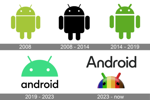
The initial Android logo was created in 2008 in two color palettes. Irina Block, the designer of the iconic Android emblem offered two solutions for the company, and the brighter and more recognizable one was the stylized Android in the light shade of green. The creature was drawn in clean smooth lines and looked very futuristic yet friendly.
2014 – 2019
The redesign of 2014 refined the contours of the Android logo, making all the elements of the creature thinner and neater. This, the white details became a bit bolder and more visible, and the creature itself — slimmer and taller. The green bow became the main color of the Android visual identity but was also elevated to a more intense and brighter shade, which was close to grass-green.
2016 – 2019
In 2016 the emblem was cut and only the upper part of the Android image was left in the concepts it was redrawn in a lighter shade of green, while the emboldened lowercase lettering, set at the bottom of the logo, featured a deeper and brighter tone.
2019 – 2023
In 2019 the icon green alien was redrawn, with its shade also changed. Now the logo of the operating system comprised just the top part of the android’s head, formed by half of a circle with two straight antennas and two white circular eyes. The lowercase “Android” wordmark was written in black sans-serif characters under the green head, looking simple yet modern and stable.
2023 – now
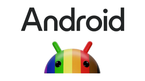
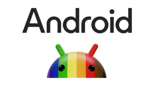
The redesign of 2023 has introduced a super cool and colorful version of the Android logo, with a new color palette and a modernized style of the inscription. The android’s head was redrawn in a three-dimensional way, with its surface set in a vertically striped pattern, with each stripe colored in one of the following shades: purple, blue, green, yellow, orange, red, or brown. The eyes of the creature are now set in black. As for the lettering part of the logo, it was rewritten in the title case, with a more stylish and unique sans-serif typeface, featuring interesting shapes of the characters and bold sleek lines of the bars.
What is an Android mascot?
The Android mascot, a friendly green robot, serves as a central piece of Android’s brand identity, bringing a dimension of approachability and fun to the technology. Its creation was inspired by the desire to offer a tangible face to the android typeface and platform, providing a consistent and inviting visual across various platforms. This mascot has become a testament to Android’s open platform’s diverse capabilities, from powering android devices to integrating with Google Play Store icon, making it a fundamental part of the assets that define Google’s logo and broader brand identity.
Versions History
The Android logo was redesigned again in 2019. And this was the first time when the graphical image got accompanied by lettering. The emblem got reduced to just the upper part of the iconic Android-man’s head, and now the arched fragment with two white eyes and two antennas is placed above the black lowercase wordmark in a simple yet stable sans-serif typeface with full traditional contours of the letters.
What is Android?
Android is the most popular Operating System for mobile devices in the world today. Though it is also used on computers, the popularity came to Android after it was adopted for smartphones. The main competitor of this OS is iOS, used for iPhones.
Android 1.0 Apple Pie (2008 – 2010)
For the first version of Android OS the logo featured a warm and cozy image with an apple pie in brownish shades, and a green apple behind it. There was nothing else on the logo, not even a letter or a monogram.
Android 1.0 Banana Bread (2009 – 2010)
The redesign of 2009 has introduced a new version of the logo with two slices of banana bread in beige and brown, set on a green background with a sun and thick rounded rays coming out of it.
Android 1.5 Cupcake (2009 – 2011)
Another version of 2009 featured a stylized cupcake with the top replaced by a half of the Android-man hard, set in green and outlined in white. The center of the cupcake was decorated by a long and thin candle.
Android 1.6 Donut (2009 – 2011)
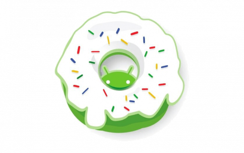
For Android 1.6 Donut version the logo depicted a green Android creature hiding behind the green donut with white cream and colorful sprinkles. It was a funny and very bright images.
Android 2.0 Eclair (2009 – 2011)
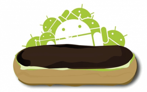
The logo of Android Eclair, also created in 2009, depicted a chocolate eclair drawn on a background with a futuristic geometric image, where the white Android was placed in front of several smaller creatures in green.
Android 2.2 Froyo (2010 – 2012)
The Android Froyo logo featured an image of a frozen yoghurt basket with blueberries and green cream on top. A tiny Android was drawn in gray on the end of the silver spoon, sneaking out of the yoghurt.
Android 2.3 Gingerbread (2010 – 2013)
The Gingerbread version of the Android badge depicted a traditional gingerbread in a shape of Android figure, with the green bow-tile, white details on the face, sleeves and pants, and two red circular buttons.
Android 3.0 Honeycomb (2011 – 2013)
The Honeycomb logo was set in a black and blue color palette with the transparent purple wings of a bee, stylized as an Android man. It was a magical and creative composition, which was used for two years.
Android 4.0 Ice Cream Sandwich (2011 – 2014)
The stylized ice-cream sandwich from another Android badge was drawn in chocolate-brown and white color palette, with the top part of the Android man featuring chocolate biscuit, and the bottom — white paper wrap.
Android 4.1 Jelly Bean (2012 – 2015)
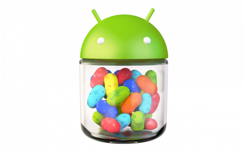
The Jelly Bean logo depicted a can of jelly beans with a rounded green top lid decorated by two short green antennas. It also featured two white yeas. The van itself was transparent, showing all the colorful jellies inside.
Android 4.4 KitKat (2013 – 2017)
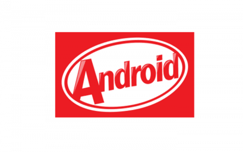
The KitKat version of the Android badge boasted a traditional KitKat badge with the lettering replaced by “Android”. The inscription was set in the same color palette and style as the original one.
Android 5.0 Lollipop (2014 – 2018)
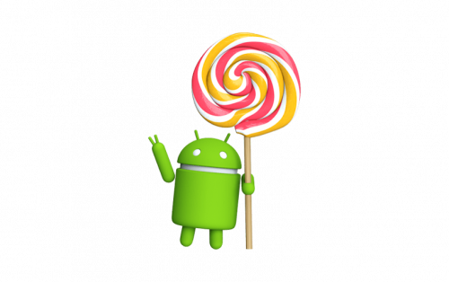
In 2014 a new version of the logo was introduced. The three-dimensional green Android man was holding a huge colorful lollipop, with the wooden stick equal to the height of the Android, and the caramel roundel making up to two heads in size.
Android 6.0 Marshmallow (2015 – 2020)
The Android Marshmallow badge depicts a stylized geometric letter “M” with two triangular peaks, set in a pink roundel with some gradient details on both the central element and the pink background.
Android 7.0 Nougat (2016 – 2020)
The Android Nougat badge depicts a stylized letter “N” in a blue and purple color palette, with the character stylized as a folded ribbon. The “N” is horizontally extended and looks very modern and cool.
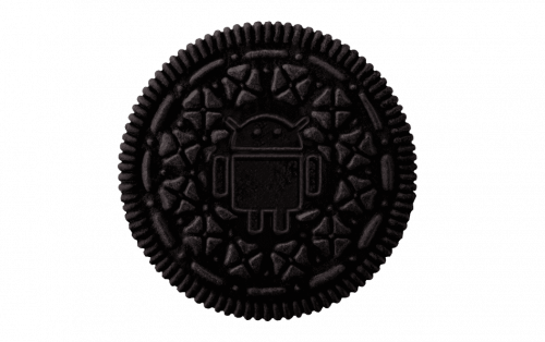
Android 8.0 Oreo (2017 – 2021)
The first Oreo version of the logo depicts a dark brown roundel with decorative elements and the contour of the Android man in the same palette. It was quite a dark image, but looking very realistic.
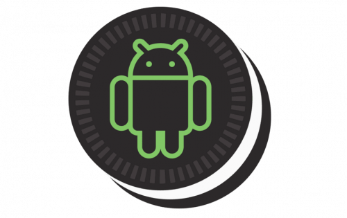
Android 8.1 Oreo (2017 – 2022)
The second Android badge got its palette lightened up, with the contour of the Android man drawn in bright green, which made it more distinctive and friendly.
Android 9.0 Pie (2018 – 2022)
For the Android 9 the logo was introduced in 2018. It is a stylized letter “P” in a bright green and white color palette, with the rounded character outlined in green, and having the bottom border of the vertical bar open.
Android 10 Queen Cake (2019 – 2023)
The logo of Android 10 features a solid green roundel with a white ring inside, and a triangular element, coming out of the bottom left part of the ring, crossing it on the right, and being prolonged to the border of the roundel.
Android 11 Red Velvet Cake (2020 – 2024)
The Android 11 logo depicts a dark blue roundel with a bright green center, surrounded by small blueish dots in different sizes, and a white eye on the right side of the central part. On the right from the white eye the orange “11” is drawn against a blue part of the badge.
Android 12 Snow Cone (2021 – Today)
The 12th Android version logo was executed in a laconic yet bright style with a lightweight white “12” in a futuristic shade written against a solid green roundel. There were no additional elements.
Android 13 Tiramisu (2022 – Today)
For the Tiramisu version of Android, released in 2022, the logo was also quite minimalistic. It was a black-and-white contoured digit on a green banner in the shape of a circular seal with ornate contours.
Android 14 Upside Down Cake (2023 – Today)
Another version of Android OS was released already in 2023, and the logo for it looked super cool, resembling the old-school space-related comics and animations. The roundel in a thick orange outline with the white lettering on it had a black and blue space image in the center, with a bright yellow orbit coming through it.
Android 15 Vanilla Ice Cream (2024 – Today)
The logo of the 15th version of Android, called Vanilla Ice Cream, is executed in the same style as the previous emblem, yet has a triangular shape, with the peak pointing down. The frame on this badge is drawn in an intense shade of green.
Symbol
The Android Logo’s main element is a robot consisting of a quadrangular torso, semicircular head with two antennas on it, and limbs presented by bars with rounded ends. Irina Blok came up with the symbol as she had received a recommendation from her boss to include a robot in the logo.
Shape and colors
Thanks to its very simple and memorable design, the logo did produce the needed effect. It is colored in so called ‘Android Green’, as green symbolizes progress, uniqueness, and striving for novelty. Because it is an open source logo, it has appeared in a variety of shapes: wearing colored clothes, with different facial expressions, etc.
Why is the Android logo a robot?
The Android logo, recognized as a robot, symbolizes the android robots’ autonomy and flexibility, mirroring the Android platform’s capacity to adapt across various devices. This design is more than just an emblem; it acts as a visual signifier of our brand, representing Google’s aim to develop technology that feels like a reliable companion in real-life environments. The robot’s full-body appearance is strategically crafted to be an identifiable element of the Android robot, ensuring it stands out as a key component of the brand identity for all Android devices, from phones to Android Auto, and even in the broader ecosystem of Google apps.


