

![]() Infiniti Logo PNG
Infiniti Logo PNG
Infiniti is a high-end Japanese car brand, which was founded in 1989 and is fully owned and managed by Nissan. The brand operates in more than 50 countries across the globe and is considered to be one of the most popular luxury vehicle manufacturers.
Meaning and history
![]()
In 1985, a group of Nissan specialists was combined into a team whose mission was to create a luxury car division for the production of a new product to be sold on the USA market.
The brand was formed to create a new luxury product of the huge Japanese automobile concern, Nissan, to be exported to the USA. The team of the best Nissan specialists was formed in 1985, and it took two years to come up with the name and the logo for the new brand.
The last letter was decided to be “I”, which made the brand name unique and memorable. The Infiniti logo plays on the name of the brand. The word Infiniti is derived from the English “Infinity”, and “I” – that is, “Me”, and “I”. The brand sign is a stylization of the infinity symbol, also made in one line. The cone inside the oval also symbolizes the road beyond the horizon, to infinity.
It took another two years to manufacture and test the first car, as well as to develop the dealer network at the same time. The market debut of Infiniti took place on November 8, 1989.
In 2004, Infiniti cars became officially available in Canada. And in 2008, at the Geneva Motor Show, it was announced the entry of Infiniti into European markets. Over the next two years, Infiniti dealers appeared in 21 countries in Europe.
Until 2012, Infiniti-branded cars were produced exclusively at the Japanese plant in Tochigi province. Today Infinity cars are produced at six plants: Tochigi and Kyushu in Japan, Aguascalientes in Mexico, Smyrna in the U.S., and Dalian and Sanyang in China.
1989 – 2004
![]()
The original Infiniti logo, introduced in 1989, featured the iconic oval emblem with the triangular cut-it element at the bottom, drawn in bold and flat black lines and accompanied by an uppercase wordmark in a narrowed yet stable geometric sans-serif typeface. The lettering was placed under the emblem and set in the same flat black lines as the graphical part.
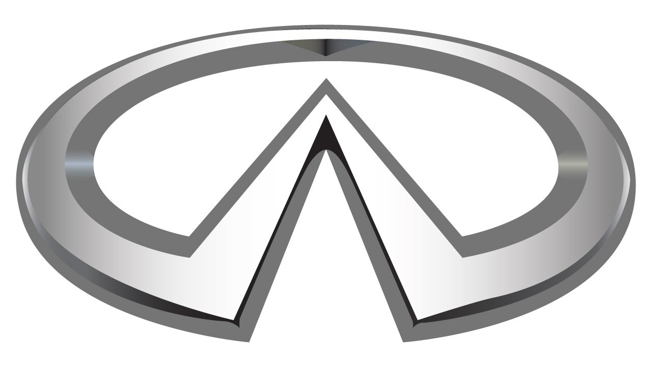
2004 – 2023
![]()
The redesign of 2004 has added volume to the Infiniti logo, making the emblem three-dimensional and redrawing it in gradient silver, with darker shades. The emblem was enlarged, while the black lettering under it got a bit more compact, with less space between the uppercase characters.
2023 – Today
![]()
In 2023 the automaker decided to come back to its original minimalistic style and introduced a flat black logo, composed of the same two elements, but with the lettering part rewritten in a more full-shaped sans-serif font with distinctive contours of geometric stable characters. The emblem got slightly enlarged compared to the initial version too.
The Infiniti brand keeps the memory of its origin. The rounded shape and the style of the brand’s logo make the Infiniti emblem look related to the iconic Nissan badge. Even though, the simplicity of the lines and minimum of the elements only enhance the luxury subtext, working great as a representation of the brand and its philosophy.
Color and Font
The Infiniti wordmark uses all capital letters executed in a traditional sans-serif font, which is similar to Josef Pro Bold, designed by graphical artist Ingo Zimmermann. It’s straight and clear lines look great with the nameplate’s wide spacing and four latter “l” that visually divide Infiniti into syllables.
The color palette of the Infiniti logo is a traditional monochrome, a reflection of elegance and confidence, the perfect choice for a powerful and progressive company — modest and strong.
The Emblem
The iconic Infiniti emblem is the most recognizable element of the brand’s visual identity. It is composed of a stylized infinity symbol, which is a horizontally placed numeral 8.
As well as the brand’s name features “I” instead of “Y” in the end, the lemniscate sign features a sharp angle instead of smooth curved lines of the “8”.
The symbol looks like a triangle formed by the first and last letters “I” of the brand’s name. It also represents the road, which extends into the horizon, and Mount Fuji, which is one of the most famous symbols of Japan.
The Infiniti emblem is executed in metallic gray when placed on the vehicles, and the color makes it look even more fine and luxurious. The brand also uses backlight for the badge on some of the models, then the emblem becomes vivid and looks mysterious and chic.
The brand also alternates matte and glossy variations of the car badge, depending on the model and car color, which is a great reflection of individual approach and custom design.
The Infiniti badge is full of meanings and symbolism, it is an outstanding example of the automobile branding, which is modern, stylish, elegant and instantly recognizable.
What does the INFINITI logo mean?
The sleek minimalistic badge of the Infinity car marque is composed of a stylized triangle, inscribed into a horizontally-oriented oval frame, with the bottom side of the figure cut out. This badge was designed by the famous Lippincott Mercer design bureau and is supposed to represent a road, going to the horizon. The triangular shape of the main badge’s element is also a symbol of growth and success. Another possible meaning of the Infinity badge is a tribute to the Fujiyama mountain, as the triangle resembles a mountain peak.
What is the font of the Infiniti logo?
Usually, the futuristic Infiniti logo is used without any lettering, but sometimes the company complements the iconic badge with the wordmark, set in the uppercase of a geometric sans-serif font, which is pretty close to Josef Pro Bold and has something in common with the well-known Frutiger Next Pro.


