Avid Technology, commonly known as Avid, is an American technology company that specializes in the creation of multimedia tools and technology for media production. Founded in 1987 by Bill Warner, it revolutionized the film and music industries with its innovative software and hardware solutions. The company’s products are primarily used in film, television, and music production. Avid has a broad global presence, operating in multiple countries and serving clients in diverse regions. With its state-of-the-art solutions, Avid has transformed how artists create, manage, and monetize their content, supporting them at every step of their workflow.
Meaning and history
Founded in 1987 by Bill Warner, Avid Technology blazed a trail in the multimedia world with its groundbreaking tools and technology tailored for media creators. Over the years, the company has marked several milestones, including the introduction of the Avid Media Composer, which reshaped video editing processes. The company also played a pivotal role in pioneering the digital non-linear editing system. Its contributions have earned it several industry awards, solidifying its place in the annals of media technology. As of today, Avid continues to be a leading player in the media technology sector, constantly innovating and adapting to the evolving needs of content creators worldwide.
What is Avid?
Avid Technology, or simply “Avid”, is an American company specializing in tools and technology for multimedia production. Founded in 1987, it offers solutions widely used in film, television, and music industries. Their innovations have significantly influenced digital editing and media workflows.
1987 – 1998
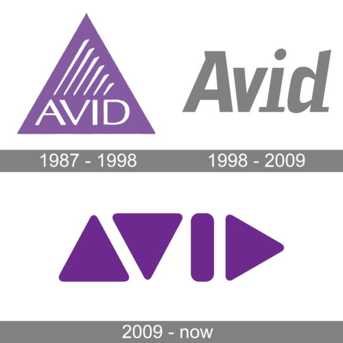
Emerging from a canvas of captivating lilac, the AVID logo seamlessly fuses modern design with symbolic profundity. Dominated by an equilateral triangle, the choice of this geometric shape might be interpreted as a nod to stability, direction, and a unified vision. Inside this triangle are elongated white streaks of varying lengths, reminiscent of the sound waves or perhaps progress bars, denoting movement, dynamism, and possibly the brand’s connection to multimedia and technology.
Positioned perfectly at the base, the word “AVID” is etched in a bold, white, capitalized font, offering a grounded counterpoint to the abstract design above. It lends clarity and recognition to the emblem, ensuring that the brand’s identity remains at the forefront. Overall, the logo exudes a sense of progressive dynamism, a blend of art and technology.
1998 – 2009
Bearing a minimalist charm, this rendition of the AVID logo is stripped of embellishments, focusing purely on the brand’s name. Crafted in a sleek, grayscale palette, the word “AVID” stands out in bold, capitalized letters. Each letter is crafted with precision, showcasing clean lines and sharp edges. The dot above the letter ‘i’ adds a subtle touch of distinctiveness, breaking the uniformity.
The font, contemporary in its design, speaks volumes about the brand’s commitment to modernity and innovation. With its stark simplicity, this logo variant could be seen as a statement of confidence, emphasizing the brand’s reputation and identity without the need for additional graphics or symbols.
2009 – Today
In this avant-garde portrayal of the AVID logo, one is immediately drawn to the trio of purple triangles, each varying in size. These triangles, while interconnected, point in different directions, perhaps symbolizing diverse pathways, perspectives, or solutions. The choice of a deep purple hue is both regal and futuristic, aligning with a brand that prides itself on leadership and forward-thinking.
The brand’s name, “AVID”, is seamlessly integrated into the design. It doesn’t merely sit beside the triangles but interacts with them, with the ‘V’ and ‘I’ converging with the shapes. This could signify a symbiotic relationship between the brand’s identity and its overarching vision. Through this design, the logo might be conveying the brand’s adaptability, interconnectedness, and its ability to think outside the box.


