

The bear symbolizes might, majesty, courage, bravery, valor, determination, and courage. It is a symbol of a warrior’s great strength, dominance, patronage, crushing power, good health, wisdom, fundamental permanence, and wealth, as well as cunning, and ferocity in the defense of their territory.
In North American peoples, the bear is the king of beasts. It is the strongest animal in the northern forests. The bear is treated with respect and reverence here. A totem animal of many northern peoples, it serves as a symbol of the connection between heaven and earth.
The bear is associated with many warlike deities, including the ancient Germanic Thor and the Celtic Artio of Bern (a city in Switzerland, whose name literally means “bear”).
The bear is often found in heraldry, symbolizing the same qualities as the lion: boldness, courage, and majesty. It is these qualities that are conveyed by designers who use the bear symbol to create logos. We are going to talk about bear logos in this article. You will probably notice right away that most of the emblems on the list belong to sports teams. And this is quite understandable, given all the meanings of this symbol, which we have already described above.
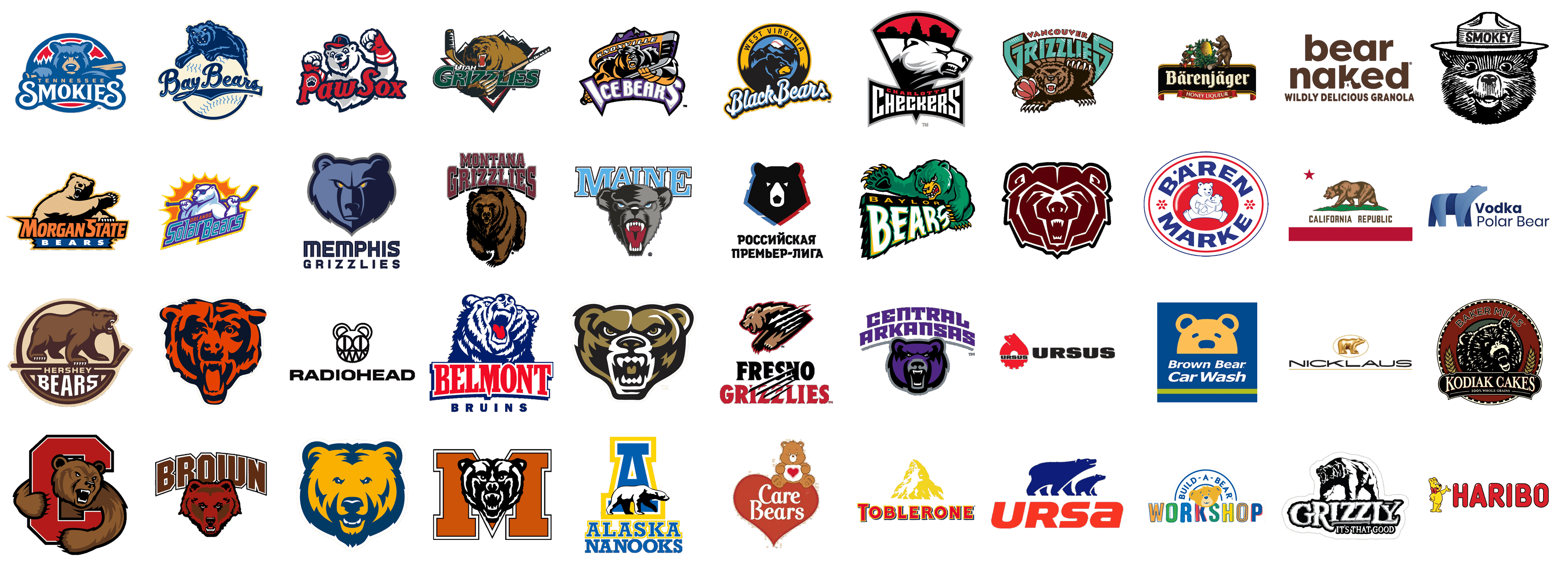
Alaska Nanooks
![]()
The logo of Alaska Nanooks features an illustration of a polar bear, which is slowly walking to the right. The image in black and white is set on a blue and yellow background with the distinctive geometric “A” and accompanied by a two-leveled inscription at the bottom.
Baylor Bears
![]()
The bear from the Baylor Bears logo is drawn in an unusual animal green color palette, which makes the whole composition fantastic and reminds of bright comics. The ferocious animal swings its paw with long sharp claws, posing a threat to the opponent.
Belmont Bruins
![]()
The bear from the Belmont Bruins logo also looks very fierce and menacing. The minimalistic style of the image combined with the patriotic red-white-and-blue color scheme creates a powerful and memorable image that symbolizes strength and fearlessness.
Brown Bears
![]()
It is quite logical that the logo of the Brow Bears team depicts a brown bear. However, the picture is drawn in a brown-red palette, which successfully distinguishes it against the background of the dark geometric inscription. Here the bear is calmer, but this does not detract from its power.
Care Bears
![]()
A cute puffy teddy bear is depicted on the logo of Care Bears, and this is one of those rare occasions, when the animal does not represent strength and fierce, but love and tenderness. The bear’s belly is decorated with a red heart, which repeats the shape of the main banner.
Central Arkansas Bears
![]()
The visual identity of Arkansas Bears is executed in quite an unusual purple and gray color palette, which looks very cool and stylish. The minimalistic way the bear is depicted and the custom mixed case lettering work great together, creating a powerful and progressive badge for the club.
Charlotte Checkers
![]()
The polar bear from the Charlotte Checkers logo looks very wild and aggressive, which is only an advantage for a sports team. The head of the animal, drawn in white, black, and gray, is part of a triangular crest with an arched top, executed with red and black accents.
Chicago Bears
![]()
One of the oldest clubs of the NFL, Chicago Bears, uses just one element in its logo, and this element is an image of a bear’s head, executed in a modern style with the use of dark blue and coral-red shades. The head is drawn in the face, with the growling bear looking directly into the viewer’s eyes.
Cornell Big Red
![]()
The bear from the logo of Cornell Big Red is executed in a pretty naive cartoonish manner, however it still looks fierce and powerful, as drawn with its mouth open and showing its sharp fangs. The bear “hugs” the enlarged geometric “C” in red, symbolizing protection and fight.
Fresno Grizzlies
![]()
The Fresno Grizzlies logo is one of the strongest and most “dangerous” in today’s list. The image of a roaring bear, which looks like it is attacking an enemy, is accompanied by the four sharp claw traces, resembling cold blazes. The same four strokes are inscribed into the two-leveled lettering with the name of the team.
Hershey Bears
![]()
The visual identity of the Hershey Bears hockey team is executed in a warm and calming brown color palette, but the image of a roaring brown bear on it adds fierce strength to the elegant composition. The bear here looks super massive and evokes a sense of power.
Knoxville Ice Bears
![]()
The bear from the Knoxville Ice Bears logo looks like a superhero from comics, and the hockey stick in its paws — is like a powerful weapon. Drawn in an orange, purple, and gray color palette, the logo instantly attracts attention, representing the club as progressive, strong, and confident.
Maine Black Bears
![]()
The black bear emblem from the Maine Black Bears‘ visual identity does not evoke any pleasant feelings. It looks quite repulsive, and its open mouth with long sharp teeth only elevates its unpleasantness. The image of a bear overlaps a light and airy blue lettering in a white and dark blue outline.
Memphis Grizzlies
![]()
The image of a grizzly bear from the Memphis Grizzlies visual identity looks super sleek and stylish. Executed in two shades of blue, with dark yellow eyes, the animal is a perfect depiction of invincibility and determination. The emblem is accompanied by quite a laconic two-leveled inscription in a fancy modern typeface.
Mercer Bears
![]()
The Mercer Bears logo is executed in a classy color palette, composed of red, black, and white. The traditional combination is elevated by quite a traditional drawing of a bear’s head, and a clean geometric shape of a capital “M” on the background.
Missouri State Bears
![]()
A minimalistically stylized bear is the only element on the logo of Missouri State Bears. The image is executed in a laconic geometric style, with reddish-brown elements separated by thin white lines. The bear’s head is outlined in black, which strengthens it and makes it more visible on any background.
Mobile BayBears
![]()
The BayBears logo is executed in a retro style, with the cool’s blue lettering in a script typeface written across the baseball in a smooth slightly yellowish shade. The composition is accompanied by an image of a crawling bear, set in the same blue palette, as the inscription.
Montana Grizzlies
![]()
The bear on the Montana Grizzlies logo expresses with its powerful appearance a sense of ownership and willingness to defend its territory from anyone. In a classic brown and black color scheme, the grizzly bear is set on a simple white background and complemented by geometric lettering in reddish-brown.
Morgan State Bears
![]()
The Montana State Bears logo depicts the bear in a fairly concise style, using a soft beige color and black touches for shading. Despite the fact that the animal is depicted with an open mouth, he does not look aggressive or frightening. On the contrary, the bear seems to politely invite the opponent to fight.
Northern Colorado Bears
![]()
The minimalistic logo of Northern Colorado Bears is composed of just one element — a stylized image of a bear’s head, executed in a bright orange-yellow and blue color palette. The animal on this badge looks very confident and calm, but it doesn’t mean, it is not going to attack.
Oakland Golden Grizzlies
![]()
Another club, that only uses an image of a bear’s head in its logo is the Oakland Golden Grizzlies. But here the bear represents aggression and determination, with its fierce eyes and an open mouth. The image is executed in an olive-brown color palette, which makes it stand out in the list of competitors.
Orlando Solar Bears
![]()
The polar bear from the logo of Orlando Solar Bears looks super relaxed and chill. The animal is wearing stylish shades and holding a hockey stick behind its neck as if it were gym equipment. The composition is decorated by an orange sun with short sharp rays and a cold-blue neat geometric lettering.
Pawtucket Red Sox
![]()
Probably, the friendliest bear of all of the sports club mascots is the one from the Pawtucket Red Sox visual identity. It is more a supportive fan than a fighting player. The bear is drawn in a white and gray palette, with a blue and red cap and gloves, which are balanced by bold red lettering.
Radiohead
![]()
A frightening bear became Radiohead’s symbol in 2000. The bear was drawn by Radiohead’s resident artist Stanley Donwood. He first made him up for his daughter as a creepy character and explained that the bear was evil by the fact that he was very hungry.
Russian Premier League
![]()
In 2018, a stylized image of a forest predator became the symbol of the Russian Football Premier League. The logo was created by Artemy Lebedev Studio, one of the most famous graphic designers in the country. With its shape, the bear’s head resembles a black pentagon, which is an integral part of a soccer ball.
Tennessee Smokies
![]()
The blue bear from the Tennessee Smokies‘ visual identity looks very focused and serious. It holds a baseball bat and is getting ready to start the game. The bear is drawn inside an oval medallion with a red and blue background, depicting forestall landscape, and accompanied by an elegant two-leveled lettering in yellow and white.
Toblerone
![]()
The Toblerone logo features a depiction of the Matterhorn Mountain. If you look closely, you can see a bear on the slope. The explanation is simple: the company is located in the Swiss city of Bern, which has this predator on its coat of arms, and the name of the city means “Bear”.
Ursa
![]()
The company name Ursa means White Bear in Latin. The Ursa logo with stylized silhouettes of a bear and a bear cub is almost the only animated logo on the building materials market. And the sleek blue, red, and white color palette make the logo timeless and full of excellence.
Ursus
![]()
Ursus is the name of a Polish manufacturer of agricultural machinery, and the logo of the company makes up a perfect depiction of its essence. The bright red emblem is a stylized machine gear with a laconic image of a bear inscribed into it. Why a bear? “Ursus” means “Bear” in Latin.
Utah Grizzlies
![]()
The bear from the Utah Grizzlies‘ visual identity looks really terrifying. The huge animal has its eyes red, and its claws extra long. The sense of aggression and power is elevated by the broken hockey stick, held by the bear. The creepy image is accompanied by the mountain landscape in the background and sharp geometric lettering at the bottom.
Vancouver Grizzlies
![]()
Another aggressive bear can be found on the logo of the Vancouver Grizzlies. The grinning animal is twirling a basketball with one paw and the other as if threatening an opponent. A large brown animal holds a heavy, bulky inscription with the name of the team on its shoulders.
West Virginia Black Bears
![]()
The West Virginia Black Bears logo depicts a dark blue and yellow animal on a dark blue background with the moon hiding behind the mountains. All these mysterious shades and elements represent the bear as a spy, who silently walks through the night.
Bärenjäger
![]()
Quite a traditional alcoholic beverage logo of the Bärenjäger features a bold title case lettering with a gothic mood, and a heraldic image of a bear and a man, where the animal takes a larger part. Here the bear depiction sends up to old German fairytales.
Bärenmarke
![]()
The cold and fresh logo of Bärenmarke is executed in a blue, white, and red color palette, and features a cute and touching image of two polar bears — a mom and her cub. Both animals smile tenderly, and their mood makes the whole badge, set in a quite laconic design, evoke a sense of friendliness and caress.
Bear Naked Granola
![]()
It is not easy to find an image of a bear on the logo of the Bear Naked Granola brand. The tiny image of the animal’s head is hidden in the bottom of the letter “K” of the “Naked” part of the inscription. The unusual brown and white color palette in combination with an interesting graphical concept makes up a very memorable design.
Brown Bear Car Wash
![]()
The Bear from the Brown Bear Car Wash logo is drawn in a minimalistic abstract style, with laconic contours and a bright blue and orange color palette. The emblem is accompanied by a two-leveled slanted lettering in a traditional sans-serif typeface, and completed by a thick green underline.
Build-A-Bear Workshop
![]()
The bright and friendly logo of the Build-A-Bear Workshop features a caricaturish image of a bear’s head in the very center. The clumsy and kind animal is drawn in a yellow and blue color scheme, above the multicolor stylized inscription and under the arched “Build-A-Bear” in clean blue lines.
California Republic
![]()
The bear from the California Republic logo is drawn in a very traditional heraldic style, which makes it evoke a sense of stability, strength, and danger. The brown animal is walking on green grass, with no other elements, but the geometric solid red five-pointed star in the upper left corner of the banner.
Golden Bear Jack Nicklaus
![]()
The Jack Nicklaus Golden Bear features a sleek and fancy logo with a three-dimensional golden figure of a polar bear, placed inside a delicate gold oval above the enlarged “Nicklaus” lettering, written in the uppercase of a modern sans-serif typeface with extended contours of the characters.
Grizzly
![]()
The visual identity of the Grizzly brand fully lives up to the name. It looks strong, aggressive, and even a bit scary. The meat here is drawn with its mouth opened, roaring on someone invisible in the left part of the composition. The black-and-white color palette and the stylized uneven typeface of the wordmark only elevate this fighting mood of the badge.
Haribo
![]()
One of the cutest logos with an image of a bear is definitely the badge of the famous sweet treats, Haribo. The animal here is not just a decoration, it is a symbol of the brand, a symbol of all the jelly bears. The yellow and red color palette of the logo makes it look bright, positive, and joyful.
Kodiak Cakes
![]()
Despite being a brand of cakes and cookies, Kodiak Cakes uses an image of quite an aggressive bear for its visual identity. The laconic image in black-and-white is set in the center of a circular medallion with a thick burgundy frame and a black banner with a classy serif inscription at the bottom.
Polar Bear vodka
![]()
The logo of the Polar Bear vodka is executed in a modern and minimalistic style, with the use of a cold blue and white color palette, which emphasizes the “Polar” part of the brand’s name. The schematic silhouette of a bear with clean minimalistic contours is set in the left part of the composition and accompanied by quite a modest two-leveled sans-serif lettering.
Smokey Bear
![]()
The Smokey Bear visual identity is based on a black-and-white depiction of a friendly bear, which wears a classy sheriff hat with the uppercase “Smokey” lettering on the ribbon. The smiling animal evokes a sense of kindness and tenderness.


