![]() Radiohead Logo PNG
Radiohead Logo PNG
Radiohead is a famous British music band, performing rock music style. It was created in 1985 by Thom Yorke and is one of the most popular English music bands, whose name is written in the Rock and Roll Hall of Fame.
Meaning and history
![]()
Though the visual identity of the famous rock band has undergone quite a lot of redesigns, there is one thing, that unites all of the logo versions created — a monochrome color palette. Every badge of Radiohead used black as the main color and mixed it which white background and accents.
What is Radiohead?
Radiohead is the name of a British rock band, which was created in 1985 and has nine studio albums released by today. The frontman and the most famous member of the band are Thom Yorke, who also plays guitar and keyboards. The band also comprises the Greenwood brothers, Philip Selway, and Ed O’Brien.
1992 — 1994
![]()
The very first logo of the band was introduced with its debut album, “Pablo Honey”, in 1992. It was a lowercase sans-serif inscription with the blurred uneven letters placed pretty far from each other. The “R” was the only written in white and placed on a solid black circle, other letters were all black.
1994 — 2000
![]()
For “The Bends” album the new Radiohead logotype was created in 1994. This time the inscription was written in all capitals and executed in an extended and solid sans-serif typeface with smooth angles and clean contours of the letters. The font, used for this emblem was Microgramma Bold.
2000 — 2003
![]()
The redesign of 2000 brought a new logotype for the band, and it could be seen on the cover of their “Kid A” album. The new capitalized wordmark was executed in a bold sans-serif typeface, which was very similar to BD Plakatbau, with pretty massive structures and a sense of style and modernity.
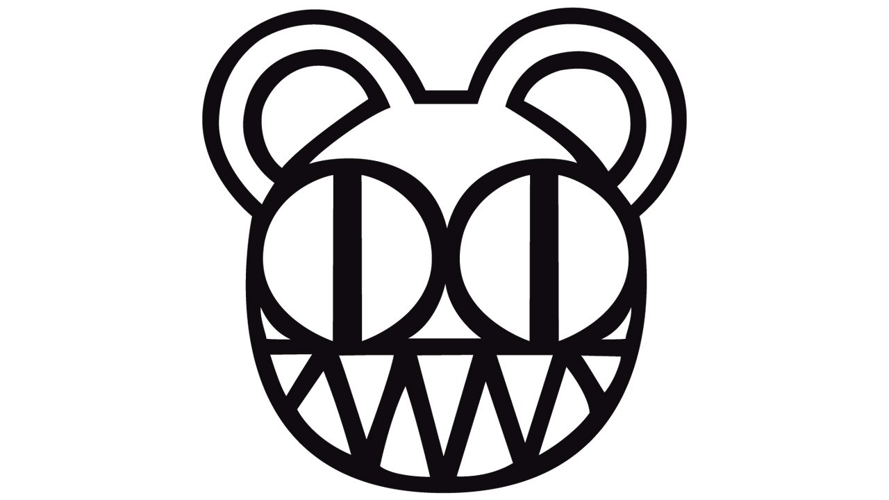
2000 — Today
![]()
The most iconic Radiohead logo was designed in 2000 and is still used by the band. This was the first and only emblem with no lettering on it. The geometric abstract bear, executed in confident black lines can become the band’s signifier and mascot. The new emblem got nicknamed “Modified Bear”.
2003 — 2007
![]()
For the band’s “Hall of The Thief” album, the monochrome logotype was rewritten again. This time the wordmark was set in the title case and used a sleek and elegant serif typeface with smooth bold lines and their edges thin and long.
2007 — 2011
![]()
In 2007 the band starts using a clean and confident sans-serif typeface for its capitalized logotype. There is a lot of air in and around the letters, which makes the whole wordmark look fresh and progressive.
2011 — 2016
![]()
The new album of the band, “The King of Limbs”, was released in 2011, with the new logo on the cover. The wordmark in this version was executed in an extra-or and narrowed sans-serif typeface, which looked intense and stable. The Font was very close to Helvetica Ultra Compressed with its confident and traditional contours.
2016 — Today
![]()
The redesign of 2016 brought a new style to the Radiohead visual identity, writing its capitalized logotype in a traditional medium-weight sans-serif typeface, where each detail and touch are perfectly balanced. For promotional and advertising materials the letters of the wordmark may be emboldened and blurred, while the white negative space of “R”, “D”, “O”, and “A” are being colored black.