

![]() Knoxville Ice Bears Logo PNG
Knoxville Ice Bears Logo PNG
For sixteen years of their history the Knoxville Ice Bears have been consistent as far as their logo is concerned.
Meaning and history
Fans first saw the Knoxville Ice Bears logo in 2002. The team is located in Knoxville, Tennessee, and competes in the Southern Professional Hockey League.
The Knoxville Ice Bears logo doesn’t differ much from the emblems of the other ice hockey teams that use the word “bear” in their names. Needless to say, it features a growling bear which is in black, grey and orange. The beast is holding a stick as a symbol of this particular kind of sports.
![]()
The mountains in the background honor the place where the Ice Bears are located ‒ the Smoky Mountains and Knoxville. The mountains are purple, which is one of the team official colors.
The Wordmark Symbol
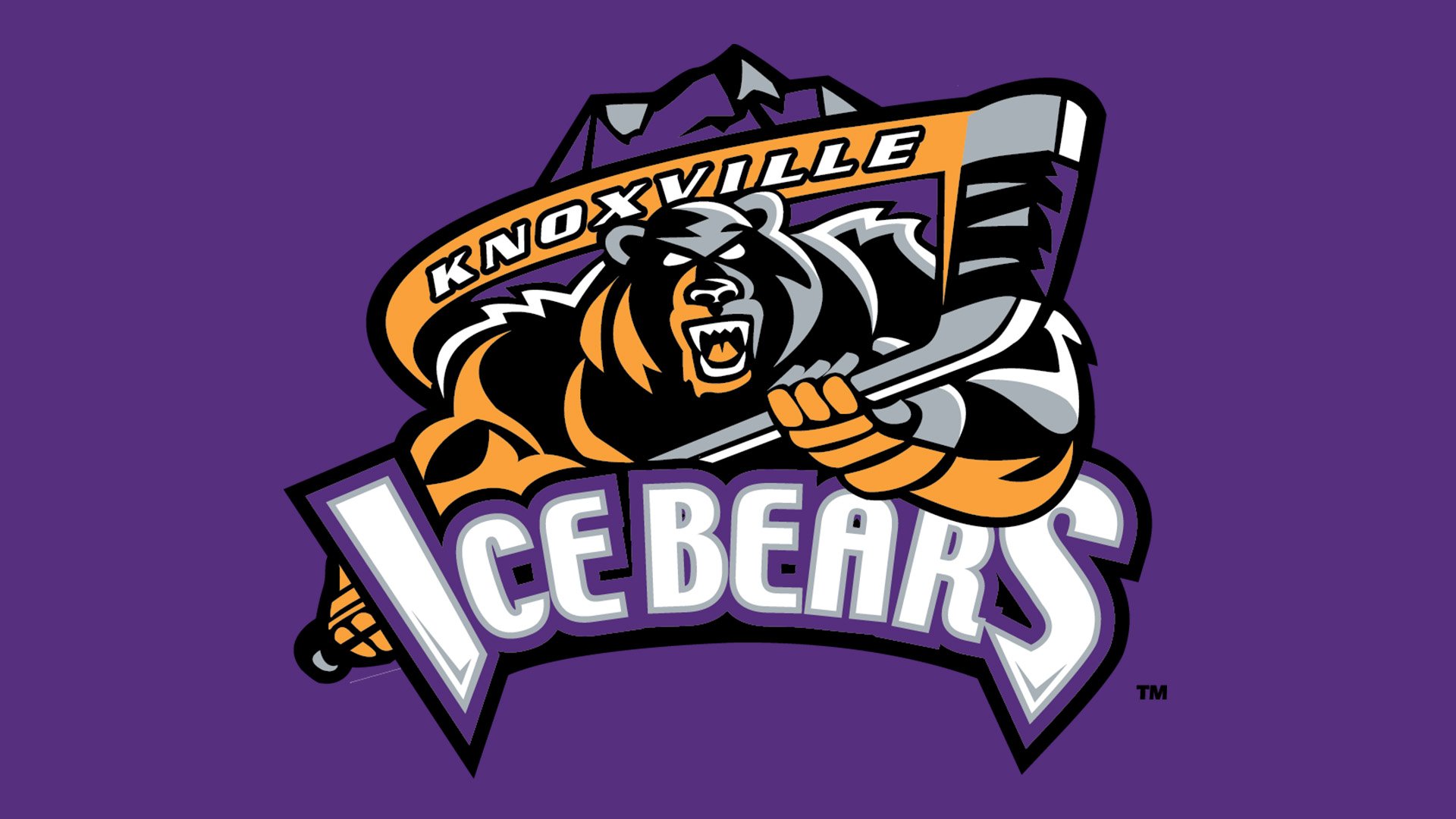
There is a banner with the name of the place above the bear ‒ the white lettering “Knoxville” against an orange background. It is in a simple sans serif typeface and in all caps. The “Ice Bears” in a large extra bold sans serif typeface is underneath. The letters “I” and “S” are larger in size than the other letters that are also uppercase. The wordmark is in white with a purple outline.


