

![]() Ursa Logo PNG
Ursa Logo PNG
Ursa is a Spanish insulation company, which was established in 1949. In the 1990s the company became very popular in the Western European market and at the beginning of the 2000s entered Eastern Europe, where became successful in no time. Today the company operates in more than 40 countries worldwide and has almost 2 thousand employees.
Meaning and history
The Ursa brand was created only in 2004, but the company it grew from, Uralita, has been on the market since 1949. And the Italia visual identity has always been simple and minimalist — a bold italicized wordmark in a blue and red color palette. The Ursa logo took the lettering style and color scheme from its mother brand’s logo but added a fresh and unique emblem, which made the company’s identity remarkable and instantly recognizable across the globe.
The corp’s logo was created in 2004 and redesigned only once, in 2015. There were no major changes made to the company’s visual identity, though it became stronger and brighter.
2004 — 2015
The original Ursa logo was designed in 2004 and depicted two polar bears in light blue, facing left. The calm red wordmark was placed under the bears with a delicate blue “Uralita” tagline in all lowercase letters.
The muted blue and red color palette of the label’s logo was a reflection of the reliable and professional company, which is focused on the quality of its products and tends to show the expertise and authority in the industry.
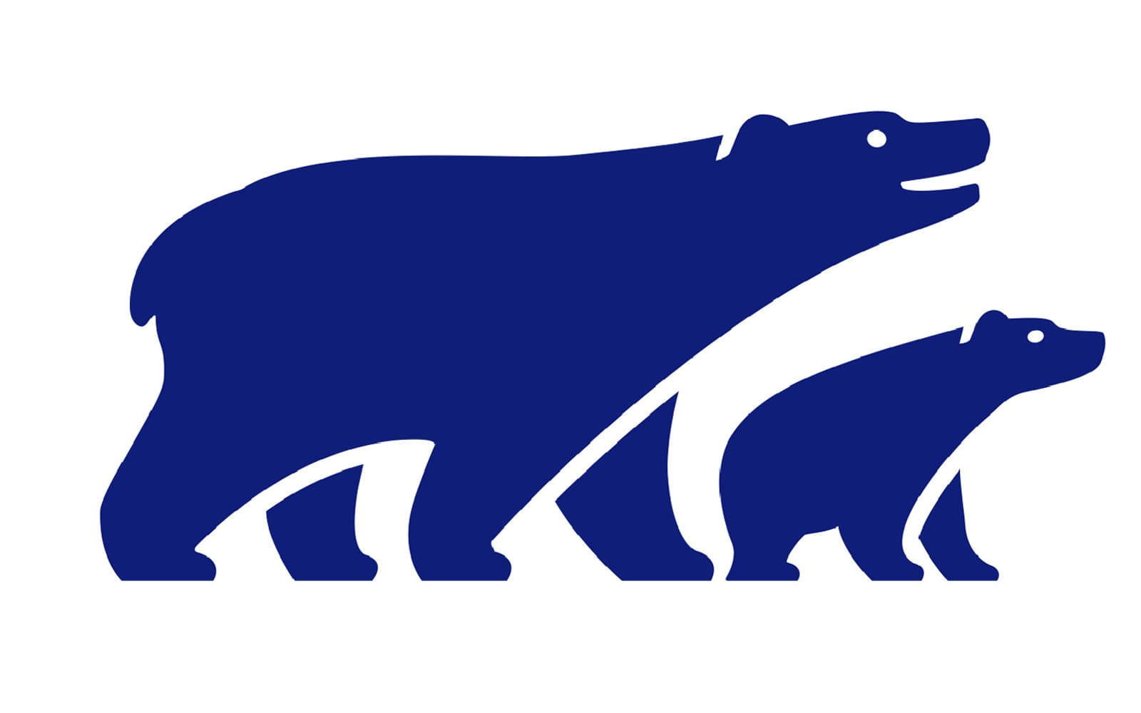
The bears symbolize the main principles of the company: humanity, wellbeing, and closeness. It is a very kind, friendly and meaningful emblem, which makes the company stand out in the list of its competitors.
2015 — Today
![]()
The company’s logo was redesigned in 2015. Keeping the main elements almost untouched. The two polar bears, symbolizing environmentally-friendly approach and protection, are still there, but now facing right and executed in a deeper and brighter shade of blue.
The new direction of the bears represents the company, which is looking into the future and open to innovations. Its progressive approach and energy are also reflected in a new color palette — blue and red are distinct and vivid now.
Font
The tagline was removed from the company’s logo, as for the wordmark, it became brighter and refined. All capital letters of the label’s nameplate are executed in a bold italicized sans-serif typeface, which is pretty close to Snasm Heavy Italic, but with modified contours of “R” and softened rounded “U”.
The sleek and smooth typeface of the Ursa wordmark shows the friendliness and responsibility of the brand, while its thick lines reflect a powerful and confident company.
![]()
Review
Ursa is one of the European leaders in the insulation industry segment. The company, headquartered in Madrid has its production facilities all over Europe and Russia and manufactures mineral wool insulation blocks for residential, commercial and industrial buildings.
The company has over 70 years of experience in its field and knows exactly what it does. They produce high-quality material with perfect water and fire resistance characteristics, which are easy to install. The Ursa insulation is durable and has a long service life, providing comfortable conditions for living or commercial use.
The company also offers a wide range of accessories and complementary products, which help to make the installation process faster and the result — better.


