The minor-league ice hockey club Charlotte Checkers is the AHL affiliate of the NHL’s club Carolina Hurricanes. The Checkers were established in 1990 under the name of Capital District Islanders and were renamed the Albany River Rats upon moving to Albany, New York.
Meaning and history
The Charlotte Checkers, an American professional ice hockey team, were founded by Felix Sabates, an entrepreneur and NASCAR team owner, in 1990. Since its inception, the team has been based in Charlotte, North Carolina. The Checkers started as a franchise in the ECHL (East Coast Hockey League), achieving early success by winning the Riley Cup in their inaugural season. Subsequently, they transitioned to the American Hockey League (AHL) in 2010, aligning themselves as an affiliate of the NHL’s Carolina Hurricanes. This affiliation has been pivotal in their growth and development, leading to notable achievements such as winning the Calder Cup in 2019, a prestigious accomplishment in the AHL.
The Checkers’ success is not just confined to their on-ice performance; they have also become an integral part of the Charlotte community, engaging in various community service activities and initiatives. The team’s current position reflects a combination of sports excellence and community involvement, making them a prominent and respected entity in the world of professional hockey. Their ongoing participation in the AHL continues to provide a platform for developing talent and entertaining a growing fan base, underscoring their significant role in the broader hockey community.
What is Charlotte Checkers?
Charlotte Checkers is a professional ice hockey team competing in the American Hockey League (AHL). Affiliated with the NHL’s Carolina Hurricanes, they boast a history of notable achievements including a Calder Cup victory.
1993 – 2002
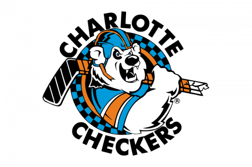
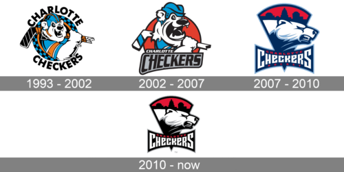
The very first logo of Charlotte Checkers was created in 1993 and stayed with the team for almost ten years. It was a bright playful badge with a caricature of a polar bear as the main element. The animal a hockey helmet and the club’s uniform was placed on a circular background with a blue and black checkered pattern. The bold black lettering in classic sans-serif typeface was written around the perimeter of the badge.
2002 – 2007
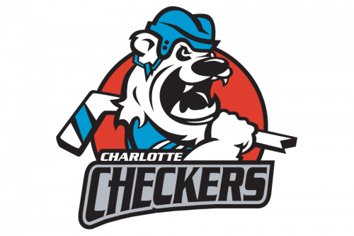
The redesign of 2002 Modernized and simplified the badge of Charlotte Checkers. The bear now looked more dangerous and was placed on a solid red circle in a black outline. The orange color was removed from the uniform, which now turned blue and white. As for the inscription, it moved to the bottom part of the logo, with the “Charlotte” in swore slanted sans-serif letters “sitting” on a gray and black banner with a fancy custom “Checkers” wordmark.
2007 – 2010
Having relocated to Charlotte, North Carolina, in 2007, the team adopted the current name and the logo depicting a bear. The original color scheme included blue, white, and red.
2010 – Today
In 2010, the Charlotte Checkers logo was updated, and, as a result, blue was replaced by black.
Colors
The bear itself is white with silver elements and a black neck. The sky is bright red, the same color as the text “Charlotte.” The lettering “Checkers” is given in white, while the skyline is black.


