 Russian Premier League Logo PNG
The Russian Premier League (RPL) is a top-tier professional football league in Russia. Not owned by a single entity, it operates as a union of the participating clubs. The league is primarily based in Russia, encompassing a variety of teams from different regions across the country. Established to foster competitive and high-quality football, the RPL has become a cornerstone of Russian sports culture, attracting fans from all corners of the nation and serving as a platform for showcasing local talent on an international stage.
Meaning and history
The Russian Premier League was founded in 2001, succeeding the Top Division of the Russian Football Championship. This transformation marked a significant shift in Russian football, aiming to elevate the sport’s standards and international presence. The league’s notable achievements include the successful hosting and performance of Russian clubs in European competitions, particularly the memorable runs in the UEFA Champions League and Europa League. Today, the Russian Premier League stands as a pivotal part of Russia’s sporting identity, consistently nurturing talent and maintaining a significant presence in European football, despite facing challenges and changes in the global sports landscape.
What is Russian Premier League?
The Russian Premier League is a professional football league, representing the pinnacle of club football in Russia. It functions as a union of top-tier Russian football clubs, orchestrating the country’s primary football competition. The league plays a crucial role in developing football talent and contributing to the global football community.
2001 — 2006

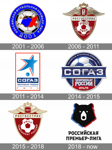
The 2001 emblem depicts a round blue shape with a soccer ball in the middle. On this ball, they also placed the map of Russia – colored in diagonal lines of white, blue and red; with a golden outline and some curvature. The blue frame is a location of the League’s name: ‘Russian Football Premier League’ in Russian. The year 2001 is also written in the bottom.
2006 — 2011

The Russian Premier League badge, created in 2006, was based on the heraldic symbols and the visual identity of the main league’s sponsor, Rosgosstrah, one of the leading and largest insurance companies in Russia. It was a three-dimensional crest with dark red as the color of the background. The upper part of the crest boasted a white and gold composition with a smaller crest having two eagles heads on top and two elongated spread to the sides wings. Between the heads of the eagles, there was a red and gold crown, which balanced the color palette of the smaller crest, with the sponsor’s monogram on it. The main part of the logo was embedded with the red and white image of the football ball, white lettering arched under it, and a white banner with gold lettering, where the Rosgossrah logotype was written.
2011 — 2014
 An old Russian Premier League logo featured a blue star in the form of a football player who is just about to kick a football.
2014 — 2015

The redesign of 2014 refined the Russian Premier League badge, keeping the blue, white, and red color palette, but redrawing the logo, making it glossy and vivid. Now the emblem featured a rounded shape, with the white “Sogas” lettering as the main element. The upper part of the medallion boasted gradient blue and white football ball pattern, while the bottom part was taken by a bright red badge with the “Russian Championship” lettering in all capitals of a modern sans-serif typeface.
2015 — 2018

With the change of the main sponsor, the logo was redesigned again in 2015. As Rosgosstrah came back to the league, their original red white, and goldcrest also returned, being redrawn in a simplified two-dimensional manner with no gradients and extra framing. Now the smaller crest under the eagles’ heads featured a white stylized “1921” datemark, while the placement and style of all other elements remained almost exactly the same as on the initial version, introduced in 2006.
2018 — Today
 In advance of the 2018–19 season, Art. Lebedev Studio developed a new brand identity. Here, one of the country’s most known symbols, a bear, is featured. The creature’s head is inscribed in the pentagon of a football. The colors of the Russian flag, red, white, and blue, are clearly seen on the logo.


