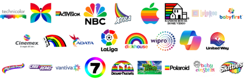
Sometimes, your company’s message can’t be encapsulated in the meaning of just one color. This is completely fine because you can use multiple colors or the whole rainbow. The rainbow, a natural phenomenon that represents color and splendor, has continued to amaze and inspire people for centuries.
The rainbow today is a symbol of the great diversity of people, cultures, religions, and universal tolerance for each other. Moreover, the rainbow plays the role of one of the important symbols in world religions. For example, in the Bible, it symbolizes the union between God and man and also means transformation, different states of consciousness, the meeting of Heaven with Earth, and a bridge between the world and paradise. Rainbows represent good luck and hope for humans. It is a playful and happy color.
Activision
The bright rainbow added to the left of the company’s name adds a fun detail that goes well with its main activity – providing entertainment products. It also reflects the diversity of the Activision products. Moreover, it serves as a symbol of its creativity when developing video games and allows the company to stand out.
ADATA
As the company puts it, the rainbow hummingbird is there to remind people about its commitment to creating a more colorful and intelligent lifestyle for all people. The seven bold colors of the bird perfectly complement a more reserved and professional inscription right next to it.
Apple
Designed by Rob Janoff, it was surely a memorable logo that was easily recognized as a symbol of the Apple company. The Rainbow Strip Apple was created to show the world that Apple developed the first computer that had colors. It stayed with the company even after new versions were designed.
Baby Einstein
Although the logo has only five bright colors, it surely creates a rainbow effect. The use of different colors for the name is easily explainable. They add playfulness and make the company logo instantly associated with baby products. Moreover, the fun colors inject some magic into everyday life.
BabyFirstTV
The rainbow color palette is quite popular in the kid-related industry. The logo depicts a flower with seven petals that create a rainbow as well as a multicolored inscription. It is a magical flower that makes the wishes come true. The muted colors create a calming yet happy and welcoming impression.
Care Bears
Care Bears creates soft and lush toys for joy and comfort. Funny colorful bear cubs love to help all those who find themselves in unpleasant situations. It is not surprising that the purple and white inscription has been decorated with a three-colored rainbow. It serves as a symbol of love and hope that everything will be fine.
CBC
This Butterfly logo appeared as a symbol of the new TV era. It marked the transition to color television instead of black-and-white. The colorful butterfly with warmer colors at the top and cooler at the bottom leaves no one indifferent and instantly attracts attention.
Cinemex
A photo tape featuring a rainbow gradient wrapped around a sphere accompanied the name of the cinema chain. The vivid color palette adds a touch of friendliness and cheerfulness. The colorful globe not only represents the international reach but also the vast diversity of the content.
Copilot
A gradient multicolor palette injects life and energy into the logo. It adds a modern and sleek touch but has a deeper meaning. The company wanted to bring all the different products together under one emblem. Thus, the colors represent each service and app offered by Copilot.
Denver Rockets
Although this logo was designed many years ago, the basketball team wanted the logo to reflect that they support diversity in the community. The rainbow background in the logo was also meant to stand for the vibrancy and growth of the city at the time.
Dickhouse
The American film and TV production company chose to add a perfect semi-circle rainbow above its name. Although there is no clear explanation for this, the radiant image attracts attention and adds a unique and memorable touch to the logo of the company that does not have kids as a target audience.
Hawaii Warriors
The rainbow appeared in the iconic logo of the UH teams after they have been referred to as the “Rainbows” by sportswriters. In fact, there is a saying that they cannot lose a game when the rainbow graces the sky. Given that Hawaii’s weather creates perfect conditions for this, the teams should have plenty of good luck.
LuLaRoe
The pastel rainbow colors in the logo reflect the company’s belief that every single human being is unique and beautiful. The square emblem was done in the same colorful palette as the name became their signature mark. The logo creates a very ambient, relaxing, welcoming, and pleasant atmosphere.
MyLittlePony
The logo looks dreamy and magical just like every character in “My Little Pony”. The rainbow colors not only create a positive and happy mood but also stand for all the colorful and unique ponies. They all have a different combination of colors for the mane and the body, which reflects their character and unique abilities.
NBC
The colorful logo of NBC Broadcasting was inspired by the appearance of color broadcasting as well as the manufacturing of color TVs by the parent company. The beautiful peacock featured in the logo also stands for new beginnings and the ability to express oneself in new ways.
Polaroid
Just like Apple, CBC, NBC, and other companies, Polaroid celebrated the advancement of color film and color screens. The seemingly fun and kid-friendly detail actually represented technological breakthroughs of the time. It reflected pride and excitement for the new era in the industry.
Random House Home
The logo might have been created with the idea that the stories in the books come to life thanks to the Random House Home. Unlike some of the other colorful logos, this one features all the colors of the rainbow, which hints at the diversity, creativity, and individuality of the company.
Seven Network
Seven Network followed the trend and had a rainbow logo designed for it. The logo tells that one can get not only uninterrupted broadcasting but also enjoy an unprecedented variety of shows and movies. The rainbow logo is the network’s second longest-lasting logo.
Skittles
A fun, joyful, colorful, artistic, and kid-oriented logo design was created for the Skittles brand. The colors in the emblem represent the amazing variety of mouthwatering tastes of Skittle candies. Later, they even came up with a slogan that said: “Taste the Rainbow”.
Spanish La Liga
Being introduced in 1993, this bright logo features a football surrounded by the seven colors of the rainbow. The team wanted these colors to show the world that the league is about promoting diversity and unity. The iconic color wheel has been used for twenty years before being replaced by a new design.
Technicolor
The company introduced a rainbow color palette in its visual identity back in the early 1950s. The vivid colors are there for a reason as the company made it possible for Hollywood to color films. It inspires companies to produce the most creative, colorful, and iconic movies, games, animation, and much more. Now, the company is represented under a different name but has retained the color style of its logo.
Treehouse
A fun and positive logo of the Treehouse brings thoughts about childhood and happiness. Given that the target audience is preschoolers ages six and younger, it is not surprising that the designers went for a dreamy, magical, and colorful image for this entertainment company.
United Way
The company has a strong and solid identity and the color gradient chosen for the logo gives it a more friendly, warm, and human approach. It shows respect, care, and hope for a better life. The rainbow represents “a blending of human diversity, creates harmony and unity of purpose”.
Vantiva
For over a century, the company was known as Technicolor. It is a company that brought color to motion pictures and opened the pathway to colorful and bright entertainment. The designers went a creative route and combined the rainbow colors of the original company with the initial of the new name.
Wipro
As the company states, “The multicolored dots are associated with energy and optimism”. It also reflects its commitment to diversity, equity, and inclusion. The company has each color represent specific characteristics and values at Wipro as well as all the different elements that make it up.
Xtra
The rainbow’s message of joy and positivity makes it a desirable color palette for many companies and Xtra is no exception. The colorful rainbow represents the attractive fragrance options for the Xtra detergent. It also shows that this detergent can be used for colored clothes.


