CBC is the abbreviation standing for one of the largest Canadian media companies, the Canadian Broadcasting Corporation, which was established in the middle of the 1930s and is owned by the government. The company is involved in both television and radio industries, along with mass media and several online services.
Meaning and history
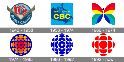
The Canadian Broadcasting Corporation is a company with a long history, so there have been several redesigns of its visual identity held throughout the years, starting at the end of the 1930s. Although the final, winning, concept was introduced already in 1974 and hasn’t changed much since then, but three experimental versions have been created before the company came up with their iconic emblem.
1940 – 1958
The CBC logo, created in 1940, stayed with the network for almost 18 years. It was a logo, designed by Hortense Binette that is modern and strong for its times’ manner. The emblem looked like an aviation badge, with long sharp wings placed in a V-shape over a circular medallion. It was executed in a blue and greenish beige color palette with the red elements, making up the map of Canada on the upper part of the logo, where the blue outlined in white “CBC” monogram in a narrowed sans-serif typeface was placed.
1958 – 1974
The redesign of 1958 introduced a badge in a different style, a more minimalist and appropriate for the new era of the company. A bright blue background had meridians and map contours in dark blue on it. The whole map image was overlapped by bold yellow lettering in two levels. The inscription was executed in a bold geometric sans-serif typeface with massive solid letters.
1966 – 1974
Along with the logo, created in 1958, another badge was used for eight years. It was very significant for the television history concept, created by Hubert Tison in 1966 to celebrate the transition to color television. So the new logo was all about bright shades. It was a stylized abstract butterfly in all the rainbow shades, with a solid black dot as the head of the creature. No lettering was used for the official version of the badge.
1974 – 1985
The iconic CBC logo, which is still used by the network, was designed in 1974 by Burton Kramer. It was an abstract composition, with some kind of a flower, formed by numerous elements, made up of the circle segments. The central element of the badge featured an extra-bold stylized letter “C”. All of the elements were executed in gradients from coral-red to dark yellow, going lighter from the center to the edges, and were placed on an electric-blue background in a shape of a square. The logo got immediately nicknamed “The Gem”. When used with the logotype, the wordmark was executed in a traditional Helvetica Neue Roman typeface.
1986 – 1992
The redesign of 1986 only rethought the color palette of the iconic badge, and the new version was executed in electric-blue and white, which looked super cool and professional. Although, several different color versions were being used by the corporation during this period. And all of them were created by Hubert Tison, the creator of the logo.
1992 – Today
In 1992 the cult badge, designed by Tison in 1974, was refined by Gottschalk + Ash bureaus, keeping the original idea of the flower/Diamond, but emboldening the elements and making the whole composition more geometric than textual. The central elements were switched from the bold “C” to a solid circle and the color palette — from optional combinations to bright red on white.
Font and color
The Canadian Broadcasting Corporation prefers not to use a logotype with its emblem, who ugh when it does, the wordmark is set in a classy and traditional Frutiger family font, which looks modest and elegant and has its contours clean and neat.
The main thing about the CBC logo is definitely its color palette. A combination of scarlet-red and white makes the abstract flower extremely bright and instantly recognizable. The color scheme of the badge evokes a sense of power and progress, along with the passion and energy of the company and its love and dedication to its audience.


