Polaroid is a famous American brand of instant photo cameras, which was established in 1943 by Edwin Land. The brand is also known for its sunglasses with polarized lenses.
Meaning and history

The Polaroid visual identity is truly unique and iconic, and the logo of the brand we all know today is still based on the very first version, introduced by the company in the early 1960s. Some things do not need to be changed much, just a slight modification will work.
What is Polaroid?
Polaroid is an American company, which was established at the end of the 1930s, and has always been engaged in the production of instant cameras and film. Today the company also manufactures digital and action cameras and has its products distributed all over the globe, which makes it one of the most recognizable brands in the industry.
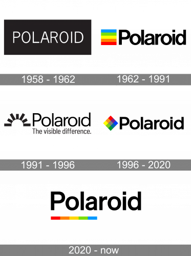
1958 – 1962
The Polaroid logo, designed at the end of the 1950s, has stayed with the company for just a few years and was more of a trial version. The badge featured a horizontally oriented solid black rectangle with a lightweight uppercase logotype written across it in a modern and clean sans-serif typeface. The simple black-and-white badge looked laconic yet professional and stable.
1962 – 1991

The original Polaroid logo, created in the 1960s was composed of a bold black wordmark in the title case with the clean rounded letters placed pretty close to each other, and a square multi color emblem, located on the left from the inscription. The square badge had a striped horizontal pattern, where each wide stripe had its color — blue, green, yellow, orange, and red. This rainbow palette reflected the color spectrum and showed the possibilities of the brand’s products — to save the most colorful moments on the photographs.
1991 — 1996

The logo, designed for the company in 19991 was the only one, executed in the monochrome palette. It features a black title-case inscription in a lightweight sans-serif with straight neat lines and without a dot above the letter “I”. The tagline “The visible difference.” was written under the nameplate uh a narrowed modest sans-serif, also in black. The square bright emblem was replaced by an arch with thick straight lines coming out of it, resembling a rising sun. It was a minimalist and stylish emblem, which showed the brand as a creative and artsy one.
1996 — 2020

The multicolor emblem comes back in 1997, but this time it is a rhombus and the pattern is not striped, but checkered. Placed on the left from the bold sans-serif inscription in black, the bright rhombus looks friendly, stylish, and confident, evoking an artistic feeling and making the imagination work.
2020 — Today
The minimalist approach was brought to the logo in 2020, and today the bold black wordmark, which still looks airy and light, is complemented by a thick underline, composed of five colorful segments — red, orange, yellow, green, and blue.
Font and Color
The Polaroid lettering has always been written in a traditional sans-serif typeface to balance the brightness and geometry of the emblem. As for the current wetsuit, the logotype is written in a font, which is very similar to Basic Commercial Pro Bold, a strong and timeless typeface.
The rainbow color palette, accompanied by a monochrome logotype, is a reflection of the brightness of the world, the colorful object around us, and happiness, which people tend to keep in their memories, and the brand gives them a possibility to save them for future generations.


