Treehouse Original is the name of a tv-channel for kids, which was established in 1997 in Canada. Today the tv-channel is one of the most popular kids content broadcasters, with dozens of series, cartoons, and programs in its portfolio. Formed from the programming block, today it is a self-sufficient channel, owned by YTV Canada.
Meaning and history
Treehouse broadcasts a wide variety of entertaining and educational programs and cartoons for the pre-school age category. Most of its portfolio is taken by the animated series and Nickelodeon programs, which are super popular all over the globe, and on Treehouse, you can see all the latest episodes of the most famous and loved shows.
What is Treehouse Original?
Treehouse Original is a Canadian television channel, which was established in 1997, and today operates in North America, showing cartoons and tv-shows for kids. The channel is specializedincontent for kids ages 2 to 5 and collaborates with such huge tv companies as Nickelodeon and YTV.
As a channel for kids, Treehouse.com had to find a perfect balance between playfulness and brightness in its visual identity, at it was actually reached from the first attempt, with the original logo created in 1997, and only being refined and modernized throughout the years, with no major changes.
1997 – 1999
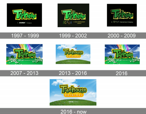
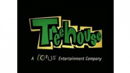
The very first Treehouse logo was designed in 1997 and stayed unchanged for two years. It was a bold and bright logotype in juicy green and yellow color palette, accompanied by the white tagline and placed on a plain solid black background. The bright green graffiti-style logotype was outlined in bold black and set on a yellow banner, which repeated the contours of the jumping wordmark letters. The white tagline was all about the mother company of the channel, saying “ a Shaw Company”, with the “Shaw” in its corporate style.
1999 – 2002
The redesign of 1999 was only about the tagline of the Treehouse logo. First of all, the lettering was changed to “A Corus Entertainment Company”, and secondly, the color was switched from white to yellow. Now the tagline lettering was placed on the left from the Corus logotype — a fancy and playful stylized wordmark with curves and swirls, executed in different colors, from green to red.
2000 – 2009
In 2000 the tagline was refined again, but this time the main logotype was slightly changed as well. The bright green lettering got a bit darkened up and muted, also the disposition of the wordmark was changed — it got slightly turned, which made the banner look more voluminous and widened the black outline of the letters. As for the bottom line of the logo, the Corus custom emblem remained untouched, but now it became a part of “A Corus Entertainment Company” inscription, with all other words written in white smooth cursive sans-serif.
2007 – 2013
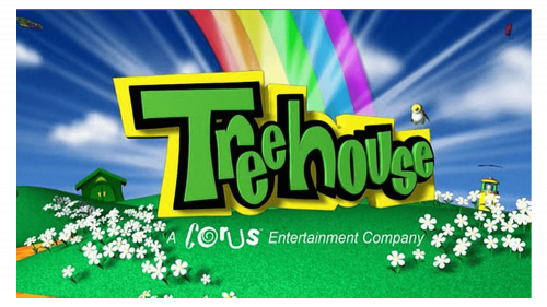
The redesign of 2007 brought the new design approach to the Treehouse logo, placing the logotype and the white (even the “Corus” parts was fully white now) tagline on a bright background with green grass, white flowers, a small house, and an enlarged rainbow coming out of the green and yellow inscription. The upper, sky, part of the badge was decorated by blurred white rays, which added light and freshness to the whole composition.
2013 – 2016
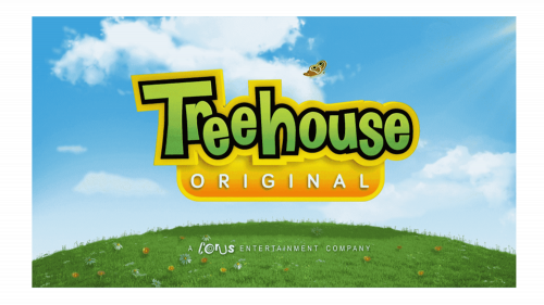
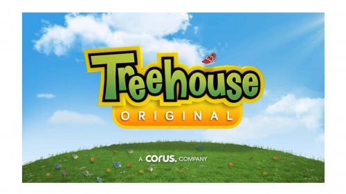
In 2013 the Treehouse Original logo was refined again. Keeping the original green and yellow badge as the main element, but making it look bolder and cleaner, but drawing the letters flat now. The background was also cleaned up, with all extra elements being removed. Now it was a light blue sky, fresh green grass with time colorful flower on it, white clouds, and a red butterfly, flying above the logotype. The tagline was still written in white and got the lines of the letters thinner and more sophisticated.
2016
For a few months in 2016, the channel get back its bright and intense logo, created in 2007. The bold lines, voluminous shapes, and super intense color palette. It was definitely the brightest emblem out of all ever created for the channel. Though it was gone by the end of the year, replaced by a refined version of the badge, introduced in 2013.
2016 – Today
The logo, used by the channel from 2016, was fully based on the one, designed in 2013, with the flat green “Treehouse” lettering in a bold black outline, set above the rounded horizontally stretched yellow banner with the white “Original” inscription in all capitals of a clean and modern sans-serif typeface. No changes were made to the background of the emblem, but the tagline was renewed. The “Corus” with its playful slanted letters was replaced by a bold stylish lowercase logotype in white.
Font and color
The funny and cool Treehouse logotype from the official badge of the TV channel is set in a handwritten sans-serif font, with the traditional shape of the bold title case letters, but a jumpy disposition. The letters dance and jump above the line, making the badge look super friendly.
As for the color palette of the Treehouse logo, it is composed of yellow and green as the main shades, and blue and white as the additional ones. The palette looks vivid and cool, making the badge memorable and recognizable.


