Activision is one of the most successful video game developers in the United States, which was established in 1979. Activision became famous after the release of Call of Duty. The company is also considered to be one of the world’s largest in its segment.
Meaning and history
What is Activision?
Activision is an American company developer and publisher of interactive entertainment content and services on a variety of gaming platforms, including video game consoles, personal computers, and mobile devices. Activision was established in 1979.
1979 – 1988
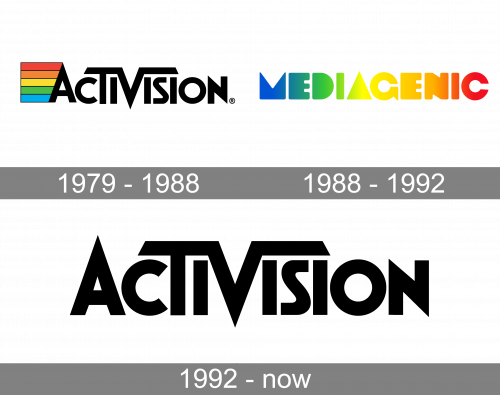
The very first Activision logo, created in 1979, stayed with the company for nine years. It was a stylized black logotype in the uppercase of a custom sans-serif typeface with the bars of the “V” elongated and bent to the sides, covering the neighboring characters. The logotype was accompanied by a graphical element, coming out of the left bar of the letter “A”. It was a trapezoid in a thin black outline, divided into five wide stripes, colored in a rainbow palette.
1988 – 1992
The redesign of 1988 introduced a sleek and bright logo, with the Mediagenic logotype in the uppercase of a custom softened sans-serif font with solid heavy letters colored in juicy gradients from blue to red, with the shades of yellow and green prevailing.
1992 – now
The Activision logo is minimalist and laconic yet it looks sharp and contemporary, reflecting the company’s nature and values.
The Activision logo is based on the wordmark. The inscription in all capitals is exe-cuted in a custom sans-serif typeface with sleek lines and straight angles. The font is similar to Futura, with some elements modified.
Three letters of the wordmark are enlarged — the first “A”, with its elongated pointed peak, “T” and “V”. The letter “V” is the central element of the Activision logo.
Both bars of the “V” are elongated and expanded to the different sides — the left bar connects to the “T” and the right one finished above the letter “I”. Both sides of the horizontal “V” bars have a diagonal gut, which adds symmetry and balance to the whole logo.
The letter “N” has its corners sharp also, and harmonized the pointed angles of “A” and “V”.
The Activision logo is perfectly balanced. Its thick lines have enough space between each other to create a sense of unity and solidness.
The monochrome color palette of the Activision logo is a reflection of a powerful and influential company, which values progress and technological innovations.
Font and color
The bold stylized lettering from the primary badge of Activision is set in a custom sans-serif typeface with sharp angles and straight bars of the letters. The closest font to the one used in this insignia is, probably, Boldini Bold Gradient, but with the contours of some letters modified.
As for the color palette of the Activision visual identity, it is more than laconic — the badge is set in a solid black shade against a white background. This choice makes the sharp and modern logo of the video games developer even edgier and more progressive, at the same time pointing to the professionalism and stability of the company.


