

![]() My Little Pony Logo PNG
My Little Pony Logo PNG
My Little Pony is a brand of toys and cartoons for girls created by Hasbro in 1981. The brand is built around a group of pony-girls each with her own name and character. The toys are extremely popular across the globe as well as the animated tv-series.
Meaning and history
![]()
The My Little Pony visual identity has always been bright and friendly. Oriented mainly on little girls’ audiences, the brand always tried to design a very tender and feminine logo, which will evoke a smile.
1983 – 1988
![]()
The Original My Little Pony logo was designed in 1983 and consisted of a rainbow with an inscription on it. One of the pony characters’ name is Rainbow Dash, and her tail is colored like a rainbow.
The My Little Pony wordmark was written in a smooth and elegant typeface in white color with a delicate blue outline.
1988 – 1992
![]()
In 1988 the logo became brighter and more modern. The lettering gained bolder lines and now had less space between the letters.
1997 – 1999
![]()
In 1997 the rainbow pattern remained, but the arch turned into a waving banner with a white sophisticated inscription in a thin outline and the heart symbol replacing the dot above the “I”.
2003 – 2009
![]()
A completely different emblem was designed in 2003. Now it was a bold modern wordmark placed inside a heart-shaped frame with an additional smaller heart on the top, where the word “My” in the lowercase was placed.
The color of the framing was gradient orange, while the inscription featured a bright purple with pink.
2009 – 2010
![]()
In 2009 the color palette switched to different shades of pink. And the typeface of the wordmark was refined. Now it is a playful custom font with curved tails of the letters and the elongated bar of the “Y”, resembling a ponytail.
2010 – 2016
![]()
The concept, combining both previous versions of the logo was brought up in 2010. Now My Little Pony logo is composed of a bold pink peppering with a rainbow and heart above it. The rainbow is drawn in four different shades of pink and purple, and the Purple Heart contains white “My” is a smooth cursive.
2016 – 2021
![]()
The redesign of 2016 was mainly about the brand’s color palette. The logo in purple, white and pink gained a new light blue shade and became more solid and modern.
The composition of the logo remains the same, but due to the white lettering in a thick purple outline, it looks whole and balanced now.
The My Little Pony logo can be seen not only on the packaging of the toy or on the tv screens, but it is also a famous brand’s emblem, that is placed on various acces-sories and fashion items and looks stylish and contemporary.
2020 – 2022
![]()
This emblem is mostly based off the previous design. They did make the purple outlining brighter and repainted the rainbow to actually look like a rainbow – it became a gradient of red, yellow, green and blue.
2021 – Today
![]()
This then became a secondary logo, and it’s mostly identical to the old 2016 design, except without the turquoise shading all over it.
2021 – Today
![]()
In 2021 the My Little Pony visual identity got another version of the logo. It is a more modest and less ornate logo in a purple and white color palette, with just a three-leveled lettering set against a plain white background with no decorative elements. The style of the outlined inscription repeats the style from the previous version, but the words are proven in straight horizontal lines.
Font and color
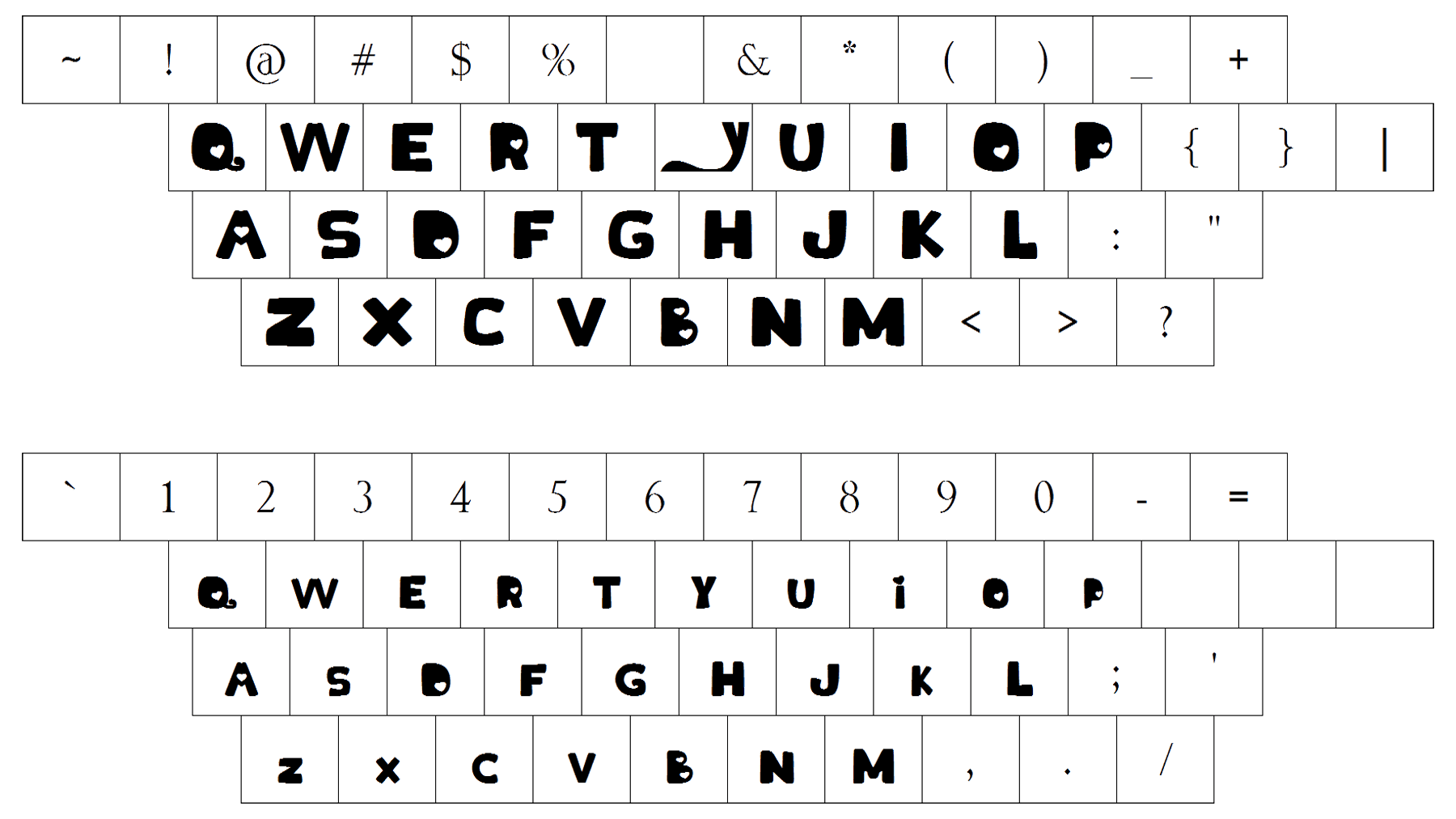
The visual identity of the My Little Pony Franchise has two different lettering styles in it. With the cursive lowercase “My” in a traditional bold script font, and a massive designer “Little Pony” in a rounded outlined sans-serif, with the negative space of some letters replaced by solid hearts.
As for the color palette of the My Little Pony visual identity, it is based on a combination of purple, pink and white, a scheme, that stands for creativity and imagination, and also looks very feminine and elegant.


