

Professional sports has long ago went beyond the borders of purely competition in physical strength, endurance and agility. Now, this is also a competition of creativity, a battle of support groups including fans and cheerleaders. Of course, this is also a competition of logos.
History of sports logo
It is fair to say that the history of sports logos began quite recently – about one and a half centuries ago, at the end of the XIX century. The commercialization of sports led to the natural need of creating recognizable visual images, which, in turn, could be taken out of the sports industry. Due to the appearance of such images, it became possible to create and sell promo products – from t-shirts to household appliances, as well as purely souvenir products. This trick made it possible for the clubs to attract money raising the quality of the game. Therefore, it is not surprising that the need for original and easily remembered logos rose very, very dramatically. The artists who had already proved themselves in industrial design (as well as non-professionals who wanted to conquer new creative horizons) offered their services in creating such logos.
Top criteria for the best logo
There are many criteria that define successful logo (including sports logo). However, it is possible to identify the basic ones since visual symbols and signs are too different to easily fall under some unified system of evaluation.
First, the logo has to be rather concise and easily reproducible. In different periods of history, the truth of this criterion was challenged, especially in the eastern part of the globe. However, today it is laconism that many consider one of the main factors determining the quality of a logo. No wonder that the ancient aphorism states: “brevity is the soul of wit.”
The color solution of the logo has to be chosen in accordance with club’s corporate colors and, at the same time, in accordance with the principles of color harmony.
The logo needs to have a symbolic meaning. This does not mean that the meaning must be objective and the symbolism must be obvious but the meaningfulness of any image and symbol is extremely important, otherwise it is not a logo, but a graphic image without any logical connection to the club.
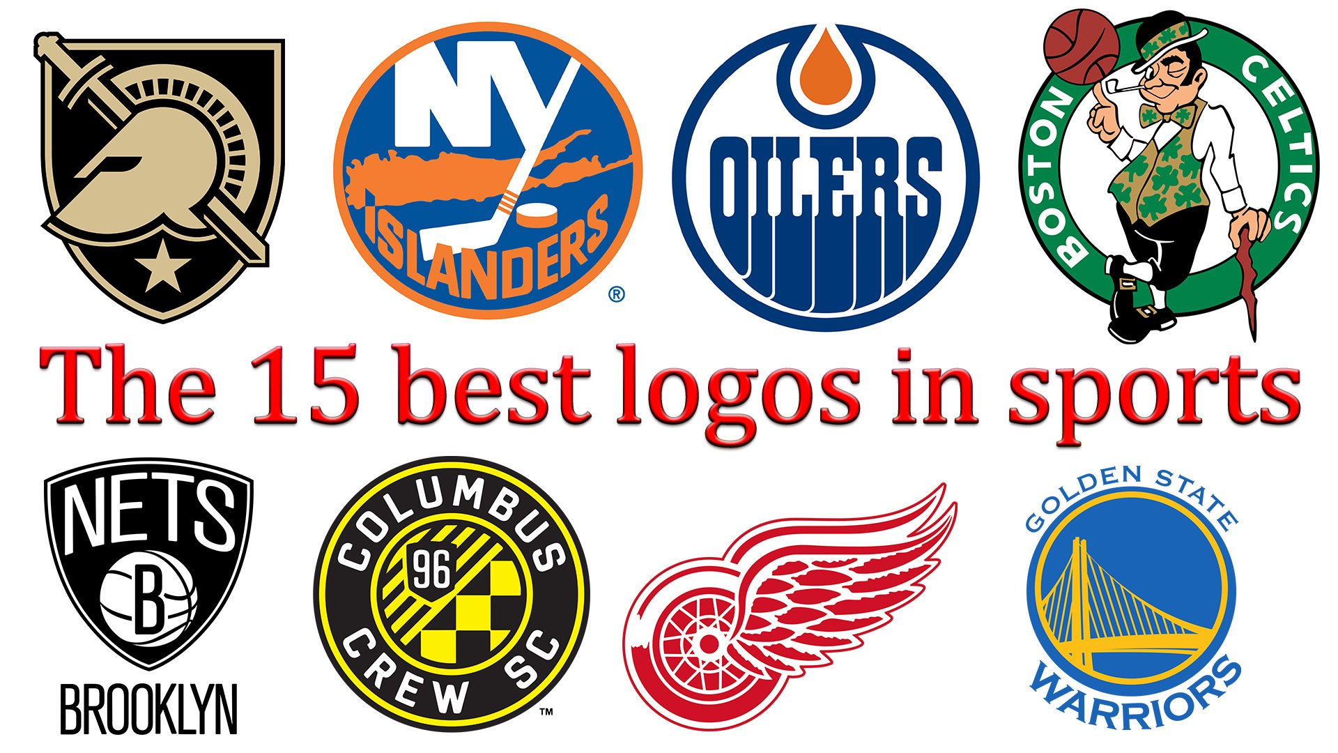
Logos of sports clubs vary in many ways. These include the presence or absence of text, sizes and ratio of logo elements, as well as many other factors. However, the objective of each of them is to become a kind of visual symbol of a sports brand. 15 best sports logos presented below fully cope with this task.
1. Dallas Cowboys
![]()
Dallas Cowboys logo is very concise. This applies to color (only dark blue and background white are used), and the shape itself. The sharp corners of its 5-pointed star express the desire to fight for victory with any, even the most dangerous rival.
2. Golden State Warriors
![]()
The colors of Golden State Warriors logo include blue and yellow. The contour of the logo, enclosed in a circle, contains text element – the name of the club. The center of represents the remarkable venue of San Francisco – its beautiful bridge.
3. Major League Baseball
![]()
The Major League Baseball logo is painted in three colors of the national flag. Blue background on the bigger part of the logo, crimson element on the right emphasizing the dynamics of the hands of a baseball player, presented in the form of a white silhouette. Although formally the central element of the logo is the figure of this baseball player, in fact, the real center is a white ball on a blue background in front of the player.
4. Texas Longhorns
![]()
Unlike many other designs, the bright monochrome color of the Texas Longhorns logo does not imply any additional contrasts. Moreover, the entire dynamics of the logo is focused precisely on the contour of buffalo’s head which does not have a single acute angle. Despite that, it is obvious that with such an opponent should be treated with all due respect.
5. Detroit Red Wings
![]()
The history of Detroit Red Wings logo has been rather long, yet it didn’t really change that much during all these years. Its core has preserved the same: an automobile wheel with two wings growing from its center. It has been slightly modified throughout the following 16 years.
6. Columbus Crew
![]()
Columbus Crew logo is presented in a contrasting three-color form and with a multitude of elements, each filled with its own meaning. There is a “chess” combination of contrasting squares, an alternation of contrasting stripes appealing to the American flag, a stylized image of the coat of arms, and several circles that smooth out the intricacy of the image. The main colors of the team are black and yellow, and the graphic elements of the logo are painted in these colors. However, this combination is quite understandable – such contrast is very noticeable even in the lack of illumination.
All the letters and numbers used in the logo are painted white, which also stands out perfectly on the black background.
7. Kansas Jayhawks
![]()
Kansas Jayhawks logo is a perfect example of how the team’s symbol became the basis for the logo. This cheerful bird with a bright plumage cannot deceive us with its false goodwill. The image has a sufficient number of sharp angles, and the bird’s beak suggests that the opponent should always be on the alert. At the same time, the color solution – red, blue and yellow – emphasizes that the main objective of the club is to bring holiday in the form of sporting event.
8. Brooklyn Nets
![]()
Unlike dozens of other teams, Brooklyn Nets basketball club emphasizes its belonging to the specific sport. The laconism of the color in the logo – black and white – emphasizes its focus on reaching the main objective – winning. Unlike most sports logos, Brooklyn Nets has its own name and a letter “B” in the visual sign that emphasizes the type of the sport.
9. Edmonton Oilers
![]()
The main feature of the Edmonton Oilers logo is its special form. At first glance, this is the circle with the name of the team inside, but on closer inspection, it turns out that the circle is not closed, and the “fiery tongue” at the top of the logo is also framed by a line representing the continuation of the logo frame. In addition, the font conditionally prolongs and “smears” the lower part of the letters of the club’s name.
10. New York Yankees
![]()
One of the most ironic sports logos was created for New York Yankees. The classic hat in the colors of the national American flag, plus the very name of the club – all of it creates the impression of an exceptional ease and playful approach to life and game.
11. New York Islanders
![]()
One of the few tri-color (blue, white and orange) logos was created for the New York Islanders club. The hockey stick, which becomes the part of the stylized letter “Y” emphasizes the club’s type of sport. The dynamics of the logo, enclosed in a round shape, is added by an orange spot in its central part. One of the interpretations of this spot of irregular shape is a “hot ice” which hints at active strategy of the game.
12. Army West Point
![]()
One of the most common forms of logos is the triangular coat of arms. The heraldic prehistory, embodied in modern images, emphasizes the dignity and credibility of the club. The logo of the Army West Point can be considered as a mix of the main “knightly” symbols – a helmet, a sword and a star at the bottom of the helmet. The two-color solution made the logo more vivid and unambiguous.
13. University Of Miami
![]()
The logo of the University of Miami sports team is quite concise. Formally, these are two mirror-like elements of orange and dark green colors that make up the letter “U”. The logo has no sharp corners – all the elements look smooth. It is interesting that the two constituent elements do not touch each other, which creates an unambiguous feeling that this logo (and, accordingly, the university team itself) reflects the so-called unity of opposites.
14. Boston Celtics
![]()
What can be less close to the image of a sports club than a dandy with a pipe in his teeth? However, Boston Celtics decided to “play” on this kind of contradiction. Fashionable shoes with buckles, green clover leaves on a waistcoat and a ribbon on the character’s hat, a sharp cane, a winking eye and a basketball on a finger – each element requires separate attention and creates a single image – cunning, seemingly relaxed leprechaun, who is still true master of his craft. Green color – the “corporate” color of St. Patrick, the patron saint of Ireland and the descendants of the Celts throughout the world – emphasizes that, in addition to the skill, the athletes of the club enjoy the support of their legendary saint – or fabulous leprechauns.
15. New York Jets
![]()
The monochrome New York Jets logo is concise enough to have the easiest (and at the same time unambiguous) reading. At the same time, it contains an indication at the club’s geography (NY), and a baseball, which hints at the type of the sport. It is interesting to note that the general form of the logo – a horizontally stretched oval – duplicates the form of the baseball.
Conclusion
In the realm of professional sports teams, the power of a well-crafted emblem cannot be overstated. It embodies the spirit, history, and identity of a team, connecting fans across generations. From the iconic Chicago Bulls’ symbol in the NBA to the NHL’s storied Montreal Canadiens, each logo serves as a beacon of pride and tradition. The Baltimore Orioles and Boston Red Sox represent the essence of American sports through their distinctive baseball team logos, while the football world shines with the emblematic shields of the Pittsburgh Steelers and New England Patriots. In basketball, the legacy of the NBA is further enriched by the dynamic mascots of teams like the Los Angeles Lakers and the Philadelphia Flyers, whose logos capture the essence of competition and camaraderie.
Across the pond, the football club Manchester United is instantly recognizable by its Red Devil emblem, symbolizing a global brand of football excellence. Meanwhile, the Seattle Seahawks and Oakland Raiders exemplify how a team’s logo can encapsulate the ethos of American football. In Canada, the Toronto Maple Leafs’ maple leaf stands as a national symbol, transcending the sport itself. The Celtics’ logo and the Laker’s emblem highlight the rich history and rivalry within the NBA, bringing fans to their feet with every game.
The New York Knicks, with their distinctive branding, remind us of the cultural impact a logo can have beyond the court. As we celebrate these emblems, from the Philadelphia Flyers to the Chicago Bulls, it’s clear that the artistry behind each logo offers more than just branding. It tells a story of triumph, perseverance, and unity, making the logos of teams like the Montreal Canadiens, Baltimore Orioles, and Boston Red Sox not just symbols, but landmarks in the landscape of professional sports.
In conclusion, this exploration of the 15 best logos in sports has underscored the significance of visual identity in American and international sports. From the NHL to the NBA, and from baseball to football teams, these logos encapsulate the essence, history, and spirit of the teams and their fans. They are not merely designs but are emblematic of the passion, dedication, and heritage of professional sports teams worldwide, making them an integral part of the sports fabric.


