Seven Network is the name of one of the most popular and well-known tv channels in Australia, which was established in the middle of the 1950s. Today the free-to-air channel broadcasts all over Australia and has a wide variety of the most famous tv-shows, series, and programs in its portfolio. The channel has won several awards during its history, mainly for sports events coverage.
Meaning and history
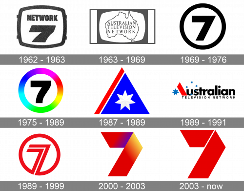
The visual identity of Australia’s second most popular tv-channels, has always been based on the digit “7”. Throughout the years the numeral was executed in different styles, colors, and decorations, but could barely be seen with any additional lettering on the badge.
1962 – 1963
The very first logo for the Seven Network was introduced in 1962, a couple of years after the establishment of the channel. It was a monochrome badge with the frame repeating the shape of the television. Inside the bold black frame, on a white background, the numeral “7” was drawn under the bold uppercase “Network”, set in a massive sans-serif typeface with slightly narrowed letters.
1963 – 1969
The Seven Network changed its name to Australian Television Network in 1963 and stayed like that for almost six years. The new logo was created for that rebranding, and it featured the contoured image of the Australia continent map, with the three-leveled uppercase inscription set in a slightly narrowed sans-serif typeface. The whole image was set on a white background and enclosed into a monochrome frame, which repeated the contours of the television.
1969 – 1976
The name was changed back to Seven Network in 1969, with the new logo designed in the same year. It was a minimalist yet brutal and powerful composition in black and white with the bold digit “7” set on a white background and enclosed into a thick black circular frame. There was nothing else on the badge, and it looked extremely modern and sleek in its simplicity.
1975 – 1989
The redesign of 1975 refined the contours of the logo elements, emboldening them and softening them. The digit now looked more massive yet elegant too, with its right part softened and a bit curved. The black “7” was set on a white background and enclosed into a circular frame, which was bolder than on the previous version, and executed in a lively rainbow color palette, with shades gradients merging one into another with no distinct borders.
1987 – 1989
The company tried to run another identity experiment at the end of 1987, and changed the name of the channel to Australian Television Network, with the new logo concept introduced in 1987. It was a bright triangular badge in blue red and white color palette, with the main blue element having a bold red diagonal line on its left and a white seven-pointed star in the middle. No lettering was added to the logo, it was intense, clean, and sharp.
1989 – 1991
The triangular emblem was refined in 1989, and inscription into a black bold logotype. It was now replacing the letter “A” in the “Australian”, which was underlined by a lightweight uppercase sans-serif “Television Network”. The blue triangle turned white, while the white star became blue. And a few smaller blue stars, resembling snowflakes, were drawn around the first letters of the logotype, adding freshness and even cold to the logo.
1989 – 1999
The experiment didn’t last long and the name of the channel got back to Seven Network again in 1989. The minimalist visual identity concept returned too, but the emblem was refined, with its color palette changed to red and white. The digit was now drawn in two bold red parallel lines set on a narrow white space from each other. The bottom part of the digit merged into a red circular frame. It was a powerful and memorable logo, with the red color standing for passion, strength, and love.
2000 – 2003
The new visual identity era started for the Seven Network in 2000. The iconic “seven in a circle” was replaced by a bold stylized “7” formed from a folded ribbon and set on a plain background without any framing. The version of 2000, which stayed in use for a bit less than three years, featured a delightful gradient color palette, with shades from red to purple in it.
2003 – Today
The redesign of 2003 kept the ribbon style of the logo, leaving the size, thickness, and shape of the iconic “7” unchanged. Although now it was a flat image; with the numeral formed by two thick red elements; placed on a narrow space between each other. The new style of the logo added power and sharpness, with its simplicity elevating the badge, making it timeless and evoking a sense of high quality and professionalism.


