Originally, Skittles were produced by a company in England. Today, the product is manufactured and marketed by the Wrigley Company, which, in its turn, is a division of Mars, Inc.
Meaning and history
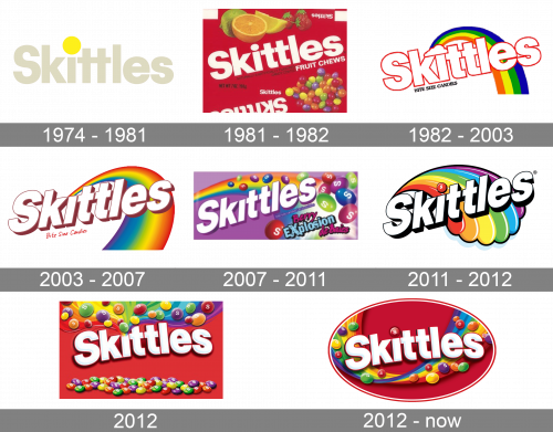
The earliest Skittles logo, which was introduced the same year the product was launched, was almost as eye-catching and colorful as the current one. However, it lacked the meaningfulness the logo has now.
What is Skittles?
Skittles is the name of the candies brand, which was established in 1974 in the United States and today is owned by the Wrigley Company. The colorful Skittles “buttons” with fruity flavor are distributed all over the globe and are known for their cool advertising campaigns.
1974 – 1981
The initial Skittles logo was composed of a light gray logotype with a bright yellow solid dot above the letter “I”. It was a simple and not memorable logo, which stayed with the brand for eight years. The color palette was pretty pale and boring, but the lines were stable and clean, which made the whole logo look confident and balanced.
1981 – 1982
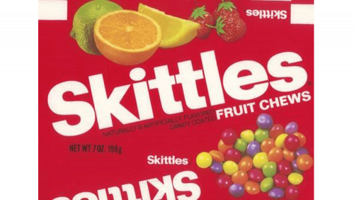
The redesign of 1981 introduced a bright vivid logo for Skittles, with a solid red background and many colorful details — fruits and candies in all the Skittles colors. The logotype in a bold sans-serif title case was written in white characters with clean contours, and set diagonally against a red background. This version of the badge only stayed active for several months.
1982 – 2003
With the redesign of 1982, a huge color palette was added to the Skittles visual identity. Now the white outlines in the red logotype were placed on a rainbow background and accompanied by lots of colorful details and additional lettering in the same style. The inscription was executed in a bold geometric sans-serif typeface and placed slightly diagonally, in the upright direction. The rainbow in the background was a representation of the skittles candies’ variety of tastes.
2003 – 2007
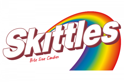
The contours of the Skittles logo were cleaned and refined in 2003. All the extra details were removed from the background, and now only the wordmark, the rainbow, and the “Bite Size Candies” tagline, handwritten in scarlet-red under the main inscription, remained on the logo. Red has obviously become the main color of the Skittles visual identity, even though all the original rainbow palettes remained, slightly blurred and with gradients.
2007 – 2011
In 2007 the Skittles logo gets another redesign. The image with a rainbow was placed on a smooth gradient background in purple-to-white and decorated by Skittles candies, set in various intense shades, with white letters “S” on them. This was a very memorable vivid badge, which stayed with the famous brand for four years.
2011 – 2012
The redesign of 2011 has introduced a refined and strengthened version of the Skittles logo, which was based on the badge, created in 2003. The contours and shadows of the characters became black, and all the stripes on the rainbow gained a black outline, with the shortened and rounded ends of the stripes. The dot above the lowercase “I” was replaced by a red three-dimensional Skittles drop.
2012
In 2012 the Skittles inscription got placed against a weed background again, with the colorful candies placed along the upper and bottom sides of the banner. At the top of the logo, the candies were enlarged and placed with some space between each other, filled with rainbow gradients. The badge was used by the brand for a few months.
2012 – Today
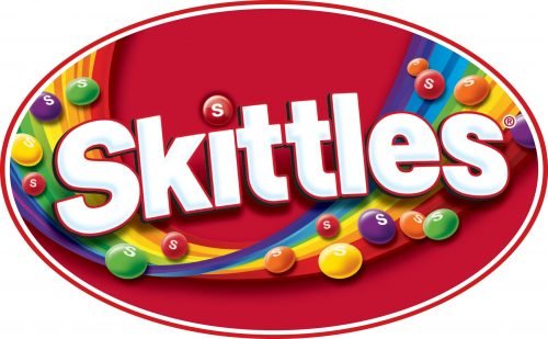
The background was switched to solid red in 2007. The images of Skittles candies were added to the new logo, in different colors, and under different angles. The Skittles logotype was softened and some light gradients were added to the bodies of the letters in order to make the whole badge more vivid and friendly. As for the rainbow, it is still there, but now it’s arching under the wordmark, making up and underline, and looking like a liquid juicy wave, with all the candies spread all over it.
Font
The typeface featured on the Skittles logo resembles the Helvetica Black font, yet it is definitely a heavily customized version.
Color
The rainbow theme has been present in all the variations of the logo launched since 1982, yet there are two colors that dominate the logotype: red and white.


