BabyFirstTV is the name of the world’s most famous tv channel for babies. The channel was established in 2006 in the United States, and today has its programs available to watch all over the globe, with most content translated to more than a dozen of languages.
Meaning and history
BabyFirstTV is the first tv channel created for babies from 0 to 3. The content on this American channel is focused on education and the development of skills, with the programs enlarging kids’ vocabulary and creative abilities.
Owned by the First Media Group, today BabyFirstTV is available in more than 30 countries across the globe, with its content translated into 15 languages. The line up of the channel consists of over 40 various programs, divided into several thematic blocks.
The logo of the tv channel reflects the variety of programs, with each petal of the lively flower standing for one of the blocks. Programs for children’s thinking are marked in yellow, programs for speech development – in red, programs for developing imagination – in pink, programs for the development of communication skills in orange, programs for basic numeracy skills are marked in blue, and feeling are associated with green, while the last, purple petal stands for music.
What is BabyFirstTV?
BabyFirstTV is the world’s first tv channel for babies, with a variety of educational content for the little ones from 0 to 4 years old. Established in the middle of the 2000s in California, today the channel is broadcasted across the globe in several languages.
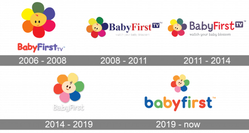
As for the visual identity, the bright and friendly image on the official BabyFirstTV badge has been changed quite many times throughout the years, but always based on one image, a cartoonish flower with petals in different shades.
2006 – 2008
The very first logo for BabyFirstTV was created in 2006, with the launch of the channel. However, the channel itself was founded two years earlier, in 2004. The first badge featured a bright image of a flower with multicolor petals NF a smooth orange central part. The smiling face in red and black looked very welcoming and kind. The graphical emblem was accompanied by stylized bold lettering with the name of the channel, written in red and purple.
2008 – 2011
The redesign of 2008 has added some gradients to the graphical emblem, making it look more voluminous and bright, and rewrote the lettering, placing it on the right from the flower, and executing in a clean and bold serif typeface with distinctive contours. The new wordmark was set in dark blue and red, making the logo look more professional and stable than in 2006.
2011 – 2014
In 2011 the BabyFirstTV logo was redesigned again, with the color palette getting a bit softer, and the lettering on the right from the emblem being rewritten in a modern sans-serif typeface with vivid jumping letters. The colors of the inscription were also softened, with blue getting muted purple and red gaining a calmer hue.
2014 – 2019
The redesign of 2014 has introduced a modified version of the BabyFirstTV logo, with the flower concept remaining untouched, but the shades of petals and the face brightened up and cleaned. The new emblem was placed inside a square above a white shadowed “BabyFirst” lettering in a custom sans-serif typeface.
2019 – Today
After the redesign of 2019, the lettering on the official BabyFirstTV logo was completely changed, being written in a bold lowercase style with rounded stable characters set in different colors, repeating the main shades of the petals in the channel’s emblem. The new inscription looks very friendly and cool, perfectly reflecting the essence of the channel and its mood.
Font and color
The bold lowercase lettering from the primary BabyFirstTV badge is set in a modern rounded sans-serif typeface with full-shaped letters. The closest fonts to the one, used in this insignia, are, probably, Frankfurter Std Medium, Hiruko Pro Bold, or Point Soft Extra Bold.
As for the color palette of the BabyFirstTV visual identity, it is still based on all the rainbow shades, which all have their meaning — one color for one programming block. The colors of the flower brilliantly represent the channel, and make the badge memorable and eye-catching, keeping all the most important features of the company and elevating them to something modern.


