

The right choice of gasoline – comfort, safety, long engine life. High-octane gasoline improves vehicle dynamics, increases engine power, and reduces fuel consumption. That is why the quality of gasoline is so important, which may differ at different gas stations. It is difficult to independently assess these characteristics, so you need to be guided by existing ratings to avoid problems with the engine in the future.
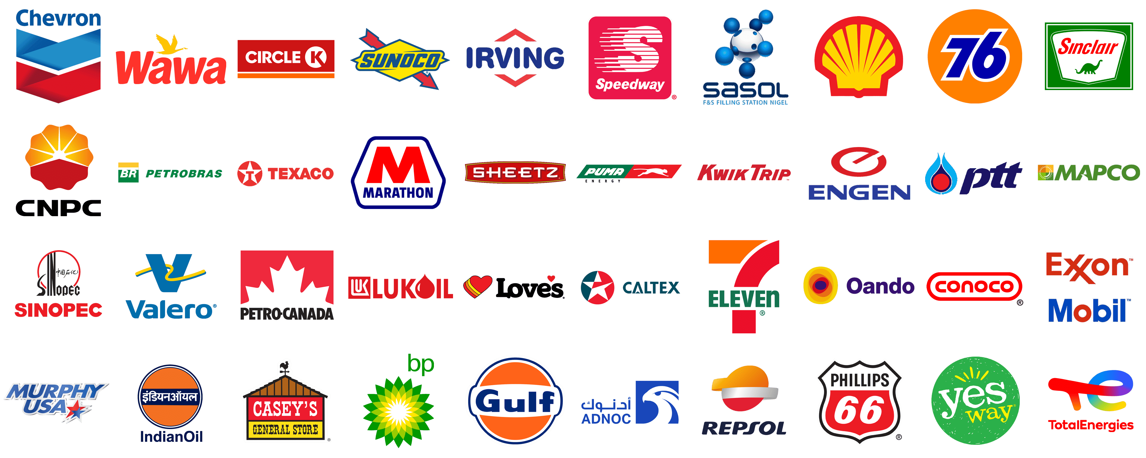
Of course, we will not tell you about the technical characteristics of gas stations, but we want to talk to you about something else. Namely, about the visual identity of brands related to automotive fuel. As you can see from the list of logos below, there are quite a few similarities in gas station emblems. First of all, it is a warm and saturated color scheme, consisting of shades of red, orange, and yellow. After all, these are the colors that most people associate with energy and motion. Secondly, many brands have logos based on interesting geometric elements that speak of progressiveness and confidence.
Caltex
![]()
The Caltex company has a very patriotic and distinctive visual identity executed in a blue, red, and white color palette. Although it is a tricolor of the national flag of the United States, the brand has decided to play with the shade of blue, to add some uniqueness to it. The emblem of Caltex is also full of heritage — a white five-pointed star on a blue and red roundel, with the tricolor cut-out on the right part of the star, colored in red. The star, as we know, is not only one of the national symbols of the USA, but also the emblem of Texas, the Lone Star State, and the motherland of the company. The lettering, set on the right of the emblem, is set in geometric blue capitals; with the negative space of the “A” stylized as a white arrowhead pointing upwards.
Chevron
![]()
The Chevron logo is a combination of a modest title case lettering and a massive geometric emblem in the shape of a traditional chevron, depicting the name of the brand. The wordmark written on top of the composition is executed in a bold and smooth sans-serif typeface, in a light shade of blue, with the small diagonal cut on the top of the “H”s vertical bar. The same shade of blue can be seen also in the upper part of the emblem, the triangular chevron in gradient blue, which is accompanied by exactly the same figure at the bottom, drawn in gradient red.
Marathon
![]()
The visual identity of the Marathon company looks pretty old-school, yet still has the strength and confidence, that represent it at its best. It is a hexagonal banner with four angles rounded, outlined in intense blue with a solid white background of the body. The central part of the medallion boasts an enlarged capital “M” in bright red, accompanied by the “Marathon” tagline in blue capitals of a traditional sans-serif typeface. The sidebars of the massive “M” are a bit flared to the bottom, which adds uniqueness to the badge and makes it look a bit playful.
PTT
![]()
The PTT logo is a very elegant and bright depiction of gas and the energy it gives. The stylish logo is executed in a red and blue color palette, where the blue is used in two shades— deep and dark for the lettering and the part of the emblem, and light blue, which can only be found in the graphical part. The emblem of the company is a stylized flame with a solid red circle in the center. The circle is outlined in dark blue with the top part elongated and pointed, while on the sides it is decorated by two light blue strokes. As for the lettering, it is set in the lowercase of an extra-bold designer typeface with an interesting delicate cut-out at the top of the “P”.
Valero
![]()
The visual identity of the Valero company is airy and calm, due to the use of a smooth and light shade of blue, which is accompanied by a thin yellow accent. The badge is divided into two parts — a massive emblem, and a bold title case lettering, written under it. The emblem of the brand is a heavy uppercase letter “V” in light blue, intertwined with a thin wavy line in blue and yellow. As for the wordmark, it uses the same font as the “V” from the emblem, and looks very stable, just like the emblem.
Wawa
![]()
The Wawa logo is a distinctive and eye-catching emblem featuring the brand name in bold, red lowercase letters. The unique aspect of this logo is the inclusion of a flying goose in vibrant yellow above the text. The goose, with its wings spread wide, symbolizes freedom, movement, and energy, aligning perfectly with Wawa’s dynamic and service-oriented approach. The red lettering is in a smooth, rounded sans-serif typeface, conveying warmth and approachability. The combination of these elements creates a memorable and friendly visual identity that resonates with customers, reflecting Wawa’s commitment to providing quality service and products in its convenience stores and fuel stations.
Circle K
![]()
The Circle K logo is a bold and modern design, easily recognizable by its red and white color scheme. The logo consists of a red rectangular background with the brand name “CIRCLE K” prominently displayed in white, uppercase sans-serif letters. The “K” is encased in a white circle, adding a distinct visual element that enhances brand recognition. Below the red rectangle is an orange stripe, which adds a touch of vibrancy and energy to the overall design. This logo exudes simplicity and clarity, making it instantly identifiable and reflective of Circle K’s straightforward and efficient service in the convenience store and fuel retail industry.
Lukoil
![]()
The Lukoil logo is a powerful and bold design that emphasizes the brand’s strong presence in the energy sector. The logo features the brand name in red, uppercase letters, with a unique design element where the “L” is styled to resemble a drop of oil, signifying the company’s core business. The typeface is clean and modern, conveying professionalism and reliability. The red color symbolizes energy and passion, reflecting Lukoil’s dynamic operations and commitment to excellence. This logo effectively communicates the brand’s identity and its significant role in the oil and gas industry, making it easily recognizable and memorable.
Casey’s General Store
![]()
The Casey’s General Store logo is a charming and rustic design that evokes a sense of nostalgia and community. The logo features a stylized depiction of a traditional barn, with a red and brown color scheme that enhances its rustic appeal. At the top of the barn is a weather vane with a rooster, adding a touch of authenticity and rural charm. The brand name “CASEY’S” is prominently displayed in bold, white letters within a red rectangle, while “GENERAL STORE” is written below in black, traditional serif font on a yellow background. This logo captures the essence of a friendly, down-to-earth general store that serves as a cornerstone in its community.
76
![]()
The 76 logo is a classic and vibrant design, instantly recognizable with its bold color scheme and clean typography. The logo features the number “76” in blue, set against an orange circular background. The typeface is bold and rounded, giving it a contemporary and approachable look. The orange circle signifies energy and enthusiasm, while the blue numbers add a touch of stability and trustworthiness. This iconic logo is synonymous with the brand’s history and reputation in the fuel industry, representing reliability and a commitment to quality service.
Petrobras
![]()
The Petrobras logo is a modern and sleek design that reflects the brand’s innovative approach in the energy sector. The logo features the abbreviation “BR” in white, set against a green rectangular background with a yellow stripe at the top, symbolizing the Brazilian flag and the company’s national pride. Adjacent to this is the brand name “PETROBRAS” in green, bold, uppercase letters, which stands for Brazilian Petroleum Corporation. The green color represents the company’s commitment to sustainable and environmentally friendly practices, while the overall design exudes professionalism and reliability, making it a strong representation of the brand’s identity.
Indian Oil Corporation
![]()
The Indian Oil Corporation logo is a vibrant and culturally significant design, showcasing the brand’s deep-rooted presence in India’s energy sector. The logo features an orange circle with a blue horizontal stripe in the middle, containing the brand name in white Hindi script on the top and “IndianOil” in English at the bottom. The typeface is modern and bold, symbolizing strength and trust. The use of orange signifies energy and dynamism, while the blue represents stability and reliability. This logo effectively captures the essence of Indian Oil’s commitment to fueling the nation’s progress and development.
Shell
![]()
The Shell logo is one of the most iconic and recognizable designs in the energy industry, featuring a stylized yellow scallop shell with red outlines. The simplicity and elegance of the shell design symbolize the brand’s deep connection to its origins and its global reach. The yellow color represents energy, optimism, and innovation, while the red outlines add a touch of boldness and visibility. The clean and modern design of the Shell logo reflects the company’s commitment to quality, reliability, and forward-thinking in its operations. This timeless logo has become a symbol of trust and excellence in the fuel industry worldwide.
7-Eleven
![]()
The 7-Eleven logo is an iconic design, characterized by its vibrant color palette and bold typography. The logo features a large, stylized “7” in red with an orange block forming the top part of the digit. Directly beneath the number, the word “ELEVEN” is displayed in a bold, green, uppercase sans-serif typeface, creating a striking contrast against the “7.” This combination of colors and elements conveys energy, convenience, and freshness, aligning with 7-Eleven’s brand identity as a leading convenience store chain. The design’s simplicity and clarity make it instantly recognizable and synonymous with quick, reliable service and a wide array of products.
BP
![]()
The BP logo is a sophisticated and modern design, featuring a green and yellow helios symbol that resembles a stylized sunburst. The gradient effect within the helios adds depth and dynamism to the logo, reflecting BP’s commitment to energy and environmental sustainability. Positioned to the upper right of the helios is the lowercase “bp” in a sleek, green sans-serif typeface, which adds a touch of modernity and approachability. The color green symbolizes environmental consciousness, while the yellow signifies energy and optimism, perfectly encapsulating BP’s brand values and forward-thinking approach in the energy sector.
Yesway
![]()
The Yesway logo is a playful and inviting design, featuring the brand name in a dynamic, hand-drawn style. The logo consists of the word “yes” in large, white lowercase letters with a distinctive, uneven typeface, and “way” in a smaller, yellow, cursive script, all set against a vibrant green circular background. Above the “yes” are yellow rays, resembling the sun, which add an element of positivity and warmth. This cheerful color scheme and informal typography convey a sense of friendliness and approachability, reflecting Yesway’s mission to provide convenient, customer-focused service in a welcoming atmosphere.
Adnoc
![]()
The Adnoc logo is a modern and powerful design, emphasizing the brand’s strength and vision in the energy sector. The logo features a stylized falcon’s head in white, set against a blue rectangular background, symbolizing precision, focus, and determination. Adjacent to the falcon image is the brand name “ADNOC” in bold, blue uppercase letters, accompanied by Arabic script above it. The blue color signifies stability, trust, and reliability, while the falcon represents the brand’s heritage and forward-looking approach. This combination creates a strong and memorable visual identity that communicates Adnoc’s commitment to excellence and leadership in the oil and gas industry.
Sinclair
![]()
The Sinclair logo is a distinctive and nostalgic design, featuring the brand name in bold, red cursive letters set against a white shield-shaped background with green borders. Below the brand name is a green silhouette of a brontosaurus, which has become a symbol closely associated with Sinclair’s brand identity. The use of the dinosaur reflects the company’s long history and its roots in the early days of the oil industry. The color green signifies growth and sustainability, while the red adds a touch of vibrancy and energy. This logo effectively blends tradition with a modern aesthetic, making it easily recognizable and memorable.
Speedway
![]()
The Speedway logo is a dynamic and energetic design, featuring a bold, stylized “S” in white with horizontal lines extending from it, set against a bright red square background. Below the “S” is the brand name “Speedway” in a clean, white sans-serif typeface, which enhances readability and modern appeal. The horizontal lines symbolize speed and motion, aligning perfectly with the brand’s name and identity. The red color represents energy and excitement, making the logo stand out and easily recognizable. This design effectively communicates Speedway’s commitment to providing fast and efficient service, reinforcing its position as a leading brand in the fuel retail industry.
Gulf Oil
![]()
The Gulf Oil logo is a classic and timeless design, featuring a bright orange disc with a horizontal white stripe across the center. Within the stripe is the brand name “Gulf” in bold, blue uppercase letters, using a clean and modern sans-serif typeface. The orange disc symbolizes energy and vitality, while the blue lettering conveys trust and reliability. This combination of colors and elements creates a striking and memorable visual identity that has stood the test of time. The logo reflects Gulf Oil’s long-standing heritage and its commitment to quality and excellence in the fuel industry.
Phillips 66
![]()
The Phillips 66 logo is a robust and classic design, inspired by the iconic shape of U.S. highway shields. The logo features a shield with a white background, outlined in black, with a bold red panel at the bottom. Within the shield, the brand name “Phillips 66” is displayed in black uppercase letters at the top and white numerals “66” within the red panel. This design evokes a sense of heritage and reliability, reflecting Phillips 66’s long history and strong presence in the energy sector. The shield shape symbolizes protection and trust, while the color scheme enhances visibility and recognition.
Sunoco
![]()
The Sunoco logo is a bold and dynamic design, instantly recognizable with its striking color scheme and distinct shapes. The logo features the brand name “SUNOCO” in uppercase, bold, blue letters set against a bright yellow diamond-shaped background. Enhancing the logo’s sense of motion and energy, a red arrow with blue outlines pierces through the diamond, pointing to the right. The combination of the yellow, blue, and red colors creates a vibrant and energetic visual identity, perfectly aligning with Sunoco’s commitment to providing high-quality fuel and services. The arrow symbolizes speed and progress, reinforcing the brand’s dynamic nature and long-standing presence in the fuel industry.
TotalEnergies
![]()
The TotalEnergies logo is a modern and colorful design, representing the company’s evolution and diverse energy portfolio. The logo features a stylized “TE” in a gradient spectrum of red, orange, yellow, green, and blue, symbolizing the company’s commitment to various forms of energy. The letters are intertwined, reflecting integration and synergy. Below the emblem, the brand name “TotalEnergies” is displayed in a clean, red, lowercase sans-serif typeface, which adds a touch of approachability and modernity. This vibrant and contemporary design conveys the company’s forward-thinking vision and dedication to sustainability and innovation in the energy sector.
Murphy USA
![]()
The Murphy USA logo is a bold and patriotic design, reflecting the company’s American heritage and commitment to service. The logo features the brand name “MURPHY USA” in uppercase, blue letters with a 3D effect, set against a white background. To the right of the name, a red and blue star with white outlines adds a dynamic and striking visual element. The blue color signifies trust and reliability, while the red symbolizes energy and passion. This combination creates a powerful and memorable logo that communicates Murphy USA’s dedication to providing high-quality fuel and convenience services across the United States.
CNPC
![]()
The CNPC (China National Petroleum Corporation) logo is a sophisticated and modern design, symbolizing the company’s strength and global presence in the energy sector. The logo features a stylized sunflower with petals in gradient shades of orange and red, creating a sense of warmth and energy. The petals form a circular shape with a white center, symbolizing unity and focus. Below the emblem, the brand name “CNPC” is displayed in bold, black uppercase letters, using a clean and modern typeface. This design effectively communicates the company’s commitment to innovation, sustainability, and excellence in the oil and gas industry.
Sinopec
![]()
The Sinopec logo is a dynamic and culturally significant design, emphasizing the company’s strong presence in China’s energy sector. The logo features the brand name “Sinopec” in bold, red uppercase letters, using a clean sans-serif typeface. Above the name, a black and red circular emblem includes stylized Chinese characters and vertical lines, symbolizing industrial strength and growth. The red color signifies energy and passion, while the black adds a touch of sophistication and stability. This combination of elements creates a powerful and memorable visual identity that reflects Sinopec’s commitment to excellence and leadership in the global energy market.
Conoco
![]()
The Conoco logo is a sleek and modern design, easily recognizable by its distinct red color scheme and clean typography. The logo features the brand name “Conoco” in lowercase, bold, red letters, enclosed within a rounded rectangular border, also in red. The typeface is smooth and modern, conveying a sense of reliability and innovation. The use of red symbolizes energy, strength, and passion, aligning with Conoco’s dynamic presence in the oil and gas industry. This simple yet effective design ensures high visibility and instant recognition, reinforcing the brand’s identity and commitment to quality and excellence.
Texaco
![]()
The Texaco logo is a classic and iconic design, symbolizing the brand’s long-standing heritage and reliability in the energy sector. The logo features a bold red circle with a white star in the center, and a red “T” in the middle of the star. Next to the emblem, the brand name “TEXACO” is displayed in uppercase, red letters, using a clean sans-serif typeface. The red color signifies energy and passion, while the star symbolizes guidance and excellence. This timeless design reflects Texaco’s commitment to providing high-quality fuel and services, making it one of the most recognizable logos in the industry.
Kwik Trip
![]()
The Kwik Trip logo is a straightforward and modern design, reflecting the brand’s focus on convenience and efficiency. The logo features the brand name “Kwik Trip” in bold, red letters, using a clean and italicized sans-serif typeface to convey motion and speed. The simplicity of the design ensures high visibility and instant recognition, aligning with Kwik Trip’s commitment to providing quick and reliable service in their convenience stores and fuel stations. The red color symbolizes energy and enthusiasm, perfectly capturing the brand’s dynamic and customer-focused approach.
Sasol
![]()
The Sasol logo for F&S Filling Station Nigel is a vibrant representation of molecular energy, reflecting the company’s commitment to innovation in the energy sector. The design features a central sphere adorned with multiple smaller blue spheres interconnected by thin lines, creating a 3D molecular structure. The central sphere is white with blue accents, while the surrounding spheres are a gradient of blue, symbolizing various elements of the energy process. Below the emblem, the name “sasol” is written in a bold, futuristic sans-serif typeface in dark blue, providing a strong, modern look. The additional text “F&S FILLING STATION NIGEL” is displayed in a lighter blue, ensuring the local station’s identity is clear and distinct. This logo effectively combines scientific imagery with a clean, modern aesthetic to convey Sasol’s role in advanced energy solutions.
Repsol
![]()
The Repsol logo is an iconic representation of the company’s identity in the energy industry. It features a dynamic, three-part emblem consisting of a stylized orange and red sphere intersected by a white, curving band. The orange top and red bottom of the sphere represent energy and warmth, while the white band cutting through symbolizes a clean, innovative pathway. Below this vibrant emblem, the name “REPSOL” is rendered in a bold, uppercase sans-serif font in navy blue, providing a solid and trustworthy appearance. The interplay of colors and shapes in the logo captures the essence of energy movement and innovation, reflecting Repsol’s commitment to modern, sustainable energy solutions. This design is both visually striking and symbolically rich, making it instantly recognizable and memorable.
Oando
![]()
The Oando logo is a vivid and contemporary design that emphasizes the company’s dynamic presence in the energy sector. It features a series of concentric circles in warm shades of yellow, orange, and red, with a dark blue central dot, resembling a target or a radiating energy source. This arrangement symbolizes focus, energy, and impact. To the right of this emblem, the name “Oando” is presented in a bold, rounded sans-serif typeface in deep purple, contrasting sharply with the warm hues of the emblem. This combination of colors and shapes creates a harmonious balance, reflecting Oando’s vibrant and forward-thinking approach to energy. The logo’s modern aesthetic and strong visual impact make it easily identifiable and convey a sense of reliability and innovation.
Love’s Travel Stops
![]()
The Love’s Travel Stops logo is a heartwarming and welcoming design that embodies the company’s commitment to customer service and care. The logo features a stylized heart made up of three layered bands in red, orange, and yellow, symbolizing warmth, love, and hospitality. Adjacent to the heart, the word “Love’s” is written in a playful yet sturdy sans-serif typeface in black, with a smaller heart dotting the “i”. This clever use of the heart motif reinforces the company’s name and brand ethos. The bright colors and friendly design elements of the logo create a positive and inviting image, making it memorable and easily recognizable. Love’s Travel Stops’ logo effectively communicates their dedication to providing a pleasant and caring experience for travelers.
Petro-Canada
![]()
The Petro-Canada logo is a bold and patriotic emblem that reflects the company’s strong Canadian roots. It features a prominent red maple leaf, a national symbol of Canada, placed atop a white background. The maple leaf is stylized with sharp, clean lines, conveying strength and reliability. Below the maple leaf, the name “PETRO-CANADA” is displayed in bold, uppercase sans-serif lettering in black, providing a striking contrast against the red and white. The simplicity and power of this design make it instantly recognizable, symbolizing the company’s commitment to serving Canadians with pride and excellence. The Petro-Canada logo’s strong national imagery and clear typography create a sense of trust and dependability, reinforcing the brand’s position as a leading energy provider in Canada.
Pilot Flying J
![]()
The Pilot Flying J logo combines modernity with a sense of adventure, reflecting the brand’s extensive network of travel centers across North America. The logo features the word “Pilot” in bold, red uppercase letters, utilizing a clean, sans-serif typeface that conveys strength and reliability. Adjacent to it, the “Flying J” part of the logo includes a stylized red “J” that morphs into an upward-pointing arrow, symbolizing progress and direction. The simplicity and clarity of this design ensure that it is easily readable and memorable, even from a distance. The use of red conveys energy and dynamism, while the arrow element introduces a sense of movement and travel. The Pilot Flying J logo effectively encapsulates the brand’s mission to support and fuel the journeys of travelers across the continent.
Hess
![]()
The Hess logo is a classic and straightforward design that has become synonymous with reliability and trust in the energy industry. The logo features the name “HESS” in bold, uppercase letters, centered within a green rectangular frame. The font used is a clean, sans-serif typeface that emphasizes clarity and strength. The green color palette is associated with energy, sustainability, and growth, reflecting the company’s commitment to environmental responsibility. The rectangular frame around the text adds a sense of solidity and stability, reinforcing the brand’s dependable image. The Hess logo’s simplicity and boldness make it highly recognizable and effective in conveying the company’s core values of trust, quality, and innovation.
Puma Energy
![]()
The Puma Energy logo is a dynamic and energetic design that reflects the company’s active and forward-moving ethos. It features a stylized puma in mid-leap, rendered in white, against a split background of green and red. The puma, a symbol of agility and power, is placed within a green rectangle on the left, signifying growth and sustainability. The right side of the logo is a red rectangle, symbolizing energy and strength. Below the emblem, the word “PUMA” is displayed in bold, uppercase letters, with “ENERGY” in smaller, more understated text beneath it, both in black. The contrast between the vibrant colors and the white puma creates a striking visual effect, making the logo instantly recognizable. This design effectively communicates Puma Energy’s commitment to dynamic growth and reliable energy solutions.
Engen Petroleum
![]()
The Engen Petroleum logo is a sleek and modern design that captures the essence of speed and efficiency. At the center of the logo is a bold, red circle featuring a stylized, uppercase “E” that appears to be in motion, thanks to its dynamic, diagonal cut. This vibrant red “E” symbolizes energy, action, and forward movement. Below the emblem, the name “ENGEN” is written in a strong, blue, uppercase sans-serif typeface, which balances the dynamic energy of the red circle with a sense of stability and reliability. The use of blue and red in the logo reflects trust, innovation, and strength, making it instantly recognizable. This design effectively communicates Engen Petroleum’s commitment to providing high-quality energy solutions with a focus on performance and innovation.
Sheetz
![]()
The Sheetz logo is a vibrant and bold design that perfectly reflects the brand’s energetic and customer-friendly identity. The logo features the name “SHEETZ” in uppercase, white, sans-serif letters that are stylized with unique, angular cuts to give a modern and edgy appearance. These letters are set against a vivid red background, shaped like a rectangle with concave sides, which adds a sense of dynamism and movement. The red background is bordered by thin, golden-yellow lines, adding an extra layer of visibility and distinction. This bright and eye-catching color scheme reflects the company’s lively and friendly service. The overall design is bold and instantly recognizable, effectively conveying Sheetz’s commitment to vibrant, convenient, and high-quality service for its customers.
ExxonMobil
![]()
The ExxonMobil logo is a clear and professional design that represents the company’s stature and reliability in the energy sector. It features the names “Exxon” and “Mobil” stacked vertically, each rendered in distinct, bold typefaces. “Exxon” is written in bright red, uppercase letters with a clean, sans-serif font, while “Mobil” is displayed in blue, uppercase letters in a slightly softer font, emphasizing the unity yet distinctiveness of the two brands. The use of red and blue colors symbolizes energy, trust, and stability. The simple and straightforward design is both modern and timeless, reflecting ExxonMobil’s long-standing reputation and commitment to innovation in the energy industry. The logo’s clean lines and bold colors make it highly recognizable and convey a sense of trustworthiness and professionalism.
QuikTrip
![]()
The QuikTrip logo is a striking and modern design that stands out with its bold use of color and typography. The logo features the initials “QT” in large, uppercase white letters with a slight drop shadow effect, set against a vibrant red square background. The letters are bold and sans-serif, giving a clean and contemporary look. The use of a red background signifies energy and urgency, which aligns with QuikTrip’s focus on quick and efficient service. The simplicity and boldness of the design make it highly memorable and easily identifiable. The QuikTrip logo effectively conveys the brand’s commitment to fast, convenient service while maintaining a modern and approachable image.
Irving Oil
![]()
The Irving Oil logo is a clean and strong design that emphasizes clarity and reliability. It features the word “IRVING” in bold, uppercase letters, rendered in a deep blue sans-serif font. The name is enclosed within a stylized red diamond shape, formed by two red chevrons pointing towards each other, creating a sense of unity and direction. The use of blue and red colors symbolizes trust, energy, and stability, reflecting the company’s core values. The straightforward design is both modern and timeless, making it easily recognizable and memorable. The Irving Oil logo effectively communicates the brand’s commitment to dependable energy solutions and its strong presence in the industry.
MAPCO
![]()
The MAPCO logo is a vibrant and fresh design that reflects the company’s focus on energy and environmental consciousness. The logo features the name “MAPCO” in bold, uppercase green letters, with a stylized sun and leaf motif integrated into the letter “M”. This motif is rendered in shades of green, yellow, and orange, symbolizing growth, energy, and sustainability. The green color palette is associated with nature and environmental responsibility, while the sun and leaf elements represent energy and renewal. The overall design is modern and dynamic, making it instantly recognizable. The MAPCO logo effectively conveys the brand’s commitment to providing clean, sustainable energy solutions while maintaining a modern and approachable image.
Conclusion
Today, there is fierce competition in the gas station market. Gas stations attract motorists not only by tempting fuel prices but also by convenient cafes, stores, etc. Gas stations have long ago turned from places where you simply refuel your car into places where you can have a good rest and spend your time comfortably on a long journey.
Of course, one of the main criteria when choosing a gas station is visual identity. And it is this part of branding that we have been talking about today. We hope the information above helped you see the tendencies and determine the strongest elements in the most famous gas station logos.


