The logo of the British multinational oil and gas company BP has gone a long way from a simple black-and-white wordmark to a vivid and meaningful symbol.
Meaning and history
The company was established in 1909 under the name of Anglo-Persian Oil Company, which had the status of a subsidiary of Burmah Oil Company. Since then, it has grown into a corporation operating in approximately 70 countries worldwide.
What is BP?
BP, formerly known as the British Petroleum Company, is a Gad and oil company, which was established in the middle of the 1950s, as a result of a merger between Standard Oil and Anglo-Persian Oil Company. Today the company operates worldwide and has gas stations in dozens of countries across the globe. BP is one of the world’s leaders in the industry.
1909 – 1920
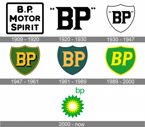
The logo, used by the BP predecessor, BP Motor Spirit, was introduced in 1909 and stayed in use for almost a decade. It was a simple yet heavy and stable badge, with the three-level inscription written in bold black title case letters, set in a bold rounded sans-serif typeface. The wordmark was placed on a plain white background and enclosed into a square black frame with the angles slightly softened.
1920 – 1930

During the first 90 years of its history, the letters “BP” (the initials of “British Petroleum”) were the centerpiece of the BP logo. Originally, the company used the letters in black on the white background. They were given inside a pair of quotation marks. The emblem would have looked utterly generic if not for the unique glyphs with distinctive sharp serifs and diamond-shaped corners.
1930 – 1947

In 1930, the emblem was slightly modified by AR Saunders. The core (including the quotation marks) remained unchanged, but now it was placed inside a shield shape. The shield had a thin black outline, which seemed a bit weak in comparison with the bold letters.
1947 – 1961
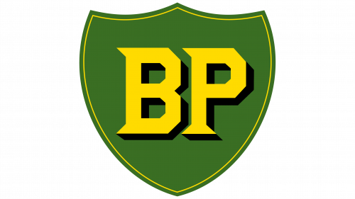
The following version of the BP logo, which was adopted in 1947, seemed to have solved the issue. Now, the shield looked more prominent and made a better fit for the letters. It was the first time that a colorful emblem was introduced. The letters and the outline of the shield featured a slightly muted shade of yellow, while the background was dark green. Also, the shield shape had two additional outlines. The outer one was black, while the one that could be seen from the inside featured a darker shade of green creating an effect of a shadow.
1961 – 1989
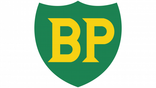
In 1961, the emblem was updated by a group of designers headed by Raymond Loewy (the author of the Lucky Strike, Exxon, Spar, and Shell logotypes). The overall design remained almost unchanged, yet there was a noticeable shift in the color palette, especially regarding the shade of green. Also, the shadow was removed both from the letters and the shield shape. The black outline was replaced by a dark green one. The glyphs were modified, too. While the sharp serifs remained untouched, the diamond corners were replaced by traditional curves.
1989 – 2000
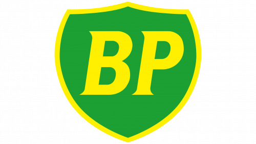
In 1989, the BP oil logo was modified once again, this time by the design company Siegel & Gale, also known for such logos as Playstation, Pfizer, AARP, Dolce, and Monster. Now, lighter shades of green and yellow were used, while the text “BP” was italicized.
2000 – Today
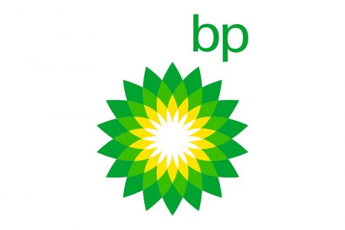
In 2000, a new era started in the BP logo history. Gone were the shield design and the capital letters. Now, the focal point of the logotype was a flower shape in bright shades of green and yellow. The text “BP” was lowercased and moved to the top right corner. The brand identity was developed by Landor Associates.
Font
The type used for the letters “BP” on the old logos had a distinctive and memorable shape, and yet, by the end of the previous century, it looked somewhat old-fashioned. So, it is only natural that the new logo features a sleek contemporary font.
Colors
The BP logo evolution, to a large extent, was the evolution of the color palette. The original black-and-white scheme was replaced by a combination of green and yellow in 1947. Although the basic colors have stayed the same ever since, there was a lot of experimenting with the shades until in 1989 the company decided to stick to joyful and vivid tones of green and yellow. In 2000, the palette was enriched with one more shade, which was a combination of the two main colors.


