The multinational oil and gas corporation ExxonMobil has a distinctive wordmark, which was created on the basis of the logos of the companies Exxon and Mobil.
Meaning and history
One of the largest gas and oil corporations in the world, ExxonMobile was established only in 1999 and had its one and only logo designed in the same year. But the company has a rich background, as it was formed through the merger of two huge old businesses, Exxon and Mobile, which have been on the market since the end of the 19th century. As for the logo, it is minimalist yet bright and instantly recognizable and the influence of the visual identities of both companies can be seen here.
ExxonMobil was an heir of one of the largest US companies, Standard Oil. Its logotype featured the word “Standard” in an oval shape, with a torch right in the middle. The palette included the colors of the American flag.
1892 – 1904
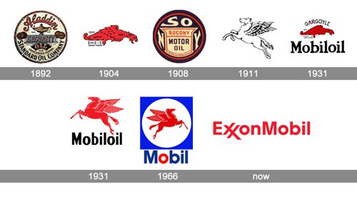
The predecessor of ExxonMobile, Standard Oil Corp was established in 1870 by John Rockefeller. The first known logo for the company was designed at the beginning of the 1890s and was composed of an ornate circle badge with the wordmark around its perimeter. The logo was created for Aladdin, the first product of the group, so the Arabic Metal p was the main graphical symbol on the emblem. It was placed in the middle of the circle, above the main nameplate, saying “Security Oil”.
1904 – 1908
The red gargoyle, drawn in profile, facing right, became the corporation’s symbol in 1904. There were no additional detail and lettering on this version of the logo, as the mythical creature was bright enough to represent the group and its power all alone. It was a very strong and brave image, which made the group stand out in the list of its competitors on the international market.
1908 – 1911
In 1908 the logo became cleaner and more modern. It was still composed of a circular badge, like the one from the 1890s, but with geometric neat lines and a new color palette — sea-blue, red, and light yellow combination was a great mixture, reflecting a strong influential company and evoking a sense of high quality and responsibility.
1911 – 1931
The iconic Pegasus was created in 1911. It was the only element of the new visual identity, drawn very detailed in thin monochrome lines. It was running to the left with its wings spread, evoking a sense of lightness, freedom, and speed and reflecting the progress and development of the company.
1931 – 1966
The red Gargoyle came back to the logo in the 1939s, along with the red Pegasus. They were used for different products of the company, but their color palette and detailed execution made them look similar and related. In both cases, the wordmark, “Mobiloil”, written in black, was placed under the image.
1966 – 1999
The new color palette was brought to the Mobil visual identity in 1966. Now the red Pegasus, facing right this time, was placed on a white circle, enclosed in a bright blue square. As for the wordmark, it now consisted only from “Mobil” lettering, executed in blue with the letter “O” in red. The inscription was placed under the emblem, perfectly balancing its shape and the white circle, mirroring the letter “O”. This logo was used by the company until its merger with the Exxon in 1999 and became truly iconic and instantly recognizable across the globe.
1999 – Today
The logo for the new name, ExxonMobil, was designed in 1999 and is composed of a red wordmark, placed in a white background. The typeface and style of the brand were created by the Lippincott&Marguiles design bureau and hasn’t been changed since 1999.
The main feature, which makes the logotype unique, is its double letter “X”, where both parts are connected and placed diagonally, showing individuality and progressive approach of the company.
Symbol
In the 1930s the Standard Oil Company was divided into severalsmaller companies, including Exxon and Mobil. Each of them had a logo of its own. The Mobil’s one featured a Pegasus, while Exxon had a wordmark logo with two interlacing “X”s.
The author of the Exxon double “X” logo was Raymond Loewy (1893-1986). He created the logo in 1966, yet the name of the company wasofficially changed to Exxon only in 1972.
Emblem
Following the merger of the two companies in 1998, anExxonMobil logo was created on the basis of the two older ones. The word “Exxon” from the first logo was lowercased (except for the first letter), while the signature double “X” was preserved. Only the wordmark was taken from the Mobil logo, while the Pegasus disappeared.
Font
The ExxonMobil logo features a pretty generic typeface, except for the two interlacing letters “X”.
Color
The current color scheme includes only red and white, while the previous versions also featured blue.


