ADNOC (the Abu Dhabi National Oil Company) is the largest oil company in the United Arab Emirates. The company belongs to the state. Over its more than 50-year history, it has developed into a commercially successful brand.
Meaning and history
The ADNOC logo has always featured a stylized falcon. However, the way the bird looks has changed dramatically. It has gone a long way from a rather cluttered design to a sleek modern logo.
What is ADNOC
The Abu Dhabi National Oil Company has been known as one of the largest oil companies in the world. At some point, it occupied the 12th line in the ranking due to the fact that it produced 3.1 million barrels per day.
1971 – 1998
Firstly, why did the company chose the falcon as its symbol? To understand this we need to remember that falcon is the national bird of UAE. So, in a way, this choice is a tribute to the country and emphasizes the company’s roots. Also, it shows that the company has had national ambitions all along.
We should also keep in mind that this bird symbolizes force and courage, which are important qualities for a business.
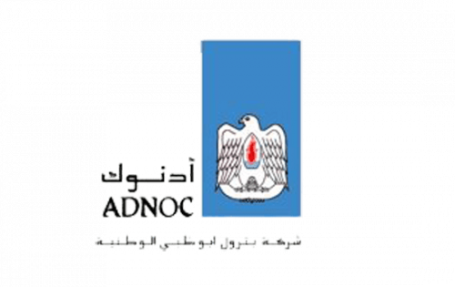
In the original logo, the falcon was depicted from head claws, with plenty of details. There was a red flame in its chest alluding to the fact that ADNOC was an energy company.
The bird was placed inside a rather large blue rectangle, and there was plenty of blank space left inside the rectangle above the bird’s head. We can assume it symbolized the sky, thus making the bird emblem even more realistic. On the downside, it somehow didn’t work this way here and just created an illusion that someone had forgotten to cut off the excess.
1998 – 2016
The second ADNOC logo also has the same feature – we can still see the blue “sky”, which also looks like a piece of paper that the designers have forgotten to cut off.
The bird, however, looks by far more modern than in the previous version. Now that there is only the head left, there is more attention drawn to the expression of the bird’s face, so there are more emotions. Also, the falcon is formed by swooshes, which create a dynamic style. The flame is gone, but the red stroke on the bird’s chest reminds of it.
While the original logo featured the wordmark in black, this one has it in blue. That’s because the emblem also has lost black elements – so, to fit the simpler palette, the designer had to change the color of the lettering.
The logo remains bilingual. The type in the English version of the wordmark preserves its overall style and size and remains legible. Then again, it’s lighter and a bit more generic due to the disappearance of the unique strokes the previous version had.
2016 – present
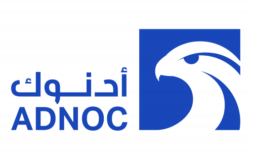
In November 2016, ADNOC announced it adopted a new logotype. This time, it is also simpler than its predecessor. It looks by far sleeker and more effective.
The bird’s head now occupies the majority of the surface. It is white with blue details, and it is placed inside a blue box. Unlike the previous logo, the box isn’t a rectangle but a square. This means that there’s no blank space. As a result, the emblem looks more proportional and logical.
The red swoosh on the falcon’s chest has disappeared. It means that the flame symbolism has gone. On the other hand, the swoosh in itself didn’t clearly refer to the flame. You needed to compare it to the previous logos to get this meaning, while the 2016 version can be understood without knowing this allusion.
Colors and font
Blue has always been either the main or the only color of the ADNOC logo. The 2016 version features a darker shade. The fact that the wordmark is better legible results partly from the darker color and partly from the fact that the glyphs have grown larger.


