

SAAB
![]()
SAAB is a big Swedish company, and it had a subsidiary that made cars until 2016. The SAAB cars were primarily compact vehicles or family cars. There were also several luxury and sports cars, but they are in minority. Although the official logo was just the word ‘SAAB’, written in grey, their emblem is a far more famous image. It depicts a blue circle with the company’s name, written in white below and a head of the griffin in the middle. That last one is mostly red, except for the golden crown above it.
Scania
![]()
Scania is one of the biggest automotive brands in Sweden. For the most part, they build trucks and buses. In both cases, it means heavy models: long hauler trucks and big buses/coaches. Their logo depicts a head of the griffin with a silver crown on top. It’s placed inside a blue figure that unites a circle and a cog-like shape, placed in the same spot. The word ‘Scania’ is normally written nearby in big blue letters.
SEAT
![]()
SEAT is the biggest carmaker to come from Spain. It’s active since 1950, during which time they developed a lot of different car models. But now, it’s mostly crossovers, hatchback cars and some racing models. SEAT’s primary emblem is a big letter ‘S’ with bold, abrupt lines and a diagonal cut that follows the direction of the central line. It basically slices the image in two bits. The colors vary, but it can be black or metallic for badges.
Skoda
![]()
Skoda is a major European carmaker from Czech Republic. The current Skoda roster comprises of crossovers, SUVs and various small cars. In particular, Skoda heavily services the market of family cars. The usual emblem of this company depicts an arrow with the wings attached on top. The current composition colors this bit bright green and places it inside a white circle with a metal frame. There’s also a wordmark, which has the word ‘Škoda’, written in black capital letters.
Subaru
![]()
Subaru is a large Japanese carmaker, active since the 50s. The company specializes in crossovers, compact cars, as well as minicars and vans. There are also several sports models, which even get featured in motorsport. The logo is a blue oval with several white stars sprinkled all over it. There is a big four-tip one in the top left section, while five smaller ones guard the opposite corner. The name wordmark depicts the company name in a bunch of capital sans-serif letters, colored dark grey.
Smart
![]()
Smart is a brand of microcars, started by Mercedes in 1994. Mercedes has long developed plans for small, brisk vehicles, which culminated in Smart. Such small, city cars are their forte, but the company has lately gotten into the development of small crossovers as well. Their usual emblem is a sort of grey ring, whose right section was cut vertically and replaced with an orange triangle. The name of the company is usually written in all lowercase letters. They use the color grey and a smooth sans-serif font.
Suzuki
![]()
Suzuki is amongst the biggest car producers in Japan. Most of their models are hatchbacks, crossovers or kei cars (which are Japan-specific minicars). Besides these, Suzuki is also very fond of motorcycles. The classic company emblem is a big letter ‘S’, styled as a Japanese glyph. It’s essentially an image that uses smooth round shape in combination with sharp, straight strokes of paint. The color is normally red, but it can be metallic grey for car badges or just black.
SsangYong
![]()
SsangYong is a major carmaker from South Korea. Presently, the manufacturer focuses on crossovers, plus a sprinkle of utility vehicles. Historically, the company has been rather famous for their luxury executive models. The emblem starts as a round shape with two identical images joining into a rhombic extension near the bottom. This looks like two mirrored tails or wings, but the company insists they are twin dragons. The color is usually black.
SAIC Motor Corporation
![]()
SAIC is the current incarnation of a long streak of Chinese car conglomerates that starts in the 50s. It’s among the biggest modern carmakers in this country. They also unite a number of smaller brands under their care. In total, this company releases a lot of crossovers and some compact cars. Their logo is just the word ‘SAIC’, written in smooth letters. The inscription is located inside a ring outline, which has two holes in its perimeter. The color is light blue for all of these elements.
Sainte Claire
![]()
Wills Sainte Claire was a brand of American cars in the 1920s. Its founder was originally one of the high-ranking employees at Ford. The company in question lived for several years and produced a number of high-performance cars. The production wasn’t successful financially. The company had an emblem, uniquely for the age. It depicted a goose flying over a wooded landscape. The name of the company was printed in serif letters above the bird.
SAIPA
![]()
SAIPA is a big Iranian car manufacturer. The company has been active since the 60s, but there were only a few SAIPA-designed vehicles. Most of their products are American, French and Japanese cars, assembled for the Iranian market. The logo displays a three-way line junction. Along each edge, there’s also a twin-line combination with a turn mid-way, which mimic the central image. The coloring is metallic grey.
Saker
![]()
Saker is a New Zealand carmaker that was active in the late 20th century. They are mostly known for their sports cars and durable racing models. They’ve developed three main models and went out of action. The logo was a black circle with an eagle depicted in the middle. The bird in question assumed a diving position in this emblem. The word ‘Saker’ was written along the bottom edge in serif letters.
Saleen
![]()
Saleen Automotive is an American car manufacturer. The company is known for building sports cars and racing models. Some of them are modifications of less powerful Ford vehicles, but a lot are also unique designs. The company’s emblem depicts a series of thin pistons, arranged diagonally. These are basically 6 pairs of two bold shapes, connected with a line. The color is burgundy red for them all. The wordmark uses black, abrupt letters with a major side horizontal stretch.
Salmson
![]()
Salmson was a French car manufacturer, abolished in 1950. The vehicles they built were originally touring automobiles and some cyclecars. The later models were mostly variations of the same Salmson S4 vehicle, which was a classic-looking luxury car. The company’s emblem was a circle, essentially. The white core contained a rhombic red outline with the letters ‘SMS’ inside. The frame around was meant for the full name, for its part.
San Storm
![]()
San Storm was a small roadster model, produced in India until 2013. It was a compact two-seater with a front-engine drive and a 4-cylinder engine. It was very popular in its home country and even got exported in large quantities. The logo depicts a shield badge, colored red but with grey bits. Above, the word ‘San’ was written in big black letters in a grey background. Below, the red section was broken up by a lightning bolt, drawn as if striking from the grey section in the top.
Santa Matilde
![]()
Santa Matilde is a Brazilian roadster, produced in the later decades of the previous century. There were many variations of this car, but they were generally small sports models with 2 doors and 6-cylinder engines. A total of five main generations were released until 1997. Their badges looked like upright triangles with curved bottoms. In them, two letters ‘S’ and ‘M’ were fitted and skewed to fit the curvature of the sides. As a result, they grew narrower closer to the top.
Saturn
![]()
Saturn was founded in 1985 as a subsidiary of General Motors that specialized in smaller cars. Their product lineup was full of compact cars, compact crossovers and some vans. This was done to counter the manufacturers from Japan, who built these vehicles types exclusively. The Saturn’s emblem was shaped like a square. A thick metallic frame accommodated a red core. In its two curved lines were drawn to resemble a portion of the planet Saturn and a meteor disc around it. Both were also styled as metal – they started from the frame and went back into it.
Saxon
![]()
Saxon Motor Car Co. refers to the American brand of cars in the 1910-20s. It produced several automobiles, typical for that era. Their main feature was that they were high-performance cars with, for the most part, 4- and 6-cylinder motors. The emblem had a rhombic shape, a metallic frame and the blue insides. The two other elements were the name ‘Saxon’, plastered in front of the rhomb and near its top. The font was a collection of big serif letters, colored white. The other was a head of the Germanic chief that occupied much of the rhomb and was colored red.
Sbarro
![]()
Sbarro is a car-building project, started in the 70s by the Swiss Engineer F. Sbarro. It’s basically a custom car shop that builds copies of older cars, as well as develops one-offs for rich customers. Sbarro’s projects are always unique, peculiar and primarily powerful. The emblem of this business uses a silhouette of a leaping greyhound dog. It’s completely black and usually drawn near the name wordmark. The latter uses square-proportioned letters of a smooth sans-serif font.
Scavas
![]()
Scavas was a car project of the Greek engineer V. Scavas. He designed several sports cars in the 70-90s. They used the same concept of a small sports car with gull wings. None of these were mass-produced, however. The badge for these cars was a capital ‘S’ with prominent serifs on the tips. It was placed inside the ring frame. As a logo, the colors are usually black for both elements.
Scion
![]()
Scion was a brand of compact cars, owned by Toyota. The production was stopped in 2016 due to insufficient success of the market. But for 13 years in play, they developed a number of compact (and subcompact) hatchbacks and crossovers. The logo looks like an oval frame with a horizontal strip of metal in the middle. On it, they placed the word ‘Scion’ in wide black letters. From it, a claw-shaped image emerges on each side.
Scott
![]()
Scott is an American manufacturer of motor sports gear and bicycles, which is headquartered in Switzerland. The logo of the company perfectly reflects the powerful and rebellious spirit of the brand’s main audience, and looks very masculine and confident. The monochromatic badge is composed of a bold abstract emblem with a black road on a white background, and a heavy italicized sans-serif wordmark in the uppercase, with the capital characters set in white and outlined in black.
Scripps-Booth
![]()
Scripps-Booth was one of the many carmakers from Detroit (USA) in 1910-20s. They constructed four distinct car models, and each of them was a touring model. That means they were high-performance vehicles with V8 engines and a huge maximum speed at the time. Their emblem is a pink circle, divided into a rim section and a central section. The former was where they placed the company name, as well as the location. These were written in burgundy serif letters. The center was fully occupied by two bright-red letters ‘S’ and ‘B’.
Seoudi Group
![]()
Seoudi Group is a company that consists of several car assembly plants in Egypt. This business manufactures cars, developed by other brands, to sell them on the local market. That includes Japanese, Italian and Russian cars, for the most part. Their logo has the words ‘Seoudi Group’ written in two variations. The first is in Arabic writing and colored in burgundy. The other is in black Latin letters right below, which say ‘El Seoudi Group’.
Setra
![]()
Setra is a bus producer from Germany. They are currently owned by Mercedes, which tasks Seta with the production of tourist buses, mostly. They are big, long and sometimes two-decked. Their logo is a vaguely rectangular burgundy shape with rounded corners and a slightly skewed bottom line. The center is given over to the company name. There, it’s written in white letters using a squat sans-serif script.
SG Automotive Group
![]()
SG Automotive is a Chinese carmaker, established in the 80s. Most of their current products are pickup trucks, with some crossovers here and there. Most still are replicas of Volkswagen or Chevrolet vehicles, while the original cars are a minority. They sell most of the current models under the Huanghai brand. Their logo is a circle, divided into a red section above and a dark blue one below. There’s a linear bank space in the middle, with a little blue wisp in the center.
Shaanxi Automobile Group
![]()
Shaanxi Company builds trucks and buses. It’s a Chinese manufacturer, founded in the 60s. The model roster includes medium-sized trucks and transit buses. The emblem is a ring with a stylistic letter ‘S’ inside. It’s connected with the frame by tiny lines that go from the tips to the ring. The style of the letter itself is a brutalist – it’s basically two titled rectangles stitched together. The color is navy blue.
Shamrock
![]()
Shamrock is an Irish-built car, developed in the 50s. It was one of the few successful models, created in Ireland. Essentially, the car was a big semi-premium model with an open roof and an insufficient engine. Their badges used a yellow-colored circle with an image of a shamrock inside as a basis. It was outlined with metallic frames, shaped like laurel wreaths. There was a crown of the same style on the top of it.
Shanghai Maple Guorun Automobile Co
![]()
Maple Automobile is a Chinese carmaker, founded in 2000. The company currently produces fully-electric vehicles, including a sedan, a minivan and a crossover options. That being said, they were big on internal-combustion hatchbacks and sedans not long before. The company uses a grey circle with turquoise maple leaf as a core of their emblems. It’s then outlined by a bold rim of dark blue. In its top, they place the acronym ‘SMA’, written in blue.
Sheffield-Simplex
![]()
Sheffield-Simplex was a line of tourers produced in Britain until 1920. They built several models, which were pretty powerful for the time. The cars mostly failed in sales, but some models still remain in private collections and museums. The logo of the company depicts a bronze nameplate of a rectangular shape. On it, both words are placed in such a way that the final letters of the first climb on top of the second word near the middle. The letters were colored dark brown.
Shelby
![]()
Shelby American is a famed manufacturer of sports cars from America. They’ve been around since the 60s, and most of their products were small, powerful sports cars. That includes, for instance, the famous Shelby Cobra. The logo of the company itself is the word ‘Shelby’, followed a bit below by the ‘American, Inc’ (in smaller letters). These inscriptions were placed inside a rectangular frame of twin blue lines, meant to resemble the race trek. On the left, the chunk of the frame transforms into the big letter ‘S’.
Shrike
![]()
Shrike was a project of a formula car, built by Australians from Holden. Several models of these were built in the 80s to compete in international racing tournaments. They weren’t very successful in the end. Holden’s logo at the time is a red image of a lion, clutching a stone (a perfect ball here). The Holden’s racing subsidiary didn’t have any logo of itself, nor did the Shrike cars. For marketing purposes, the Holden logo was used.
Shuanghuan Auto
![]()
Shuanghuan Auto was a Chinese car brand until is dissolution in 2016. The product lineup consisted of mostly SUVs and off-road vehicles. Some of these cars were copied from the German and Japanese brands. Their emblem depicted a metallic ring with a thin wire-like line in the middle. It was arranged into what seemed like the letter ‘S’, except a very squat and skewed one. Its tips were elongated and connected with the front sides of the square.
Siam Di Tella
![]()
Siam Di Tella is originally a manufacturer of home appliances from Argentina. In 1959-1967, they tried building several car models. These included 2 pickup trucks and several passenger car models. The production wasn’t too successful, and it was shut down. Their current logo is just the word ‘Siam’, written in bold black letters. The cars they produced were all badged by the little skewed ‘S’ letters. These looked like 5 short lines, jammed together in a square space.
Siata
![]()
Siata was an Italian car manufacturer, active from 1926 until 1970. Besides building several models of small sports cars, Siata also modified several models of other brands. That mostly means Fiat cars, some also of sporting variety. The Siata emblem is a long, narrow shield of mostly dark blue. In its center, there is a bold yellow letter ‘S’ with a small image of a car placed in its middle. It’s colored brown, and the same color is used for the words that spell ‘Siata Torino’ around the letter.
Sichuan Tengzhong
![]()
Tengzhong is a minor Chinese carmaker. Previously, the company built infrastructure, for the most part. Presently, they develop heavy trucks and tow trucks, as well as some other vehicle types. Their logo looks like four knots of alternating white and red, tied into a single vaguely round image. In its middle, there is a red rhomb with a white center and two grey lines on the sides. That’s likely supposed to mean the engine.
Simca
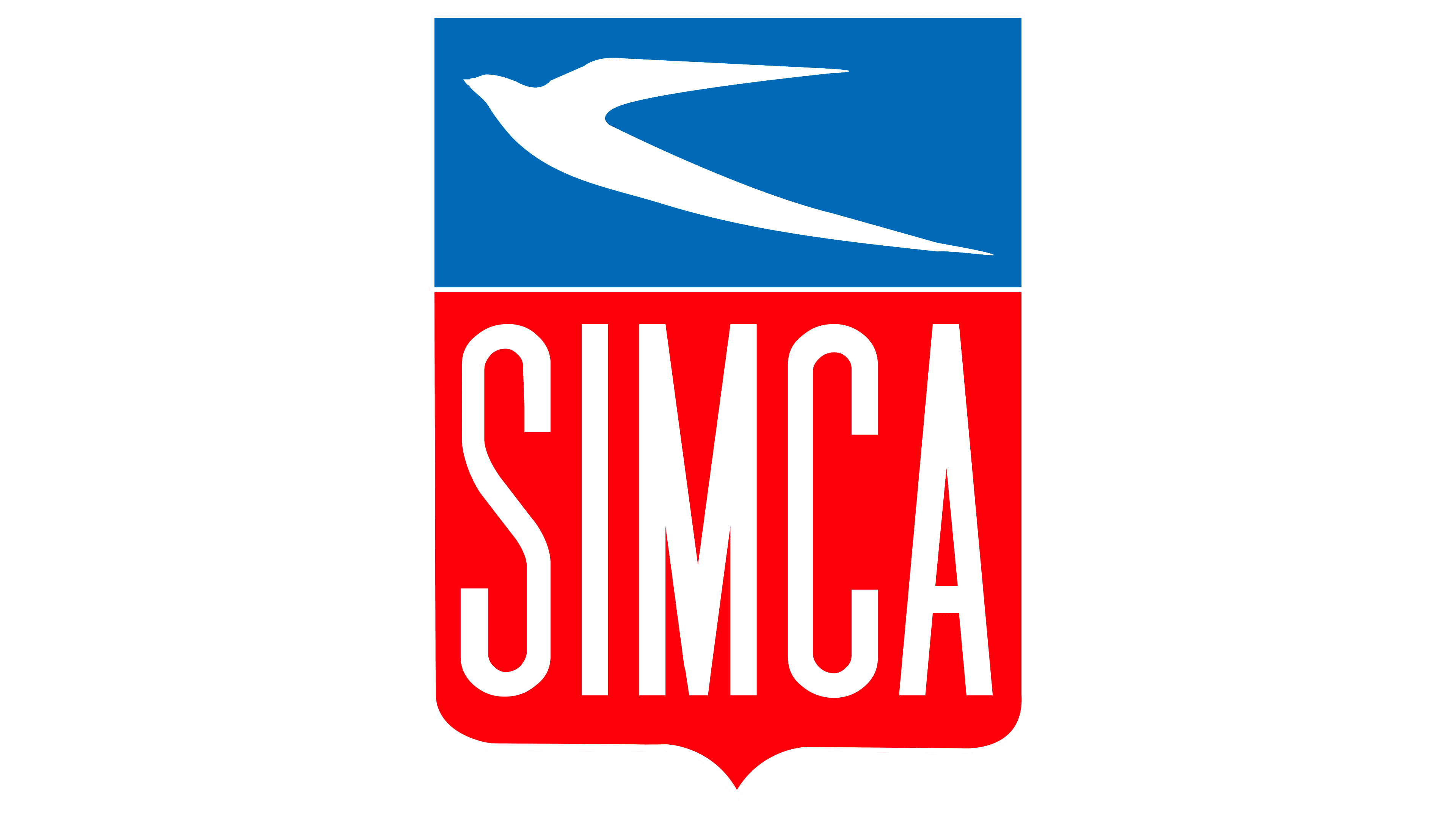
Simca was a French carmaker, known primarily for building compact cars and small sports models. It was founded in 1934 and discontinued by the 70s. The Simca technologies were used even after by Chrysler and companies that were part of Simca subsidiaries all over the world. Their emblem is a wide shield shape, whose two-thirds below are filled with the color pink. The rest is turquoise. On the former, they placed the white, tall letters that made up the company name. The latter just has a white silhouette of a swallow.
Simca do Brasil
![]()
Simca do Brasil is a Brazilian carmaker, a subsidiary of the French Simca company. Interestingly, this company developed many original models and didn’t just assemble their parent’s existing cars. That included various passenger cars, including compact urban models and larger 4-seaters. Both were consumed by Chrysler in the 60s. This company had the same shield emblem as Simca proper, except the top was yellow, and the rest of the logo was colored dark green. There was also an additional ‘do Brasil’ bit beneath the name.
Simca Vedette
![]()
Simca Vedette was a line of large sedans (for the most part), produced by Simca in the 50s. There were two generations of these cars with many variations, but they were generally always big cars. The car was originally called ‘Ford Vedette’, on account of it being built in a Ford-owned factory. The logo was a combination of two words. The first was ‘Simca’, written in big sans-serif letters. ‘Vedette’ was written right below in cursive, italic letters.
Simson
![]()
Simson was a German vehicle manufacturer that went bankrupt in 2003. It was originally a producer of arms and ammunitions. Later, the company started making mopeds, motorcycles and other two-wheeled vehicles. The logo has the words ‘Simson’ written in big cursive letters in the middle of a circle. On this circle, there’s also a red lightning bolt underlining the word. On either side, there is a short wing. The color was golden for most of the logo.
Singer
![]()
Singer was a British car manufacturer until 1970. They were pioneers in the area of compact cars, being among the first to produce small, economic automobile. Besides that, they also built a variety of bicycles and motorcycles. This is reflected on the company’s emblem. It depicts a spoke wheel with a big letter ‘S’ in the center. The colors were usually black and white.
Sisu Auto
![]()
Sisu Auto is a Finnish vehicle manufacturer, operating since the 30s. Their primary focus is on lorries and buses, including some minibuses. Besides that, the company is also a massive supplier of military vehicles. The Sisu logo is a square, divided by into two parts of red and blue. The red is empty, but the blue one contains the word ‘Sisu’, written in white letters. The characters are all capital and use a sans-serif font.
SML Isuzu
![]()
SML Isuzu is a Japanese vehicle manufacturer. They specialize in buses, minibuses, trucks, as well as special utility models. They aren’t owned by the Isuzu, but the latter took part in the foundation of SMLI. The logo is a wordmark of the company that depicts the acronym, written above the word ‘Isuzu’. Both are colored white and both use a smooth, sleek sans-serif font. These are usually placed onto a red background.
Sofia
Sofia was the first Bulgarian-made sports car. Two versions were made in the 80-90s, but none was really successful. The car was supposed to be a small 2-door sedan with a V4 engine. The doors also opened upwards, a so-called gull-wing structure. These cars didn’t seem to have any finalized emblems, seeing how they were a one-man project. The car’s name was used for most marketing occasions.
SOMACA
![]()
SOMACA is a Moroccan car company. Originally, it was owned by Simca, and now by Renault, both French companies. As such, SOMACA mostly assembles Renault cars now, and before that, they assembled Simcas. The logo is just the word ‘SOMACA’, written in tall sans-serif letters. The color is bright red, but it can vary. They don’t seem to have distinct badges, and the cars simply use Renault emblems.
Soueast
![]()
Soueast is a Chinese company, founded in 1995. Their own brand consists of compact crossovers, sedans and some vans. But they also build Mitsubishi and Dodge vehicles. The Soueast emblem is a red oval with white spots. Inside, they placed a simplistic image of a bird’s head. They simply drew several lines that extended from the frame’s bottom right section.
Southern Cross
![]()
Southern Cross was an Australian car, built in the 30s. It was an open touring car with some characteristics of a luxury model. Only a two-digit number of these cars were ever produced. These cars had a badge of an oval shape. Most of the inside was pink, and there were 7-tip stars all over it. The biggest one was on the oval’s left side, while the other 5 variably-sized ones were on the right half.
SOVAM
![]()
SOVAM is a French company that doesn’t produce cars now, but they used to. In the 60s, the company developed a few prototypes of a compact sports car. It had a sleek design and an 800 cc engine, but wasn’t successful. Their automotive branch used a logo that depicted the company’s name in dark blue letters. They were a normal sans-serif script, but the tips of the ‘V’ in the middle extended into horizontal lines above the rest of the letters. The word ‘Automobiles’ was present right above.
SPA
![]()
SPA was an Italian carmaker that built high-performance vehicles. The company existed in 1900-20s, and in this time they’ve finalized a small number of sports cars. Some of them are still kept in the museums. The logo was a mere black circle with the letters ‘SPA’ inside. They were white, had a slight serif font and were also mismatched size-wise. In particular, the central letter was much bigger than the rest.
SpadaConcept
![]()
SpadaConcept is an Italian design studio for cars. It’s a minor company that worked with several European brands. In particular, they created designs for sports cars, motorcycles and even airplanes. The logo is a black circle with a white frame around it. Inside the former, there are two horizontal stripes and the vertical image in the middle that seems to be two mirrored (almost) chisel instruments. The word ‘Spada’ is written in black on the top of the frame.
Spectre
![]()
Spectre R42 was a supercar model, produced by the British company called Spectre Supersports. This one is considered their most successful product. It had a streamlined design, a V8 and a small sedan composition. The Spectre logo is a polygon shape with a blue core. On it, the company name was written in white in the center. Right above it, a theatric mask was placed, also in white.
Speranza Motors
![]()
Speranza is an Egyptian carmaker, founded in the 80s. It was originally importing and assembling Japanese models. Nowadays, they produce a number of compact cars that are partly based off Japanese vehicles. The Speranza logo is a stylized letter ‘A’ without the central bar. It’s surrounded by an incomplete oval with a lacking top. This emblem is colored a metallic grey.
Spetsteh
Spetsteh is a Russian vehicle manufacturer. They specialize in building all-terrain vehicles, some of them on tracks. The majority of them are heavily modified versions of the UAZ cars. The company’s logo is just an emerald-colored square with a letter ‘S’ in the middle. The letter is colored white. The font used there is a pretty basic serif.
Springuel
![]()
Springuel is a historical automaking brand from Belgium, which only existed for five years, and in 1912 merged with Imperia Automobiles, which kept being afloat until 1948. The logo of the Belgian automaker was executed in a very elegant yet dramatic yellow and black color palette, with the enlarged stylized letter “S” as the star of the composition. The symbol was placed on a geometric vertically-oriented banner with additional lettering along all three parts.
Spyker
![]()
Spyker was a Dutch carmaker, established in 1880. They were a major producer of Dutch aircraft for some time. But the most prominent of their products were the automobiles they built since the 1900 and until 1926. These were high-performance models, for the most part. The logo depicted a spoke wheel, whose rubber part served as a frame where the company name was placed. In the middle, there was also an airplane propeller that stretched far outside the wheel boundaries.
Squire
Squire was a British automotive company of the 1930s. It produced sports cars and components for them. Their cars had a peculiar form factor of coupe bodies. Their single vehicle line was Squire Car – a two seat car, used for races. Only 7 models of this car were made, but these cars got a reputation for exceptional high speed. As the Squire Company didn’t operate for a lot of time, it hadn’t any logotype.
SRT
![]()
Street & Racing Technology was an American engineering group, established in 1989. It was focused on producing vehicles for Jeep, Chrysler and Dodge brands. They also tuned cars, upgrading engines, chassis and other components. Now SRT is absorbed by Dodge. The SRT logotype was just their name on the white background. It was written in a black sans serif typeface.
SSC North America
![]()
SSC North America is an American automotive startup, established in 1998. It is focused on manufacturing sports cars as well as parts for them. Their automobiles are positioned as the fastest and lightest vehicles in the world. The brand logo is the brand name, where the part ‘SSC’ has a sharp gray font. The other part, ‘North America’ inscription, is written in a simple red sans serif typeface. Right side from the name, we can see a checkered blue and white shield. It had a red triangular line in the middle, image of a deer below and handwritten inscription ‘In Veritate Victoria’ above.
Standard
![]()
Standard was a British company, operating in the first half of 20th century. They specialized in making various cars, including compact cars, racing cars and trucks. They also produced tractors for farmers and off-road vehicles for army. The brand logotype was a circle with the British flag. Above and below, there were two words ‘Standard Converty’. They had a custom white typeface with rounded letters, changing their size from beginning of the words to their endings.
Stanley
![]()
Stanley was an American vehicle manufacturer, operating from 1902 until its defunct in 1926. They made mostly steam automobiles. Most of them were two-seat automobiles with now doors and roofs. Shortly before its defunct, the company began to make experiments with internal combustion engines, but they didn’t go far. The company logotype was just their name with now background and other special details. It had a handwritten yellow typeface.
Stearns Knight
![]()
Stearns Knight is an American automotive manufacturer. The company existed for the first 30 years of 20th century. They made high-quality luxury cars, most of which were saloons, convertibles and sedans. Their automobiles were made generally on basis of company-made components. The company logotype was inscription ‘The Stearns’, written in a white handy typeface. The inscription was located on the black rectangular background with a white outline.
Sterling
![]()
Sterling was an American automobile, manufactured in North America between 1987 and 1991. There were various variations of this car, equipped with different components and which had different form factor. Some of them were assembled as sedans, while others had a form of hatchback. The Sterling car line was launched by Austin Rover Company, specializing in producing of compact cars for working class. The Sterling logotype was their name, placed above various blue and green lines.
STI
![]()
Subaru Tecnica International is a Japanese vehicle company. They make high performance cars branded as Subaru, as well as parts for them. These cars are often used on races and other sports events. The company logo is abbreviation ‘STI’. It has a bold red typeface, executed in contours. The feature of the logo is the letter ‘S’. It has an elongated upper tip, so it intertwines all other letters.
Stephens
Stephens was an American vehicle company during 1910s-1920s. They manufactured luxury cars. In the list of their products were saloons, sedans and roadsters. These cars were equipped with high performance components, so they quickly got a reputation of top cars. The company didn’t have any logotype. Probably, the company holders just used the brand name in some handwritten font in advertisement blocks in newspapers.
Steyr
![]()
Steyr was an Austrian automotive company, operating from 1915 to 1926. They focused on designing, production and developing of compact cars. Most of their cars were made on basis of foreign car components, mostly from Germany. Steyr Automotive was a subsidiary of a same-named company, which now specializes in guns and artillery production. The parent’s logotype depicts its name, written in a strong black sans serif font, where all letters are connected. It’s placed right side from the emblem of a sack with the brand name on it.
Stoewer
![]()
Stoewer was a German automotive manufacturer, founded 1899 and dissolved 1945. They made machines for textile and leather production, as well as bicycles, cars and other vehicles. Most of their vehicle products were supplied to the German army during the First and Second World Wars. The brand logotype was its name, written in a white serif font with custom E and W letters. The name was placed on a blue oval with some white lines. Sometimes, the brand designers also drew a blue circle with a yellow dragon on it. In this case, there was also a shield-like contour, and the oval transformed to a bit circled rectangle.
Strathcarron
Strathcarron Sports Cars plc was a British engineering company, operating from 1998 to 2001. It produced high performance sports cars and components for them. Their cars were made of extra-light materials. Due to the powerful engines and turbochargers they could accelerate high speed. The firm produced cars in very limited quantities. It didn’t have any logo as it operated for too little time.
Studebaker
![]()
Studebaker was an American automotive manufacturer, active between 1852 and 1967. In different times, they worked on wagons, carriages and automobiles. They began to produce automobiles in 1911. These were generally touring cars, roadsters and sedans. Episodically, there were some buses and trucks produced by the company, but it didn’t go far. The company logotype was 50/50 white and red circle, split by wavy S letter. The circle was outlined white and blue.
Studebaker Canada
![]()
Studebaker Canada was an automotive company, based in Ontario. It was focused on designing, development production of cars and operated during 40s-60s. They made high-quality luxury cars, most of which were convertibles, sedans or cabriolets. During their last years, they also began to import foreign production of foreign companies, mostly Mercedes-Benz and Volkswagen. Their logo is a car wheel with a line over it. On the line, we can see the ‘Studebaker’ inscription written in a handy font.
Stutz
![]()
Stutz was an American engineering company during 1910s-30s. Their production included various cars. Most of them were racing ones, but in the last years before defunct, the company produced luxury roadsters, sedans and convertibles. The vehicles they made were equipped with high performance components and had a serious and distinctive appearance. The Stutz Company logo was their name, written over image of two blue wings. The name and the wings were placed above the circle, on which was the company’s full name.
Sunbeam
![]()
Sunbeam Company was a vehicle manufacturer in Britain. It produced high-level racing cars, cyclecars and motorcars in the first half of 20th century. During the WWI and WWII, they manufactured trucks and off-road vehicles for army. They also created luxury roadsters and coupe cars, as well as buses, commercial cars, etc. Thir logotype was their name written in an elegant handwritten typeface. It was located in an oval frame, easy to put on the car bodies.
Superformance
![]()
Superformance is an American car brand, which appeared in the end of the 20th century. The company produces various cars, most of which, however, are models for sports and races. Their cars are made using extra-light materials and equipped with powerful engines. Most of them have a peculiar appearance. The Superformance logotype is a red square with two white lines on it. Below the square, we can see the brand’s black name written in a strong angular typeface.
Swallow Doretti
![]()
Swallow Doretti is a British sports car, manufactured in 1954-55. It was a two-seat coupe car with a compact body. The car was made of very light materials. Jointly with a four-cylinder engine they allowed the car to accelerate very high speed. There were only about 270 models made. Its manufacturer was Standard Motor Company, existed between 1903 and 1968. Their logo was the British flag with the company name below and above it.
Syrena
![]()
FSO Syrena was a vehicle, produced in 50s-80s by FSO, a large Polish automotive manufacturer. It was a high quality sedan which had a coupe body. There were several models of the car, produced for 30 years. Syrena could be seen as a pickup, sports car and commercial automobile. The car line also had a logotype. It was a handwritten inscription ‘Syren’, with all letters connected by a bottom line.
Conclusion
In this comprehensive overview, we’ve journeyed through the diverse landscape of car brands that start with the letter ‘S’, showcasing a range of vehicles from luxury sports cars to commercial vehicles, and highlighting the innovation and rich history of these automobile manufacturers. From the high-end supercars of Saleen Autosport to the robust commercial offerings of Scania AB, each brand brings its own unique flair to the automotive world.
Among these, Suzuki Motor Corporation stands out for its versatile range of vehicles, including motorbikes and automotive parts, reflecting its status as a manufacturing company with global reach. Similarly, Skoda Auto, a Czech automobile manufacturer under the Volkswagen Group, exemplifies European engineering and design, offering a mix of reliability and sophistication.
The article has also spotlighted niche manufacturers like Spyker Cars from the Netherlands, known for their luxury sports cars and a commitment to high-performance sports car excellence. Meanwhile, Spania GTA delves into the realm of high-performance supercars, captivating car enthusiasts with their cutting-edge designs and unparalleled power.
Furthermore, we’ve touched upon companies with a legacy, such as Saab Automobile and its successor National Electric Vehicle Sweden (NEVS), which carry forward the innovation and assets of the iconic Saab brand. This narrative wouldn’t be complete without acknowledging the contributions of pioneers like Carroll Shelby, whose collaboration with brands like Cadillac and GM has left an indelible mark on the automotive industry.
In addition to these manufacturers, we’ve explored the services and products beyond vehicles, such as vehicle financing, driver training, and the production of outboard motors, showcasing the broad spectrum of the automotive industry. The inclusion of companies like Mahindra, Nissan, Hyundai, Audi, Kia, Bentley, Honda, Alfa Romeo, Lexus, and Cadillac, among others, underscores the global nature of the industry, with headquarters spanning from the Czech Republic to the Netherlands, each contributing to the tapestry of automotive excellence.
This list of car brands that start with ‘S’ is not just a collection of names but a testament to the sector’s diversity, from publicly traded companies to those with a legacy of innovation. It reflects a world where automotive parts, luxury vehicles, and commercial transport coexist, driven by a shared passion for mobility and excellence. Whether it’s the elegance of a Bentley, the reliability of a Honda, or the pioneering spirit of NEVS, these brands collectively represent the pinnacle of automotive achievement, catering to the desires and needs of drivers around the globe.


