7-Eleven is a famous international chain of supermarkets, which was established in 1927 under the name Tote’m stores. Today the company owns almost 70 thousand convenience stores in 17 countries across the globe. All stores are open 24 hours and offer a wide range of drinks and prepared foods.
Meaning and history
7-Eleven is the brand, which is known even in those countries, where the chain has no locations. In 2017 this franchise was called the most successful in the world, with more than 60 thousand physical stores in almost 20 countries on different continents.
7-Eleven, established in the United States at the end of the 1920s, today has around a thousand of its shops, while the other 63 thousand are franchise-based.
The second largest market of the chain after the USA in Japan. The first 7-Eleven store was opened in Japan at the beginning of the 1970s when Ito-Yokado company bought the American franchise. In less than twenty years of this cooperation, the Japanese partner has bought 70% of the American Southland Group, the mother company of 7-Eleven.
In the 1980s, 7-Eleven opened overseas offices in Australia, Sweden, Taiwan, Hong Kong, Singapore, Guam, Malaysia, and the Philippines.
What is 7-Eleven?
7-Eleven is the largest chain of small supermarkets, with 64 thousand locations in different countries of the world. The chain consists of a thousand owned stores and 63,000 franchise outlets, operating in the United States and 18 other countries, mostly in Asia. Most of the minimarkets are located in Japan.
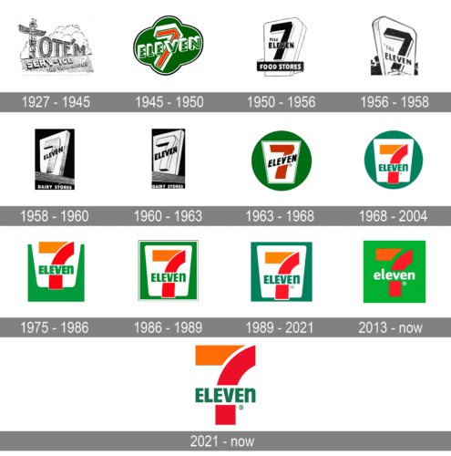
1927 – 1945
The company, known as Tote’m stores until 1946, using a large wooden Totem as its symbol. It was replacing the first letter “T” of the wordmark and was instantly recognizable across the country.
1945 – 1950
The “7-11” name appeared when the store chain decided to expand its working hours and placed it on the banners, to let customers know that now they are open from 7 am to 11 pm. The name stuck and stayed with the company even when they started working 24/7, which happened only in 1963.
1950- 1956
The first logo after the name change was designed in 1946 and was composed of a white trapezoid with its narrow side down. The geometric figure was placed on a green circle and had a bold red “7” with “Eleven” in capitals placed diagonally over the digit.
The logo was bright memorable and dynamic, reflecting the growing and successful company. It stayed with the chain for more than 20 years and became a basis for all the next versions of the visual identity.
1956 – 1958
The badge, used by the chain in 1956, had the contours of the elements clivhtly refined. The “7” got enlarged, but had its outline a bit thinner, which created a more airy look of the whole image. As for the lettering, crossing the digit, it got straighter and lost half of its massive shadow.
1958 – 1960
The redesign of 1958 has removed all the additional elements form the badge, keeping only the “7” and the “Eleven” lettering, crossing it diagonally. The contours of both elements were cleaned up and strengthened, and the silhouettes of both letters and a number got more confident and professional. The digit had its body in gradient gray, making up a voluminous look.
1960 – 1963
In 1960 the color palette of the 7-Eleven badge was simplified to only black and white, with all the gray shades and gradients completely removed. The minimization of the color scheme was supported by the refinement of the lettering contours, with the digit getting redrawn too, in a more modern and laconic way.
1963 – 1968
In 1963 the white banner with the “7” and the “Eleven” was placed on a solid green roundel. The trapezoid got its sides straighter and angles sharper, and gained a thin outline, which added distinction to the composition. The digit got colored red now, while the lettering turned fully black, creating a strong and clean color contrast.
1968 – 2004
The logo was redesigned in 1969. The trapezoid gained sleeker rounded angles and the color palette switched — the digit was now executed in red and orange with the vertical bar slightly arched. As for the inscription, it was now located horizontally and executed in green.
Another element was changed — the last letter of the nameplate, “N”, was now written in the lowercase. According to the legend, the wife of the company’s said the logotype looked harsh when it was in all-caps, so she proposed to replace one letter for a friendlier image.
1975 – 1986
The new shape and brighter color came to the 7-Eleven visual identity in 1975. The background is now not circular but rectangular and the trapezoid is lover up from the center so that the horizontal bar of “7” comes out the upper side of the frame.
As for the color palette, it still consisted of green, white, red and orange, but green gained a lighter and juicier shade, which made the whole logo brighter and more playful.
1986 – 1989
The redesign of 1986 has darkened up the color palette of the badge and moved the white trapezoid slightly down, making up a more harmonious look. The composition remained the same, but the contours of the characters were refined, letting more air into the inscription, and creating a lighter and brighter image.
1989 – 2021
The current version of the logo was designed in 1989 and is a mix of all previous versions. The logo from today is composed of a dark green rectangle with a white trapezoid in the middle. There is a bold “7” in red and orange and a green “Eleven” wordmark placed over it horizontally.
The current logo looks professional and modern. It is instantly recognizable across the globe and evokes a sense of reliability, success, and passion.
2013 – Today
In 2013 the 7-Eleven badge was significantly redesigned. The red and orange digit was now placed directly on the green background (the shade of green became more intense), and the wordmark was fully rewritten. Now the lettering is set in the lowercase of a modern sans-serif typeface, with all characters colored white.
2021 – Today
The redesign of 2021 has brought back the more traditional 7-Eleven concept, refining the logo of the company, used in the 1990s. The green banner was removed, so now just the orange and red digit, crossed by the green uppercase lettering, was placed on a plain white background with no framing. The shade of green in the wordmark got darker.
Font
The iconic wordmark, composed of the capital letter with “N” in the lowercase, is executed in a bold sans-serif typeface, which is very close to Filmotype Manchester font with its thick straight lines, evoking seriousness and stability.
The inscription looks strong and elegant at the same time, due to the simplicity of its shapes, while the lowercase letter, in the end, adds uniqueness and shows the playful and creative character of the company.
Review
The iconic chain of convenience stores is known mostly for its selection of beverages, such as Slurpee (which is a flavored and colored ice drink) and Big Gulp (big portions of soda water).
Besides famous drinks, the chain sells all the necessary items which can be found in any convenience store, along with a 7-eleven branded product line. There is also a wide selection of ready to eat foods, such as salads and sandwiches, fruit plates and pizza slices. The company is constantly developing and adding new products to its assortment.
In 2016 the chain started opening organic stores, which became instantly popular. Today there are more than 500 points with natural products under the brand name. Being owned by the Japanese group, 7-eleven has its stores in Asia and Northern Europe.
Besides foods and related items for sale, convenience stores offer lottery tickets and tobacco, pre-paid phone cards and self-serve ATMs, where you can load money to your e-wallet account or pay bills.


