Repsol is a Spanish fuel company, which was established in the 1950s by the Repesa group as a fuel label and became a separate company in the 1980s. Today the brand is widely recognized across the globe as one of the leading companies in the petroleum industry, with more than twenty thousand workers worldwide.
Meaning and history
Repsol, a multinational energy and petrochemical company, was founded in 1987 in Spain. This establishment marked a significant step in the consolidation of the Spanish oil industry, which began in the early 20th century. The genesis of Repsol is rooted in the merger of several older companies, giving it a rich heritage in the energy sector.
Throughout its history, Repsol has achieved numerous milestones. It has been a pioneer in the exploration and production of oil and gas, both in Spain and internationally. One of its most notable achievements was the discovery of significant oil reserves in the 1990s in Latin America, particularly in Venezuela and Colombia, which played a crucial role in its international expansion. The company has also been at the forefront of technological innovations, such as the development of cleaner and more efficient fuel technologies.
Today, Repsol holds a significant position in the global energy market. It has diversified its interests, focusing not only on oil and gas but also on renewable energy sources. This strategic shift is a response to the global push for sustainable and environmentally friendly energy solutions. Repsol continues to be a major player in the energy sector, adapting to changing market dynamics and focusing on innovation and sustainability.
What is Repsol?
Repsol is a leading multinational energy company, specializing in oil and gas production, refining, and distribution. It is actively expanding into renewable energy sectors.
1951
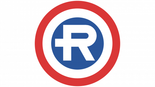
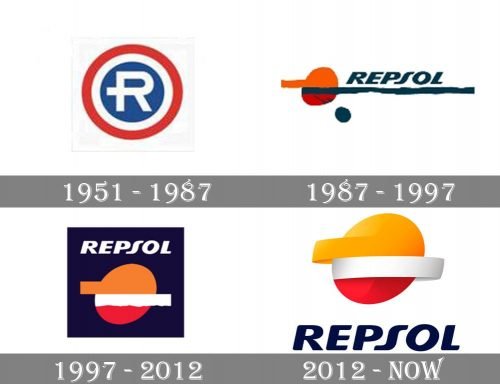
The brand’s roots can be traced back to 1951 when the REPESA (Refinería de Petróleos de Escombreras S.A.) introduced a line of lubricants under the name of Repsol. The original Repsol logo sported a large white “R” inside a blue circle. The blue circle, in its turn, was placed inside white and red rings.
1987
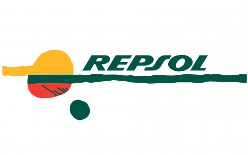
In 1987, Repsol became not just a brand but a company specializing in oil and gas. Therefore, it needed a new, clearer identity. The design was developed by the Wolff Olins brand consultancy.
The circle on the logo is the sun, which is used as a symbol of energy. The orange and dark blue lines seen on the logo were used to introduce strength and motion. The company name was given in a dynamic type. The “S” looked very unusual because it appeared to have been straightened. As a result, it did not really merge with the other glyphs.
1997
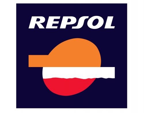
The design grew simpler and less casual. The blue line grew shorter, while the name of the company moved above the “sun.” The letters forming the wordmark were not italicized as much as in the previous version. Yet, the “S” still looked slightly out of place.
2012
The Repsol logo now features a 3D effect. The dark blue background has disappeared leaving the design much cleaner and lighter. The wordmark has grown slightly larger and moved below the emblem.
Font and color
The ironic Repsol logo uses a custom smooth font for its wordmark, and it softened the whole look, making it timeless and elegant. The bold and slightly italicized inscription is executed in a typeface, which is pretty close to such rounded sans-serif fonts as City Boys Soft Heavy Italic and FF Signa around Pro Extended Black Italic, but with some lines modified.
As for the color palette of a bright brand’s badge, it is composed of yellow and red, the colors of energy and passion, which reflect the essence of the brand — fuel. The navy blue lettering and a wide white stripe of the image add professional accents, pointing to the company’s stability, trustworthiness, and expertise.


