Marathon Petroleum Corporation is an Ohio-based company that works in refining, marketing, and transportation. Before a corporate spin-off in 2011, the company belonged to Marathon Oil. In 2018, it purchased Andeavor, which made it the nation’s largest petroleum refinery operator.
Meaning and history
The company has been incredibly consistent in its visual brand identity. The Marathon Petroleum logo has remained the same for more than the first decade of its existence. Moreover, by the time the logo was adopted by Marathon Petroleum, it already had been used by its parent company for almost half a century.
Such loyalty to the brand’s visual heritage has its advantages, but there are also quite a few drawbacks.
2011 – 2022

Marathon Petroleum Corporation was established as a subsidiary of Marathon Oil in 2009. By that time, Marathon Oil was a well-known company with a more than 120-year history (it was founded in 1987).
We can also mention that before Marathon Oil formed Marathon Petroleum Corporation, another company with a similar name existed, Marathon Petroleum Company LLC or Marathon Ashland Petroleum LLC. In its turn, it was created in 1998 as the result of the merger of the refining businesses of Marathon Oil and Ashland Inc.
The reason why the history of the brand is of paramount importance here is that it helps to trace the roots of the Marathon Petroleum logo. It is an exact copy of the logotype that its parent company used from 1962 to 2011. Interestingly, when in 2011 the parent company adopted a new logo, this didn’t affect the visual brand identity of the subsidiary, so their logos don’t share anything in common now.
The design of the parent company’s logo was quite simple, yet recognizable. So it was only natural that, when the subsidiary was created, top executives were tempted to give it the same logo. While the names of the companies were slightly different, this didn’t present a problem as the only word written in the logo is “Marathon.” Such a logo instantly made it obvious that the two companies are connected.
What is Marathon Petroleum
Marathon Petroleum Corporation (MPC) is an energy company headquartered in Findlay, Ohio. It boasts the country’s largest refining system. It was ranked 508 in the 2021 Forbes Global 2000.
As for the design itself, we can acknowledge that, for its time, it was pretty adequate. The logo was dominated by a large “M” in a slightly cooled-down shade of red. Below, the wordmark could be seen, which was set in a simple sans. The type doesn’t have a single decorative element and looks modern even now.
The combination of the emblem and the wordmark was placed inside a blue shape with white filling. The shape had six rounded angles. Interestingly, some of the angles were rounded to a greater extent than others.
2022 – Today
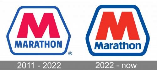
The redesign of 2022 only strengthened and refined the Marathon Petroleum badge, created in 2011. The hexagonal framing got bolder and more even, with the shade of blue darkened and looking more professional and expensive. As for the enlarged “M”, it also changed its shade, getting red more scarlet. The main change was made to the “Marathon” lettering, which is now set in the title case, with the deep blue letters written in a classic full-shaped sans-serif typeface, with traditional contours and cuts of the lines.
Icon
The website icon features a scaled-down version of the primary logo. On the one hand, this makes the icon recognizable enough. On the other hand, the name of the brand is too small to be legible, and it only creates visual noise in the emblem.
Colors and font
The color scheme is simple and straightforward. The combination of blue and red with white background is one of the most widely used palettes in commercial logos. There is also a patriotic hint in it as it echoes the colors of the Flag of the United States.
The clean and minimalist lines of the typeface used in the Marathon Petroleum logo save the design from looking old-fashioned. In spite of the slightly cluttered structure, it is still pretty tolerable even in our era of minimalist trends.


