PTT Public Company Limited is a state-owned oil and gas company headquartered in Chatuchak, Bangkok, Thailand. It is the owner of submarine gas pipelines, multiple LPG terminals, not to mention Café Amazon, a popular coffee chain. It works in electricity generation, petrochemical products, oil, and gas extraction, to name just a few industries.
Meaning and history
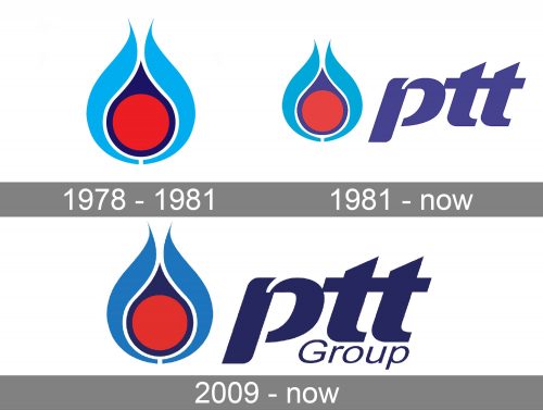
The pictorial part of the PTT logo has remained virtually unchanged since it was introduced in 1981. While preserving this part of its heritage, the company still has experimented with the typography.
1978 – 1981
During the company’s first years it had a rather simple visual brand identity. It didn’t have an emblem, just a typographical part. You could see the initials of the three words forming the company’s name (”PTT” or “ปตท.” (“Por-Tor-Tor” in Thai).
1981 – present
The company’s first governor, Dr. Tongchat Hongladaromp came to the conclusion that a new visual brand identity was needed. As PTT was expanded, it was in search of an emblem that would better reflect its values and ambitions and also would be more distinctive.
The in-house design team led by Rayong Yimsa-Ard developed approximately 30-40 versions. Under the supervision of Dr. Tongchat Hongladaromp, the team carried on the work until a single design was eventually selected.
In 1981, this emblem was trademarked and attained the status of the official PTT logo.
The emblem consists of four elements. At the center, there is a circle in a bright and clean shade of red. It is placed inside a dark blue drop. Eventually, there are two symmetrical elements in light blue, which can also be loosely interpreted as a drop.
What is PTT
PTT has been known as the largest oil and gas company in Thailand. It was established in 1978 as the Petroleum Authority of Thailand. As of 2021, it is ranked 234 on the Forbes Global 2000 list, while the Fortune Global 500 ranking places it on the 206th line.
The red circle can be interpreted as energy (oil, gas), while the blue elements represent the ocean. Such an interpretation makes perfect sense if we take into consideration that the company owns multiple offshore drilling rigs and extensive submarine gas pipelines.
We should also point out the prevalence of rounded shapes and curves on the emblem. On the subconscious level, people tend to perceive it as a symbol of one’s ability to compromise. This might have been one of the reasons why the designers who worked on the logo opted for such an emblem. However, a more important reason seems to be the need to use a drop shape. After all, both the oil and the ocean where it is often found are liquid.
2009 – present
The recognizable emblem remained unchanged, but a new wordmark was developed.
The Thai version of the logo featured the name of the brain in dark blue. The letters were rather small. There were quite a few rounded elements, and the letters were italicized. This created the “liquid” feel that made the wordmark “rhyme” with the pictorial part of the logo.
The global version featured the wordmark in English. The word “PTT” was lowercased. Below, there was the lettering “Group” in smaller letters. The type was italicized.
Colors and font
While the glyphs in the PTT logo have a classic structure, you can notice slightly unusual elements making the font recognizable. Also, elements like the top of the “p” create a visual link with the curves and acute angles of the emblem.
The palette symbolizes the energy (red) and ocean (light and dark blue).


