Petrobras is a company from Brazil, which was established in 1953 and today is one of the hugest gas and oil corporations of the region, which is semi-public.
Meaning and history
Petrobras, formally known as Petróleo Brasileiro S.A., is a Brazilian multinational corporation in the petroleum industry. Founded on October 3, 1953, by the Brazilian government, the company has played a pivotal role in the development of the Brazilian economy and energy sector. Its establishment was part of a broader movement towards economic nationalism in Brazil, a significant step away from foreign dependency in the oil industry.
Throughout its history, Petrobras has achieved numerous milestones. It made significant contributions to the development of deep-water and ultra-deep-water oil production, particularly in the Campos and Santos Basins. This breakthrough in offshore oil exploration and production positioned Brazil as a prominent player in the global oil market. Additionally, Petrobras has been instrumental in developing advanced technology for biofuel production, reinforcing its commitment to sustainable energy.
In its current position, Petrobras remains one of the largest oil producers in the world and a leader in the development of advanced technology for deep-water and ultra-deep-water oil exploration. Despite facing challenges such as political controversies and market fluctuations, the company continues to play a vital role in Brazil’s economy and maintains a strong presence in the global energy industry.
What is Petrobras?
Petrobras is a Brazilian multinational energy corporation, primarily engaged in petroleum exploration, production, refining, and distribution. It stands as a key player in the global energy sector, renowned for its deep-water oil exploration capabilities.
1958
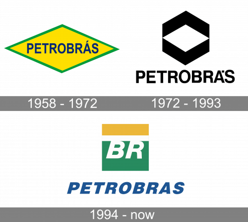
While the history of the company started in 1953, it was only in 1958 that the brand introduced its first logotype. The design showcased a yellow rhombus with dark green trim. The centerpiece of the emblem was the lettering “Petrobras” in blue. It featured an all-caps sans. The letters were rather high and stood pretty close to each other, which helped to make the long company name look somewhat shorter and more proportional.
As the company explained, the logo was inspired by the national flag of Brazil. To be precise, the logo borrowed the rhombus shape and the combination of colors: blue, green, and yellow.
1972
The similarity with the flag almost disappeared. Only the rhombus now reminded of the national symbolism of Brazil.
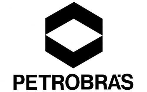
This time, the rhombus was white. It was placed over a gray or black hexagon. Either to the right or below, the word “Petrobra’s” in a classic sans could be seen. Below the name of the company, you could see the smaller lettering “Petroleo Brasileiro S.A.”
Somewhere in the 1970s, Petrobras Dustribuidora brand introduced the “BR” emblem, which grew exceptionally popular because it could be seen on every gas station that belonged to the company.
1993
Originally, the “BR” emblem was paired with the hexagon logo. However, over time, the Petrobras initiative started to be associated with several important problems, while its emblem was not as popular as the “BR” mark. Eventually, the company decided to drop the hexagon. Today, the “BR” mark is used by all the company’s branches.
In the current Petrobras logo, the letters “BR” are white. They are placed inside a square divided into three fields. The name of the company in a simple italicized sans can be seen to the left or below.


