Sunoco is a motor fuel distribution company from the USA, which was established in 1886 in Texas and today is a part of Energy Transfer Partners Group.
Meaning and history
Sunoco LP is a master limited partnership based in Dallas, Texas. It was founded in 1886.
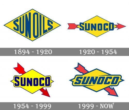
1894 – 1920
The original Sunoco logo reflected the old name. The design featured the lettering “Sun Oils” squeezed inside a rhombus. The effect of being squeezed appeared because the letters came very close to the sides of the rhombus.
The rhombus was yellow with blue trim, the letters were blue.
1920 – 1954
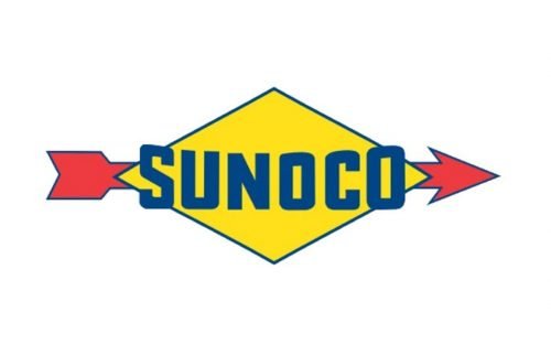
The rhombus grew somewhat flatter. The writing became flatter, too. While in the previous logo, the middle letters were higher than the final and the initial ones, the approach was different here. In the updated version, the central part was somewhat lower than the sides, although the difference was not as dramatic as in the original logo.
Another notable alteration was the red arrow.
1954 – 1999
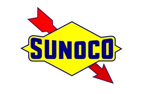
The blue and yellow grew brighter, more vivid. The arrow changed its direction – it was now going down from the left top corner to the right bottom corner.
1999 – Today
The design forces behind the Sunoco logo decided to return to the original palette with its muted tones. The arched lettering was straightened. Also, the letters were italicized, which provided some dynamism. The dynamic effect was reinforced by the blue strokes that appeared above and below the wordmark.
Font and color
The bold italicized Sunoco inscription from the brand’s emblem looks progressive and sleek, and its massive letters do not look too heavy due to the softened angles and some sharp elements. The typeface of the Sunoco wordmark is close to Mesquin Italic font, but with some lines modified.
The color palette of the Sunoco emblem is based on three shades — yellow, blue, and red — a combination, which evokes a sense of growth and progress, pointing at the company’s professionalism and reliability.


