Circle K Stores, Inc. is a chain of convenience stores. It belongs to the Canadian company Alimentation Couche-Tard. As of 2020, there are over 9,800 stores in North America (the majority of them in the US and Canada), over 2,700 stores in Europe, and around 2,370 franchised stores globally.
Meaning and history
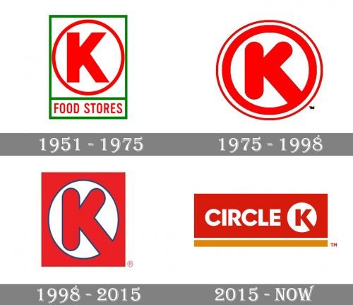
While the Circle K logo has gone through several updates, it has always been consistent in the use of the red color as the dominant one. What’s more important, the logo has always literally depicted the chain’s name (the “K” and the circle).
1951
The story started in 1951 when entrepreneur Fred Hervey bought three Kay’s Food Stores in El Paso, Texas. While the new owner wanted to give the chain a new name, he also was ready to preserve some of the brand’s heritage. So, he opted for the name “Circle K Food Stores.”
The first emblem already featured the letter “K” (capital) inside a circle. To make the design eye-catching, the authors of the logo opted for an extremely bright shade of red and complemented it with a rather vivid green. The green was used for the rectangular border into which the writing “Food Stores” was placed.
1975
The design grew more dynamic and professional. The “K” got flatter and adopted rounded corners, which better fitted the “circle” theme. One of the lower ends of the glyph stretched beyond the circle symbolizing that the road was free for the customers to come. Also, the new “K” resembled a tick (rotated clockwise), which has always been a symbol of something positive.
The circle, into which the glyph was placed, grew bolder. To add some depth, the authors of the logo decided to draw a thinner circle around it and leave some white space in between.
This logo has been used in Japan since 1980, while in other countries, it was replaced in 1998.
1998
The shape of the glyph remained the same. Like in the previous version, the “K” was placed over a white circle. This time, however, the white circle was housed inside a red square. The “K” and the circle adopted a thin dark trim.
2015
The ends of the “K” became rectangular, like on the original Circle K logo. The glyph grew somewhat smaller in proportion to the circle and lost the dark trim.
Now, the roundel was placed inside a large red rectangle also housing the word “Circle” in a similar bold type with rectangular ends.
Below the red rectangle, there was a thick orange stripe separated by a white gap. The company changed its “Simplify Your Day” tagline to “Take It Easy.”


